


Overview
The modelplot function, within the modelsummary package, constructs coefficient plots from regression output - i.e. visualization of model estimates and confidence intervals. In this building block, we will provide two examples of coefficients plots that are frequently used:
- A focal regression coefficient across multiple models
- Multiple regression coefficients within a single model
We will be using the models from the paper "Doing well by doing good? Green office buildings". These models regress the logarithm of rent per square foot in commercial office buildings on a dummy variable representing a green rating (1 if rated as green) and other building characteristics. Please refer to the modelsummary building block for more information about the paper.
Load packages and data
Let's begin by loading the required packages and data:

# Load packages

library(rlang)
library(ggplot2)
library(modelsummary)
library(dplyr)
library(fixest)
library(stringr)
library(extrafont)

# Load data

data_url <- "https://github.com/tilburgsciencehub/website/blob/master/content/topics/Visualization/Data_visualization/Regression_results/data_rent.Rda?raw=true"
load(url(data_url)) #data_rent is loaded now
The modelsummary table
Below you see the five regression models for which results are displayed in Table 1 of Eiccholtz et al. (2010). For a detailed overview and understanding of these regressions, please refer to the modelsummary building block.
reg1 <- feols(logrent ~
                green_rating + size_new + oocc_new + class_a + class_b +
                net + empl_new |
                id,
                data = data_rent
                )

# Split "green rating" into two classifications: energystar and leed
reg2 <- feols(logrent ~
                energystar + leed + size_new + oocc_new + class_a + class_b +
                net + empl_new |
                id,
                data = data_rent
                )


reg3 <- feols(logrent ~
                 green_rating + size_new + oocc_new + class_a + class_b +
                 net + empl_new +
                 age_0_10 + age_10_20 + age_20_30 + age_30_40 + renovated |
                 id,
                 data = data_rent
                 )

reg4 <- feols(logrent ~
                 green_rating + size_new + oocc_new + class_a + class_b +
                 net + empl_new +
                 age_0_10 + age_10_20 + age_20_30 + age_30_40 +
                 renovated + story_medium + story_high + amenities  |
                 id, data = data_rent
                 )

# add fixed effects for green rating
reg5 <- feols(logrent ~
                 size_new + oocc_new + class_a + class_b +
                 net + empl_new  + renovated +
                 age_0_10 + age_10_20 + age_20_30 + age_30_40 +
                 story_medium + story_high + amenities |
                 id + green_rating,
                 data = data_rent
                 )
Plotting a Focal Coefficient Across Multiple Models
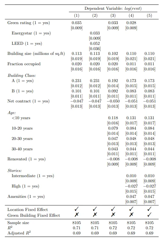
Let's create a coefficient plot of the "Green Rating" variable, which measures the impact of a green rating on the rent of the building. The Green rating variable is binary, taking the value 1 if the building has a certified green rating and takes the value of zero otherwise. We will plot the regression coefficient and it's confidence interval across a different regression specifications.
We will include the regression models 1, 3, and 4 in the models list, as these include the Green rating variable. The order of the models in models2 will determine the order of the variable rows in the plot.
We can customize the variable names displayed in the coefficient plot using the coef_map argument. In the vector cm, we assign a new name to the original term name. Only variables included in coef_map will be shown in the plot.
models2 <- list(
  "Model (4)" = reg4,
  "Model (3)" = reg3,
  "Model (1)" = reg1)

cm = c('green_rating' = 'Green rating (1 = yes)')
modelplot(models = models2,
          coef_map = cm
          )
Changing the confidence level
By default, the confidence level is set to 95%. We can change this by specifying the desired level using the conf_level argument.
modelplot(models = models2,
          conf_level = 0.99,
          coef_map = cm
          )
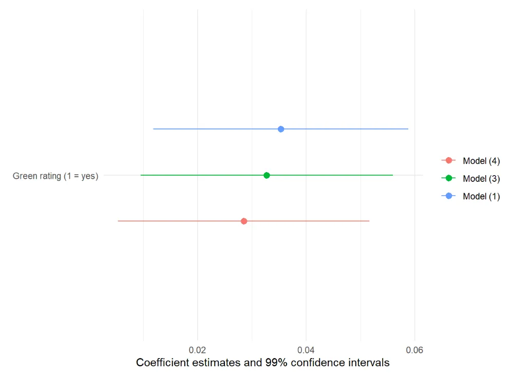
Further customization of the plot
Further customization of the plot can be done using ggplot2 functions. In the next code block, the following changes are made:
- Adding a theme
- Changing the font type to Times New Roman
- Modifying the color of the lines
- Adjusting the order of the legend
Within the scale_color_manual() functions, we specify the colors of the lines and control the order of the regressions in the legend. To do this, we need to define two vectors: color_map for the colors of the lines, and legend_order for the order of the regressions in the legend.
color_map <- c("Model (1)" = "black",
               "Model (3)" = "blue",
               "Model (4)" = "red"
               )
legend_order <- c("Model (1)",
                  "Model (3)",
                  "Model (4)"
                  )

modelplot(models = models2,
          coef_map = cm
          ) +
  theme_minimal() +
  theme(text = element_text(family = "Times New Roman")) +
  scale_color_manual(values = color_map,
                     breaks = legend_order
                     )
 Tip
TipBefore specifying Times New Roman as the font type in our plot, we need to import this font into R. You can use the following code to import the font:
For Windows users:
R
library(extrafont)
font_import() loadfonts(device = "win")
For IOS users:
R
library(extrafont)
font_import(prompt = FALSE) loadfonts()
Note that running font_import() may take a few minutes to complete.
Changing the labels
We can modify the labels of the plot using the labs()
argument. We omit the x-axis label and add a title, subtitle, and caption. Also, the title of the legend is changed by specyfying it as a character string and assigning it to the color parameter within labs().
Furthermore, we can change the position of the text elements within theme(). Specifically, we adjust the position of the title and subtitle to be centered by setting hjust = 0.5. Similarly, the caption is placed on the left side by setting hjust = 0.
modelplot(models = models2,
          coef_map = cm
          ) +
  theme_minimal() +
  theme(text = element_text(family = "Times New Roman")) +
  scale_color_manual(values = color_map,
                     breaks = legend_order
                    ) +
  labs(x= "",
       title = "Coefficient 'Green rating' with
                95% confidence intervals",
       subtitle = "Dependent variable is log(rent)",
       caption = "source: Doing well by doing good?: Green
                  office buildings by Eiccholtz et al. (2010)",
       color = "Regression models"
       ) +
  theme(plot.title = element_text(hjust = 0.5),
        plot.subtitle = element_text(hjust = 0.5),
        plot.caption = element_text(hjust = 0)
        )
This plot visualises the relationship between the presence of a green rating and the rent of the building. For the different regression models, the magnitude and the statistical significance of the green rating is unchanged. Thus, the plot reveals that the rent in a green-rated building is significantly higher by 2.8 to 3.5 percent compared to building without a green rating.
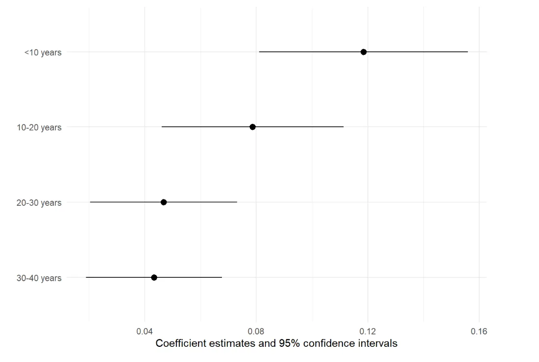
Multiple Coefficients Within a Single Model
We can also use a a coefficient plot to visualize more than one regression coefficient from a single model Let's showcase the coefficients of the each of the building age variables in regression 3 to demonstrate this. This plot allows us to visualize the effects of different building age categories on the the log of rental prices.
We can construct this plot as follows:
cm2 = c('age_30_40' = '30-40 years',
        'age_20_30' = '20-30 years',
        'age_10_20' = '10-20 years',
        'age_0_10' = '<10 years')

modelplot(models = reg3,
          coef_map = cm2
          )
Further customizations
Similar to the first example, we can customize the plot further with ggplot2 functions. We add a theme, change the font type and adjust the labels and captions.
modelplot(models = reg3,
          coef_map = cm2
          ) +
  theme_minimal() +
  theme(text = element_text(family = "Times New Roman")) +
  labs(x= "",
       title = "Coefficients in Age category of regression (3)",
       subtitle = "Dependent variable is log(rent)",
       caption = "source: Doing well by doing good?: Green
                  office buildings by Eiccholtz et al. (2010)"
       ) +
  theme(plot.title = element_text(hjust = 0.5),
        plot.subtitle = element_text(hjust = 0.5),
        plot.caption = element_text(hjust = 0)
        )
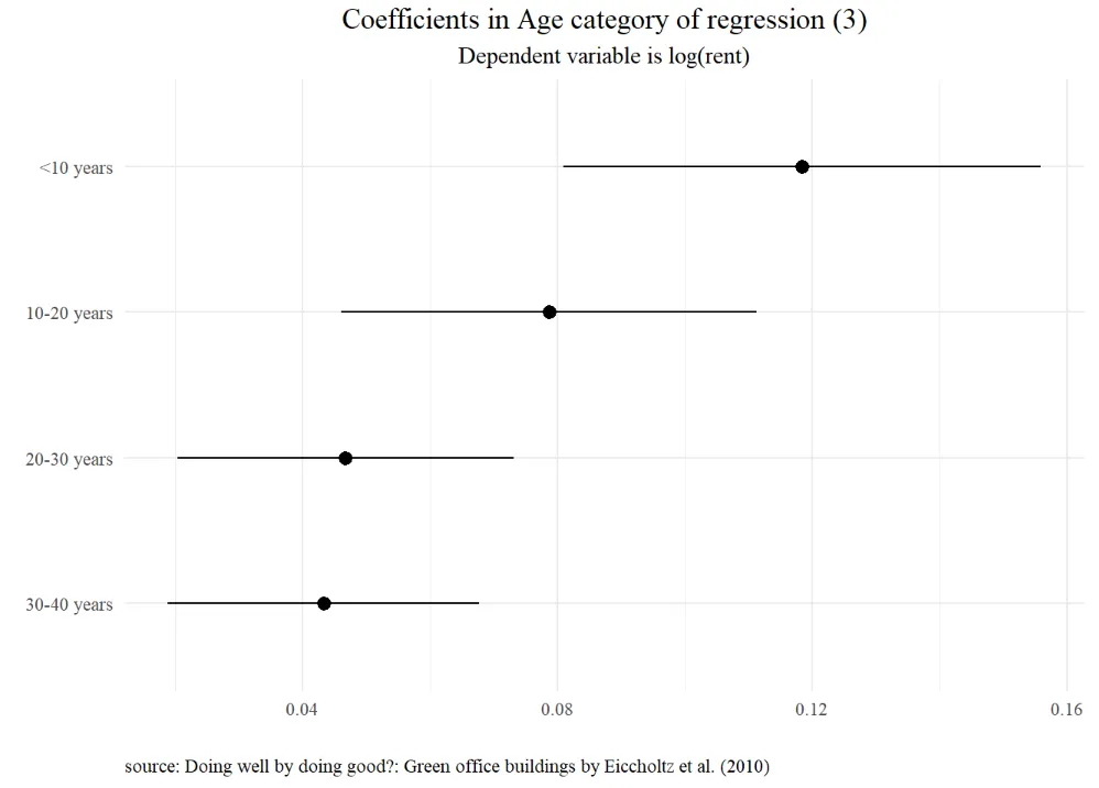
This plot clearly demonstrates that newer buildings command a significant premium compared to older ones, indicating a positive relationship between building age and rent in these models.
 Summary
The modelplot function from the modelsummary package offers a useful tool for creating clear and informative coefficients plots in R. In this building block, two examples are provided. The first example demonstrates how to visualize a single coefficient across multiple models. The second example showcases how to visualize multiple coefficients within a single model.