


Overview
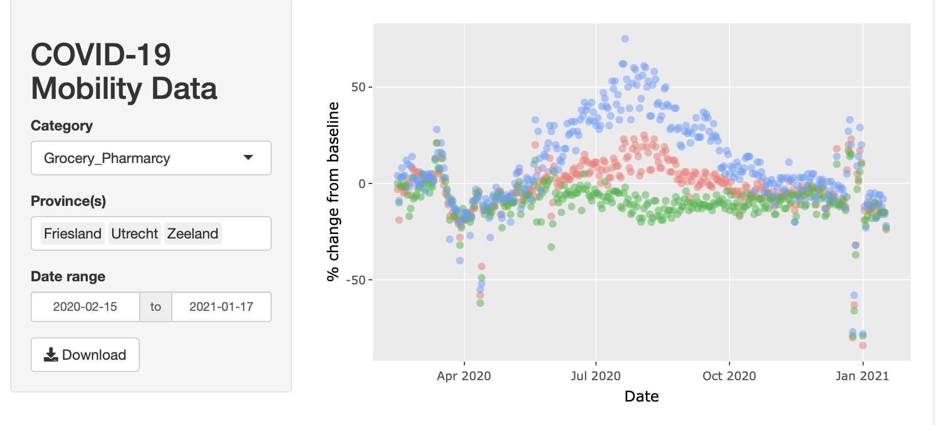
This example illustrates how to create a Shiny app which allows you to interactively explore Google’s COVID-19 Community Mobility Reports of the Netherlands through an intuitive visual interface (see the live version here).
How to create it
1. Skeleton
The Shiny library helps you turn your analyses into interactive web applications without requiring HTML, CSS, or Javascript knowledge, and provides a powerful web framework for building web applications using R. The skeleton of any Shiny app consists of a user interface (UI) and a server. The UI is where the visual elements are placed such as a scatter plot or dropdown menu. The server is where the logic of the app is implemented, for example, what happens once you click on the download button. And this exactly where Shiny shines: combining inputs with outputs. In the next two sections, we’re going to define the inside contents of the ui and server parts of our app.


 library(shiny)
 ui <- fluidPage()
 server <- function(input, output){}
 shinyApp(ui = ui, server = server)
2. User Interface
In our app, we have a left sidebarPanel() with a header, category, province, date range selector, and download button. Shiny apps support a variety of control widgets such as dropdown menus, radio buttons, text fields, number selectors, and sliders. Each of these controls has an input id which is an identifier that the server part of our app recognizes. The label is the text you see above each control. Depending on the widget, you may need to specify additional parameters such as choices (list of selections in dropdown), selected (the default choice), multiple (whether only one or more selections are allowed), or the start and end values of the date picker.
On the right, there is a mainPanel() that shows the plot, figure description, and table. The plotlyOutput turns a static plot into an interactive one in which you can select data points, zoom in and out, view tooltips, and download a chart image. Similarly, the DT::dataTableOutput() makes the data table interactive so that you can sort by column, search for values, and show a selection of the data.
ui <- fluidPage(
   sidebarLayout(
       sidebarPanel(
         h2("COVID-19 Mobility Data"),
         selectInput(inputId = "dv", label = "Category",
                     choices = c("Retail_Recreation", "Grocery_Pharmarcy", "Parks", "Transit_Stations", "Workplaces", "Residential"),
                     selected = "Grocery_Pharmarcy"),
         selectInput(inputId = "provinces", "Province(s)",
                     choices = levels(mobility$Province),
                     multiple = TRUE,
                     selected = c("Utrecht", "Friesland", "Zeeland")),
         dateRangeInput(inputId = "date", label = "Date range",
                        start = min(mobility$Date),
                        end   = max(mobility$Date)),
         downloadButton(outputId = "download_data", label = "Download"),
         ),
       mainPanel(
         plotlyOutput(outputId = "plot"),
         em("Postive and negative percentages indicate an increase and decrease from the baseline period (median value between January 3 and February 6, 2020) respectively."),
         DT::dataTableOutput(outputId = "table")
       )
   )
)
3. Server
The server function requires the input and output parameters where input refers to the input ids of the ui, for example, input$provinces denotes the current selection of provinces. In the same way, input$date[1] and input$date[2] represent the selected start and end date in the date picker.
First, we create a reactive variable for the filtered data. Any time the user manipulates the province selection or date picker, this variable is re-evaluated. To access the data, you can call the variable name followed by parentheses: filtered_data().
Second, we build up the plot with the ggplot library by defining the dataset, horizontal and vertical axes, and color categories. Next, we add a scatter plot with reduced transparency, remove the default legend, and change the vertical axis label. Note that output$plot refers the outputId of the plotlyOutput() function.
Third, we make sure that the current selection of data is shown in a table and that the download button becomes functionable by writing filtered_data() to a csv-file.
server <- function(input, output) {
    filtered_data <- reactive({
        subset(mobility,
               Province %in% input$provinces &
               Date >= input$date[1] & Date <= input$date[2])})

    output$plot <- renderPlotly({
        ggplotly({
                p <- ggplot(filtered_data(),
                aes_string(x = "Date", y = input$dv, color = "Province")) + geom_point(alpha = 0.5) + theme(legend.position = "none") + ylab("% change from baseline")
            p
        })
    })

    output$table <- DT::renderDataTable({
        filtered_data()
    })

    output$download_data <- downloadHandler(
        filename = "download_data.csv",
        content = function(file) {
            data <- filtered_data()
            write.csv(data, file, row.names = FALSE)
        }
    )

}
4. Source Code
As the last step, we put everything together in a single code snippet that you can re-use for your own projects (just 65 lines of code!). A couple of additional changes we have made include: importing the required packages and the mobility dataset, converting the data type of the date end province columns, and adding some white space here and there.
To publish your app online, you can simply hit the “Publish” button in the R preview window and follow the steps in the wizard.
library(shiny)
library(plotly)
library(DT)

mobility <- read.csv("mobility_data.csv", sep = ';')
mobility$Date <- as.Date(mobility$Date)
mobility$Province <- as.factor(mobility$Province)


ui <- fluidPage(
    sidebarLayout(
        sidebarPanel(
            h2("COVID-19 Mobility Data"),
            selectInput(inputId = "dv", label = "Category",
                        choices = c("Retail_Recreation", "Grocery_Pharmarcy", "Parks", "Transit_Stations", "Workplaces", "Residential"),
                        selected = "Grocery_Pharmarcy"),
        selectInput(inputId = "provinces", "Province(s)",
                        choices = levels(mobility$Province),
                        multiple = TRUE,
                        selected = c("Utrecht", "Friesland", "Zeeland")),
            dateRangeInput(inputId = "date", "Date range",
                           start = min(mobility$Date),
                           end   = max(mobility$Date)),
            downloadButton(outputId = "download_data", label = "Download"),
        ),
        mainPanel(
            plotlyOutput(outputId = "plot"), br(),
            em("Postive and negative percentages indicate an increase and decrease from the baseline period (median value between January 3 and February 6, 2020) respectively."),
            br(), br(), br(),
            DT::dataTableOutput(outputId = "table")
        )
    )
)

server <- function(input, output) {
    filtered_data <- reactive({
        subset(mobility,
               Province %in% input$provinces &
               Date >= input$date[1] & Date <= input$date[2])})

    output$plot <- renderPlotly({
        ggplotly({
                p <- ggplot(filtered_data(), aes_string(x="Date", y=input$dv, color="Province")) +
                geom_point(alpha=0.5) + theme(legend.position = "none") +
                    ylab("% change from baseline")

            p
        })
    })

    output$table <- DT::renderDataTable({
        filtered_data()
    })

    output$download_data <- downloadHandler(
        filename = "download_data.csv",
        content = function(file) {
            data <- filtered_data()
            write.csv(data, file, row.names = FALSE)
        }
    )

}

shinyApp(ui = ui, server = server)