Overview
Python has a lot of libraries for visualizing data, out of which matplotlib and seaborn are the most common. In this building block we construct the plots defined in Data Visualization Theory and Best Practices with both matplotlib and seaborn.
Setup
To install matplotlib follow this guide. This is the base library for plotting in Python.
 Tip
TipYou can also plot with pandas, which is built on top of matplotlib.
To install seaborn follow this guide. This is also built on top of matplotlib to create statistical plots.
Let's first import the libraries.

import pandas as pd
import matplotlib as mpl
import matplotlib.pyplot as plt
import seaborn as sns
We are going to use two datasets, the Iris dataset and the Monthly stocks dataset, containing closing prices of 4 companies over time. Let's load the datasets.
iris = pd.read_csv('iris.csv')
stocks = pd.read_csv('stocks-monthly.csv',parse_dates=[0])
Gallery of Plots
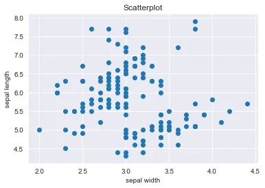
1. Scatterplot
Matplotlib
Creating a scatterplot with matplotlib is simple, we just need to follow a simple syntax. For this plot type we use the Iris dataset.
#create the scatterplot using two quantitative attributes
plt.scatter(iris['sepal width'], iris['sepal length'])

#name the X axis
plt.xlabel('Sepal width')

#name the Y axis
plt.ylabel('Sepal length')

#name the plot
plt.title("Scatterplot")

#add gridlines
plt.grid()
The scatterplot visualizes the sepal width on the X axis and the sepal length on the Y axis. The plot shows us that the majority of the points are concentrated around the center denoting that in general the flowers, regardless of their species, have a medium sepal length and width.
Output:
TipWe can also change the color of the dots by adding the parameter c = #some color. We can see all supported colors in matplotlib by running mpl.colors.cnames.
Additionally, we can change the style of the markers (dots) by adding the parameter marker = #some marker. We can see all supported marker styles in matplotlib by running mpl.markers.MarkerStyle.markers.
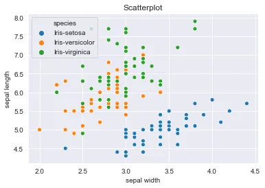
Seaborn
Creating the same scatterplot in seaborn is easy. Additionally, it can take the categorical variable of flower species as parameter for color hue. This way, each species has a different color and is easier to identify.
sns.scatterplot(iris['sepal width'], iris['sepal length'], hue = iris['species']).set(title="Scatterplot")
Output:
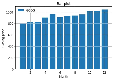
2. Bar plot
Matplotlib
For the bar plot we use the Monthly stock dataset. We visualize the months on the X axis and closing prices of one company on the Y axis.
#create the bar plot using the months and closing prices of Google
plt.bar(stocks['Date'].dt.month, stocks['GOOG'])

#add legend
plt.legend(['GOOG'])

#name the X axis
plt.xlabel('Month')

#name the Y axis
plt.ylabel('Closing price')

#name the plot
plt.title("Bar plot")

#add gridlines
plt.grid()
Output:
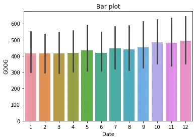
Seaborn
When plotting with seaborn it automatically adds a different color for each bar, as well as add error bars. They represent the uncertainty or variation of the corresponding coordinate of the point.
sns.barplot(stocks['Date'].dt.month, stocks['GOOG']).set(title="Bar plot")
Output:
3. Stacked bar chart
Matplotlib
#add each categorical variable (company) with a different color
plt.bar(stocks['Date'].dt.month, stocks['GOOG'], color='r')
plt.bar(stocks['Date'].dt.month, stocks['MSFT'], bottom=stocks['GOOG'], color='b')
plt.bar(stocks['Date'].dt.month, stocks['AMZN'], bottom=stocks['GOOG']+stocks['MSFT'], color='y')
plt.bar(stocks['Date'].dt.month, stocks['NASDAQ'], bottom=stocks['GOOG']+stocks['MSFT']+stocks['AMZN'], color='g')

#name the X axis
plt.xlabel("Months")

#name the Y axis
plt.ylabel("Closing price")

#add legend
plt.legend(["GOOG", "MSFT", "AMZN", "NASDAQ"])

#add title
plt.title("Closing prices of stocks in each month")

#add limit for Y axis to better visualize all categories
plt.ylim(0,800)
Output:
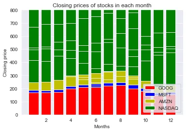
seaborn doesn't have a direct function for plotting stacked bar charts. An alternative is to create it using the pandas library following this syntax: DataFrameName.plot(kind='bar', stacked=True, color=[.....])
4. Line chart
Seaborn
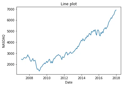
When plotting line charts with seaborn we have to specify exactly what to visualize on the axes:
sns.lineplot(data = stocks, x = 'Date', y = 'NASDAQ').set(title="Line plot")
Output:
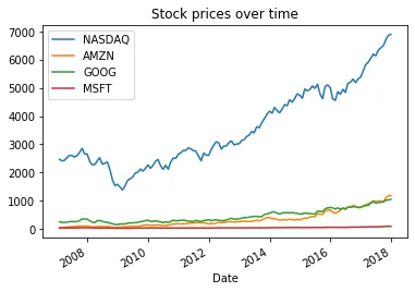
Matplotlib & Pandas
We can use a simple command to plot all 4 companies in the same line plot:
#we first set the date column as index
stocks_d = stocks.set_index('Date')

#create line plot with title
stocks_d.plot()
plt.title("Stock prices over time")
Output:
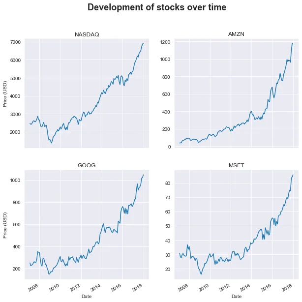
Subplotting
We can also create several subplots under the same figure. For instance, we create one line plot for each company.
#create display of figure
fig, ax = plt.subplots(nrows=2, ncols=2, squeeze=False, sharex=True, figsize=(10,10))

#plot each company on a different position in the figure
stocks_d['NASDAQ'].plot(ax=ax[0, 0])
stocks_d['AMZN'].plot(ax=ax[0, 1])
stocks_d['GOOG'].plot(ax=ax[1, 0])
stocks_d['MSFT'].plot(ax=ax[1, 1])

#set titles for each subplot
ax[0, 0].set_title('NASDAQ')
ax[0, 1].set_title('AMZN')
ax[1, 0].set_title('GOOG')
ax[1, 1].set_title('MSFT')
ax[0, 0].set_ylabel('Price (USD)')
ax[1, 0].set_ylabel('Price (USD)')

#set title of whole figure
fig.suptitle("Development of stocks over time", size=18, weight='bold')
Output:
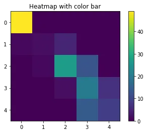
5. Heatmap
Before actually creating the heatmap, we need to rearrange the data to create a pivot table. We use the Iris dataset to create the pivot table after the petal length and width levels.
levels = ["tiny", "small", "medium", "big", "large"]
iris["petal width level"] = pd.cut(iris["petal width"], len(levels), labels=levels)
iris["petal length level"] = pd.cut(iris["petal length"], len(levels), labels=levels)

iris_grouped = iris.groupby(["petal width level", "petal length level"]).count().reset_index()

# fill the NaN values with 0's
iris_grouped["count"] = iris_grouped["species"].fillna(0)

# pivot the table
iris_matrix = iris_grouped.pivot("petal width level", "petal length level", "count")

# pivot orders the levels alphabetically, so reorder them according to the order in the 'levels' variable
iris_matrix = iris_matrix.reindex(levels, axis=0);
iris_matrix = iris_matrix.reindex(levels, axis=1);

iris_matrix
We can now create the heatmap from the new matrix.
Matplotlib
plt.imshow(iris_matrix)
plt.colorbar()
plt.title("Heatmap with color bar")
Output:
Seaborn
sns.heatmap(iris_matrix, square=True).set(title="Heatmap with color bar")
Output:

6. Histogram
For the histogram we use seaborn since it is the best library for statistical plotting.
#we can create a more complex chart that contains the histogram, the density plot and the normal distribution

from scipy.stats import norm
sns.distplot(iris['petal length'], fit=norm).set(title="Histogram with normal distribution")
Output:
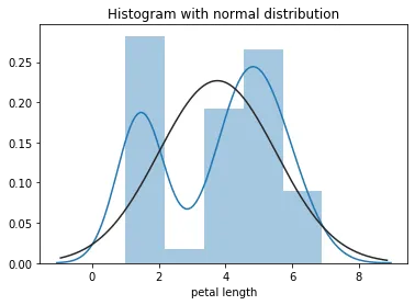
The blue line represents the density plot and the black line is the fitted normal distribution
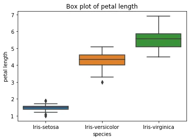
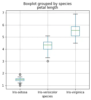
7. Box plot
We can visualize the distribution of petal length for each iris species with the box plot.
Matplotlib
iris.boxplot(column = 'petal length', by = 'species', figsize = (5,5))
Output:
Seaborn
sns.boxplot(data=iris, x='species', y='petal length').set(title="Box plot of petal length")
Output: