


Overview
The process of simply preparing your data set and creating some summary statistics often isn't enough for understanding your data well. However, mapping some statistics into charts and figures can help you tell a compelling story!
Data visualization facilitates making comparisons, understanding trends or identifying outliers. Visualization also speeds up the decision making process, as it makes it easier for you (or your reader) to comprehend the information, especially if it is a vast amount of complicated data.
In this building block, we go through the theory of data visualization, describe the most common chart types and conclude with best practices for plotting.
Theory of Data Visualization
Data Encoding
Data visualization makes use of marks (geometric primitives) and channels (appearance of marks) to create a chart. Marks can consist of: - points - lines - areas - any other complex shapes
Channels are ways in which we present the marks and consist of: - position (horizontal, vertical) - color (hue, saturation, luminance) - size (length, area, volume) - shape (orientation/tilt, curvature)
Several aspects should be considered when constructing a data visualization:
- What is the data and how is it structured
- Who is the user/reader
- What should the user be able to do - exploration/confirmation/communication of data
- What are the actions and targets
- How to map between data items and visual elements
Chart Elements
The chart below contains all necessary elements for a proper visualization.
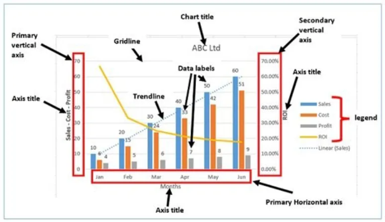
First of all, a chart needs to have a coordinate system , axes and scaling of data. In the above example there are two coordinates, the X and Y axes representing months on the horizontal axis and financial indicators on the primary vertical axis. Additionally, it has a secondary vertical axis showing the ROI.
A complete chart also has a legend for providing mapping information, axes titles, a chart title, data labels and gridlines for better readability of the data.
Chart Types
There is a vast range of chart types that could be used to visualize data, however in this building block we describe 7 of the most common ones, as they cover most of the visualization goals.
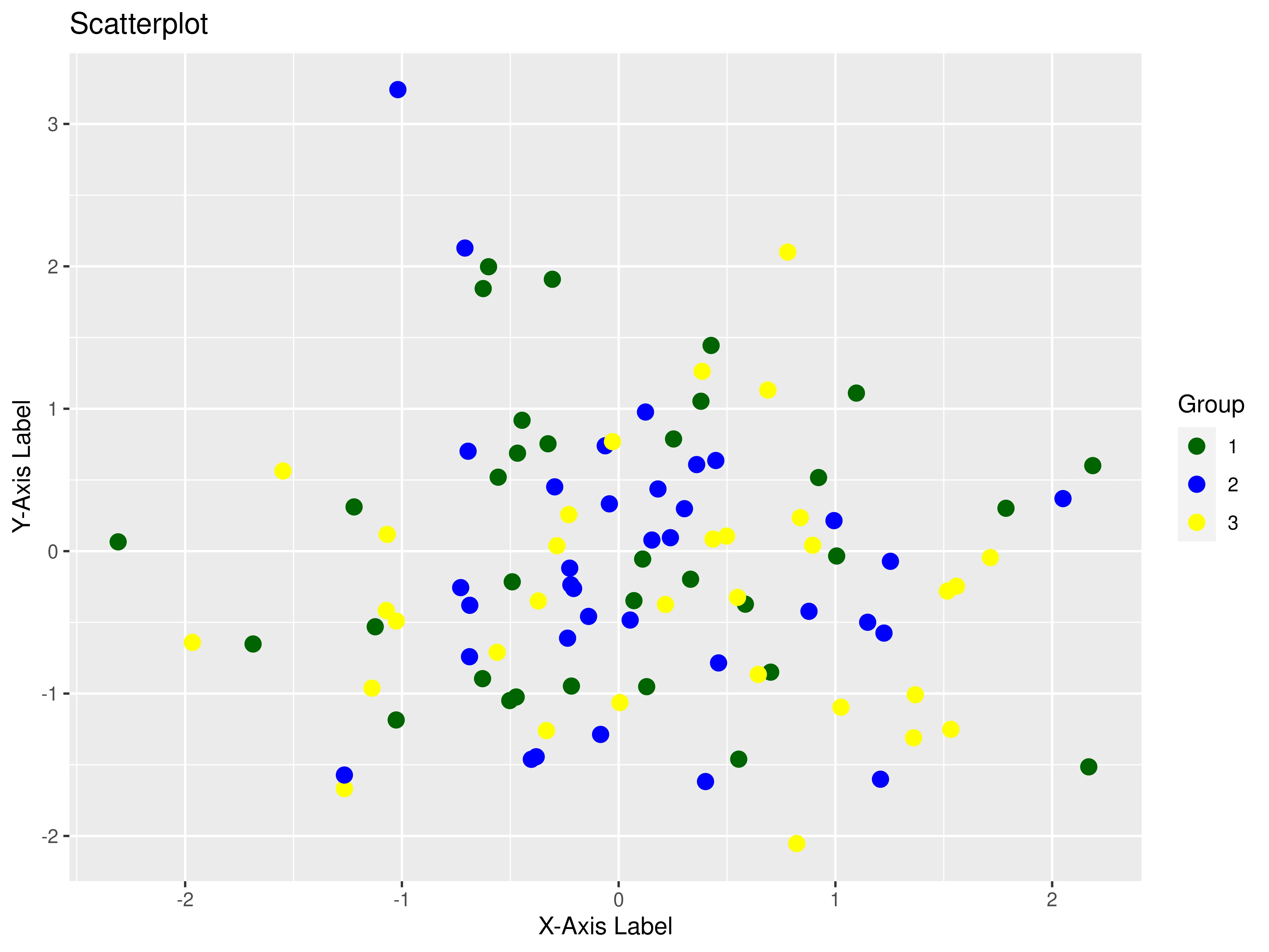
1. Scatterplot
The scatterplot can represent data with 2 quantitative attributes in horizontal and vertical channel positions. The used marks are points and the purposes of a scatterplot are to find trends or outliers, visualize a distribution or correlations, or identify clusters.
Code
With the following code you can create a scatterplot with self-generated data in R. You can substitute this kind of data with any dataset you are working with. This process will be replicated for every figure in this building block.

library(ggplot2)
# Generate random data (you can replace this with your actual data)
set.seed(123)  # For reproducibility
data <- data.frame(
  x = rnorm(100),   # X-axis values
  y = rnorm(100),   # Y-axis values
  group = sample(1:3, 100, replace = TRUE)
)

# Create the scatterplot using ggplot2
scatter_plot <- ggplot(data, aes(x = x, y = y, color = factor(group))) +
  geom_point(size = 3) +  # Customize the size of the points
  scale_color_manual(values = c("DarkGreen", "blue", "Yellow")) +  # Define colors for groups
  labs(
    title = "Scatterplot",
    x = "X-Axis Label",
    y = "Y-Axis Label",
    color = "Group"
  )

# Display the scatterplot
print(scatter_plot)
The output should look like this:
2. Bar plot
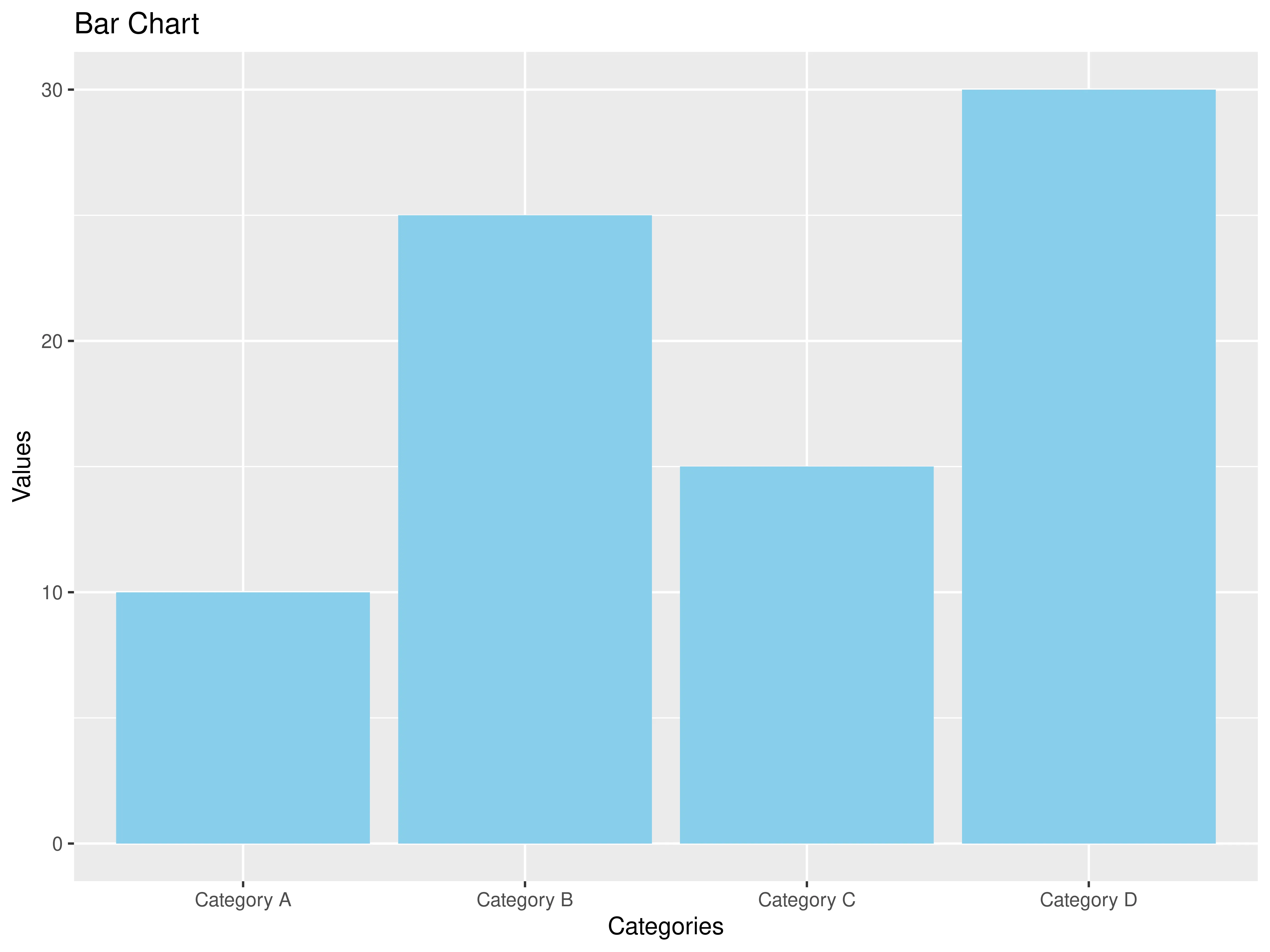
The bar plot can visualize one categorical and one quantitative attribute. It uses bars (thick lines) as marks and the used channels are length (to express quantitative value) and spatial regions (one per mark). These can be separated horizontally and aligned vertically (or the other way around) and are ordered by attribute values (either by label/alphabetical or by attribute length). The task of the bar chart is to compare or lookup values.
Code
# Generate sample data
data <- data.frame(
  Category = c("Category A", "Category B", "Category C", "Category D"),
  Value = c(10, 25, 15, 30)
)

# Create a bar chart
bar_plot <- ggplot(data, aes(x = Category, y = Value)) +
  geom_bar(stat = "identity", fill = "skyblue") +
  labs(title = "Bar Chart", x = "Categories", y = "Values")

bar_plot
The output should look like this:
3. Stacked bar chart
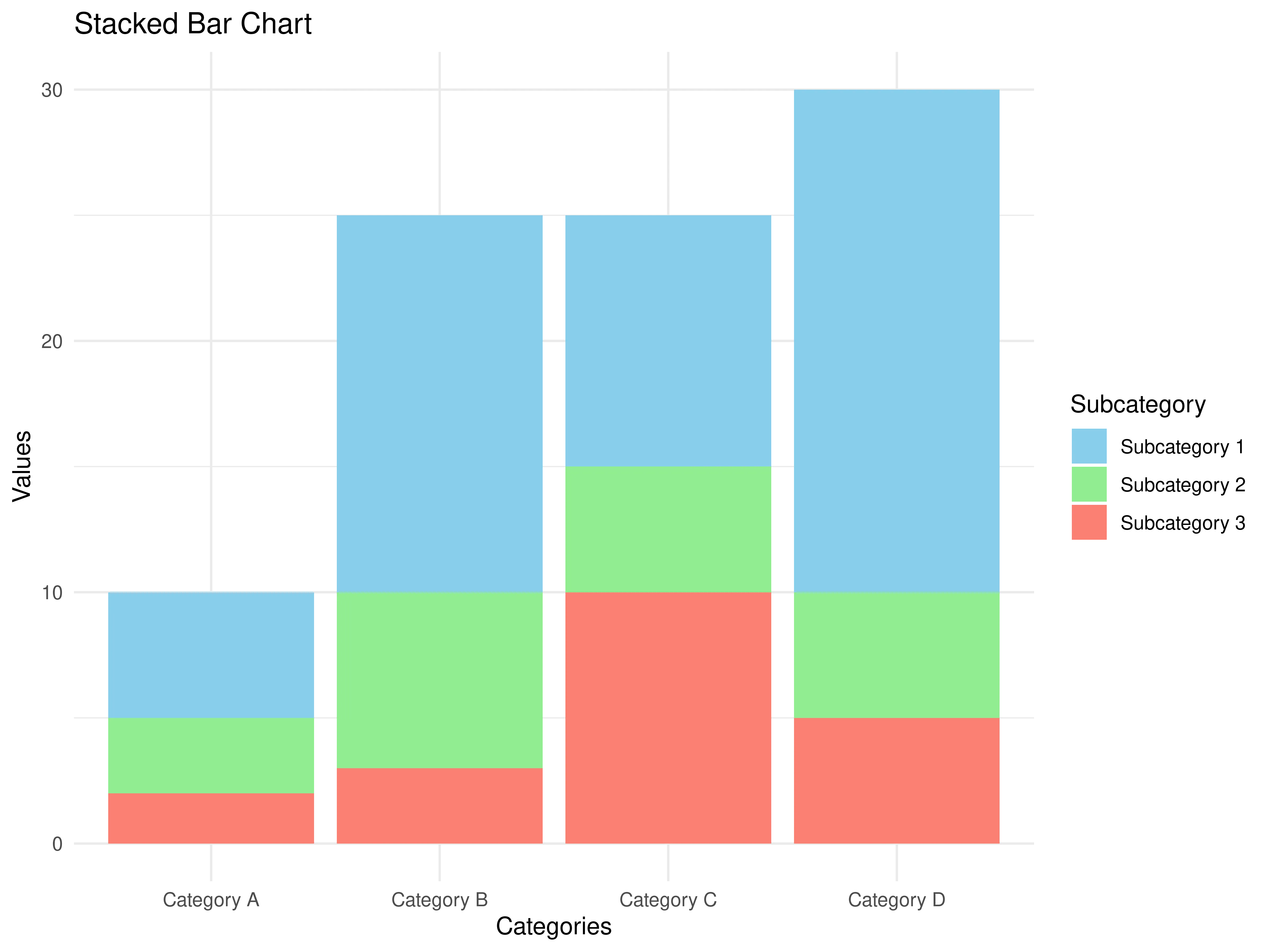
The stacked bar chart can visualize two categorical attributes and one quantitative attribute. As a mark it uses a vertical stack of line marks. For the channels the stacked bar chart uses length and color hue, as well as spatial regions to represent data. Its task is again to compare and lookup values, and additionally, it can inspect part-to-whole relationships.
Code
# Generate sample data for a stacked bar chart
data <- data.frame(
  Category = rep(c("Category A", "Category B", "Category C", "Category D"), each = 3),
  Subcategory = rep(c("Subcategory 1", "Subcategory 2", "Subcategory 3"), times = 4),
  Value = c(5, 3, 2, 15, 7, 3, 10, 5, 10, 20, 5, 5)
)

# Create a stacked bar chart
stacked_bar_chart <-  ggplot(data, aes(x = Category, y = Value, fill = Subcategory)) +
  geom_bar(stat = "identity", position = "stack") +
  labs(title = "Stacked Bar Chart", x = "Categories", y = "Values") +
  scale_fill_manual(values = c("Subcategory 1" = "skyblue", "Subcategory 2" = "lightgreen", "Subcategory 3" = "salmon")) +
  theme_minimal()

stacked_bar_chart
The output should look like this:
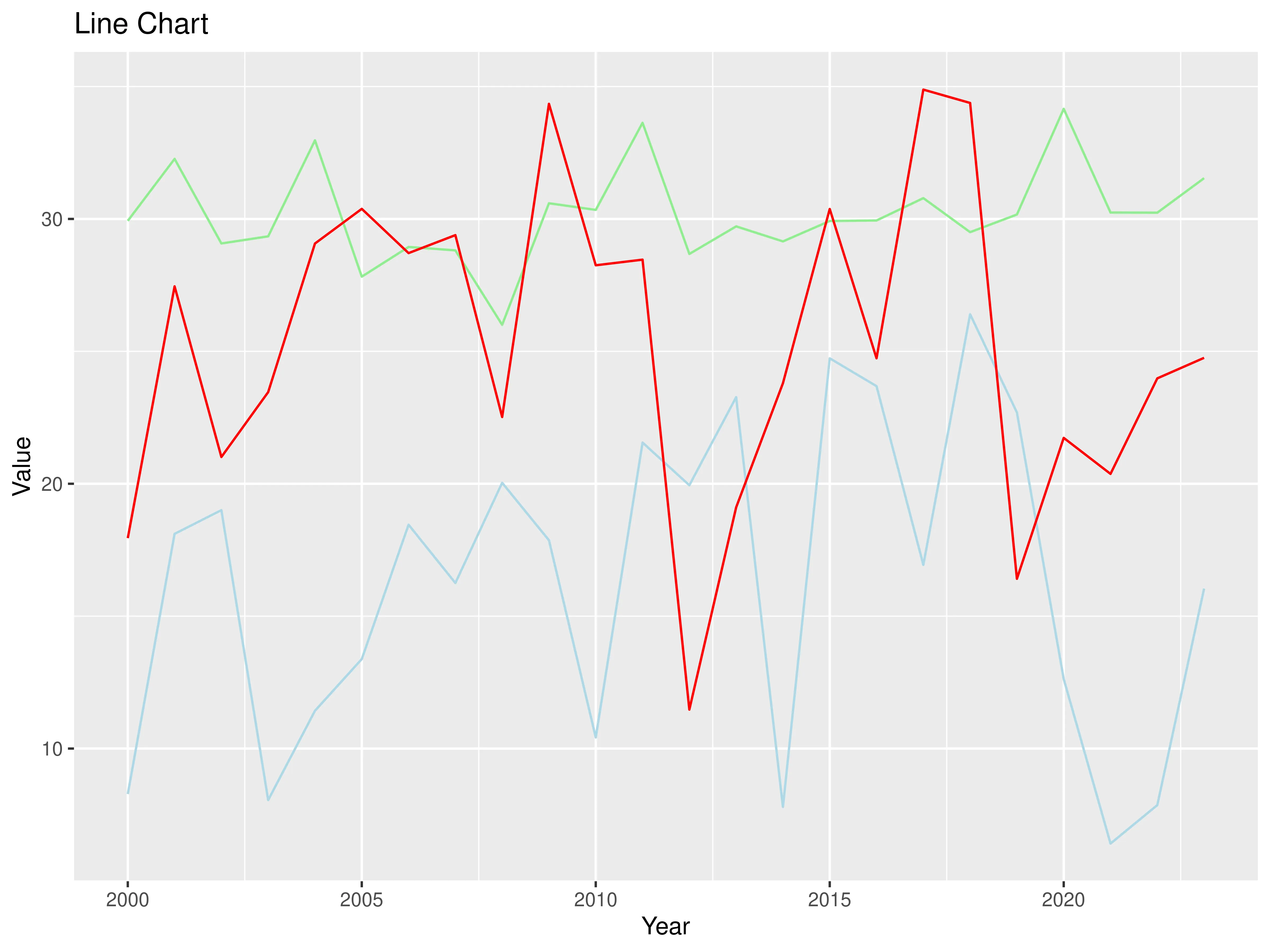
4. Line chart
The line chart represents 2 quantitative attributes and uses points with line connections between them as marks. The channels are aligned lengths to express quantitative value and are separated and ordered by attributes into horizontal regions. The task of the line chart is to find trends.
Code
set.seed(456)  # Set a random seed for reproducibility

# Generate data for three lines
years <- 2000:2023
line1 <- rnorm(length(years), mean = 15, sd = 5)
line2 <- rnorm(length(years), mean = 30, sd = 2)
line3 <- rnorm(length(years), mean = 25, sd = 6)

data <- data.frame(
  Year = years,
  Line1 = line1,
  Line2 = line2,
  Line3 = line3
)

line_chart <- ggplot(data, aes(x = Year)) +
  geom_line(aes(y = Line1), color = "LightBlue", linetype = "solid") +
  geom_line(aes(y = Line2), color = "LightGreen", linetype = "solid") +
  geom_line(aes(y = Line3), color = "red", linetype = "solid") +
  labs(title = "Line Chart",
       x = "Year",
       y = "Value")

print(line_chart)
The output should look like this:
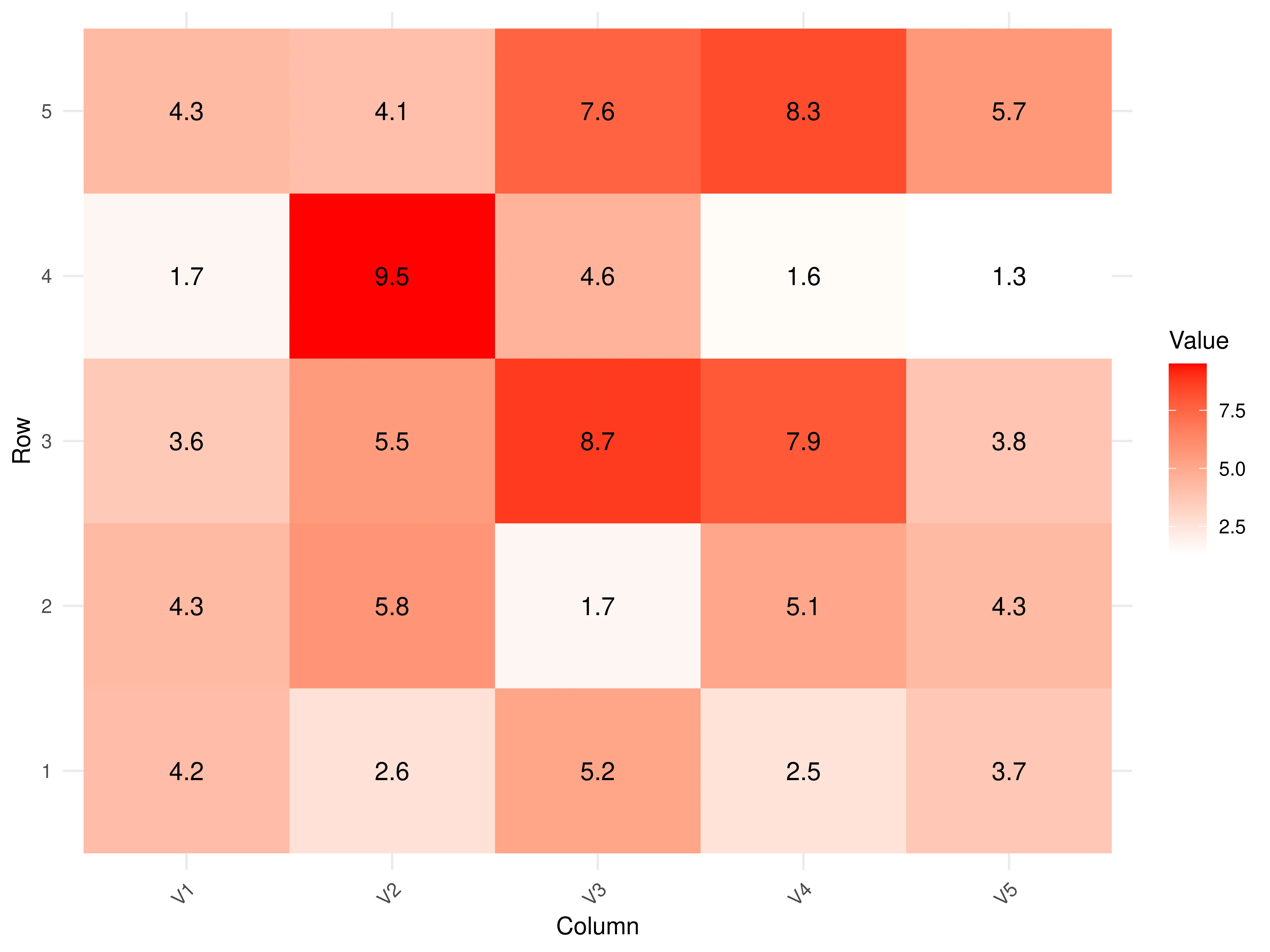
5. Heatmap
The heatmap can visualize 2 categorical attributes, usually in order, and one quantitative attribute. It uses areas as marks in the shape of a matrix indexed by the 2 categorical attributes. The channel is color hue ordered by the quantitative attribute. The purpose of the heatmap is to find clusters and outliers.
Code
install.packages("tidyr")

# Load the required packages
library(ggplot2)
library(tibble)

# Create a 5x5 matrix with random values between 1 and 10
data_matrix <- matrix(runif(25, 1, 10), nrow = 5)

# Convert the matrix to a data frame and add rownames as a column
data_df <- as.data.frame(data_matrix)
data_df <- tibble::rownames_to_column(data_df, var = "Row")

# Convert the data to a long format
data_df <- tidyr::gather(data_df, key = "Column", value = "Value", -Row)

# Create the heatmap using ggplot2 and add text labels
heatmap_plot <- ggplot(data_df, aes(x = Column, y = Row, fill = Value, label = round(Value, 1))) +
  geom_tile() +
  geom_text(size = 4, color = "black") +  # Add text labels
  scale_fill_gradient(low = "white", high = "red") +
  theme_minimal() +
  labs(x = "Column", y = "Row", fill = "Value") +
  theme(axis.text.x = element_text(angle = 45, hjust = 1))  # Rotate x-axis labels for better readability

print(heatmap_plot)
The output should look like this:
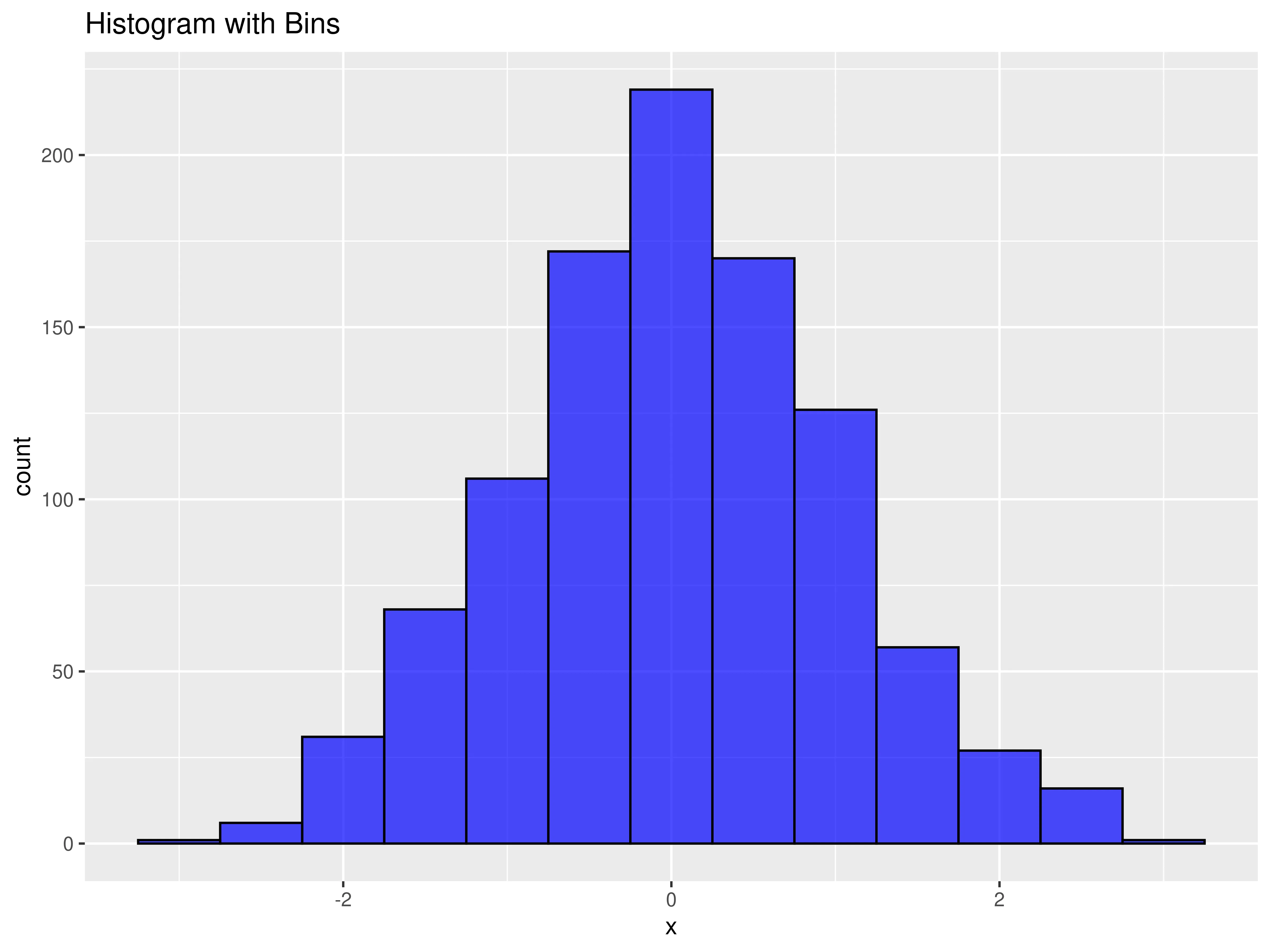
6. Histogram
The histogram is used to find the distribution or shape inside some data. It visualizes the frequency of an attribute from a table by using bins and counts. The bins are intervals in which the range of values is divided into, and counts are the frequencies of the values inside each interval.
Code
# Set a seed for reproducibility
set.seed(123)

# Generate random data with a normal distribution
data <- rnorm(1000, mean = 0, sd = 1)

# Create a histogram with bins
hist_with_bins <- ggplot(data.frame(x = data), aes(x)) +
  geom_histogram(binwidth = 0.5, fill = "blue", color = "black", alpha = 0.7) +
  labs(title = "Histogram with Bins")

# Create a line plot of the distribution
line_plot <- ggplot(data.frame(x = data), aes(x)) +
  geom_density(fill = "blue", color = "black", alpha = 0.7) +
  labs(title = "Distribution Line Plot")

# Display the plots
hist_with_bins
line_plot
The output should look like this:
7. Box plot
The box plot is also used to find the distribution of the data. It maps the attributes by calculating 5 quantitative values: - median: central value/line - lower and upper quartile: boxes - lower and upper limits: whiskers
Any values outside the limits are considered outliers.
Code
set.seed(123)
data <- data.frame(
  categories = rep(c("A", "B", "C", "D"), each = 50),
  values = rnorm(200)
)

box_plot <- ggplot(data, aes(x = categories, y = values)) +
  geom_boxplot() +
  labs(
    title = "Box Plot Example",
    x = "Categories",
    y = "Values"
  )
box_plot
The output should look like this:

Best Practices for Data Visualization
We have compiled a few best practices geared towards academic publishing.
 Tip
Tip-
Monochrome Compatibility: Prioritize monochrome (black and white) designs for figures, especially when unsure of the printing format. If the publication medium allows for color, use a distinct and color-blind friendly palette. Tools like ColorBrewer can assist in choosing appropriate colors.
-
Simplicity and Clarity: Don't overcrowd the visualization. It's better to have multiple clear visualizations than one cluttered and hard-to-decipher chart. Each visualization should convey a singular, focused message.
-
Stick to Recognizable Formats: While innovative charts can be captivating, academic readers expect clarity and familiarity (such as the common formats shown above).
-
Detailed Annotation: Every visualization should self-contain all necessary information: - Title: A succinct description of what the visualization represents. - Axes Labels: Clearly labeled with variables being represented. - Units: Always specify the units of measurement. - Legends: Ensure that any symbols, colors, or patterns used are clearly explained. - Captions: Provide a brief overview or important insight, especially if there's a key takeaway or if the visualization requires additional context.
-
Scaling and Typography: - Axes Ranges: Choose ranges that highlight the data's key aspects without misrepresenting any variability or skewing perception. - Font Size & Style: Fonts should be legible even when the figure is downsized for print. Avoid decorative fonts; stick to clean, universally-readable fonts like Arial, Helvetica, or Times New Roman.
Remember, the primary goal of data visualization in academic papers is clarity and effective communication of the research findings. Your visualization should aid comprehension rather than introduce confusion.
Saving plots
To save the plots just created we will use the function ggsave, part of the ggplot2 package.
The first necessary step is downloading and calling the package:
install.packages("ggplot2")
library(ggplot2)
The second step is saving the plot, so that is available for future use. You can do the following step for all figures, here it is displayed for one only.
#Saving the last plot we created as a PNG file with custom dimensions and resolution
ggsave("my_box_plot.png", plot = box_plot, width = 8, height = 6, dpi = 600)
For a more in-depth exploration of the syntax and capabilities of ggsave(), check out this article.
Summary
Data visualization is essential for understanding data. It uses marks (like points and lines) and channels (such as color and size) to create charts. A complete chart includes axes, legends, titles, and labels for clarity.
Common chart types include scatterplots, bar plots, stacked bar charts, line charts, heatmaps, histograms, and box plots.
Best practices for data visualization in academic publishing include monochrome compatibility, simplicity, recognizable formats, detailed annotation, and attention to scaling and typography.
The text also includes code examples in R for creating these visualizations and explains how to save them using the ggsave function.