


Overview
The goal of this building block is to provide a guide to create basic forest plots, compare the results of different studies, and assess the significance of their pooled effects.
Forest plots are a visual representation that summarises findings from various scientific studies that investigate a common research question. They find significant application in the field of meta-analysis, a type of statistical analysis that combines and examines results from a number of independent studies.
More practically, forest plots identify a statistic that is common to such set of studies and report the various instances of that statistic. This, in turn, allows to compare the different results and the significance of the overall pooled summary effect.
Among the benefits of forest plots, we find:
- clear and concise
visualrepresentationof results; effectsizeandconfidenceintervalcomparison across different studies;- overall, useful tool to evaluate the consistency and strength of evidence, identify potential sources of bias, and make informed judgments about the effect of interventions or exposures.
Forest Plots in R
One of the most popular R packages used for forest plots is forestploter. Compared to other packages (e.g., forestplot), forestploter focuses entirely on forest plots, which are treated as a table. Moreover, it allows to control for graphical parameters with a theme and to have confidence intervals spread across multiple columns and divided by groups.
Generate Dataset
The code blocks below shows how to generate a dataset and create a basic layout for a forest plot.
- Load the required packages and generate a simulated dataset.

library(forestploter)
library(dplyr)

data <- data.frame(
  Study = c("Study A", "Study B", "Study C", "Study D", "Study E"),
  Group1 = c(200, 150, 180, 250, 120),
  Group2 = c(150, 170, 160, 240, 130),
  smd = c(0.51, 1.27, -0.54, 0.81, 0.87),
  CI_Lower = c(-0.25, -0.74, -1.6, 0.55, -0.1),
  CI_Upper = c(1.25, 1.4, -0.1, 2.1, 1.3)
)
- Calculate standard errors and weights to be used in the derivation of the pooled standard error and of the overall pooled effect.
data$se <- (data$CI_Upper - data$CI_Lower) / (2 * 1.96)
data$Weight <- 1/data$se^2
data$Weight <- data$Weight / sum(data$Weight)
pooled_effect <- round(sum(data$smd * data$Weight), 2)

data$Weight <- round(100 * (data$Weight), 2)

data$n <- (data$Group1 + data$Group2)
n_studies <- 5
pooled_se <- sqrt(
  (sum((data$n - 1) * data$se^2)) / ((sum(data$n) - n_studies))
)
- Calculate the confidence interval for the pooled summary effect, insert empty cells to match the forest plot's graphical representation, and include a final summary column.
z_score <- qnorm(0.975)
lower_bound <- round(pooled_effect - z_score * pooled_se, 2)
upper_bound <- round(pooled_effect + z_score * pooled_se, 2)

data$` ` <- paste(rep(" ", 30), collapse = " ")

data$`SMD (95% CI)` <- paste(data$smd, " [", data$CI_Lower, ", ", data$CI_Upper, "]", sep = "")
- Reorder the columns and keep only those necessary for the final forest plot. Generate a totals row to append to the original dataset and make any adjustments necessary to ensure that variables appear neat.
data <- data %>%
  select(Study, Group1, Group2, smd, CI_Lower, CI_Upper, se, ` `, Weight, `SMD (95% CI)`)

totals <- c(" ", sum(data$Group1), sum(data$Group2), pooled_effect, lower_bound,
            upper_bound, pooled_se, " ", sum(data$Weight),
            paste(pooled_effect, " [", lower_bound, ", ", upper_bound, "]", sep = ""))

data <- rbind(data, totals)

data$Weight <- paste(data$Weight, "%")

data[nrow(data), 1] <- "Overall"
Create Forest Plot Theme
- Generate and customise forest plot theme.
tm <- forest_theme(base_size = 10,
                   # Graphical parameters of confidence intervals
                   ci_pch = 15,
                   ci_col = "#0e8abb",
                   ci_fill = "red",
                   ci_alpha = 1,
                   ci_lty = 1,
                   ci_lwd = 2,
                   ci_Theight = 0.2,
                   # Graphical parameters of reference line
                   refline_lwd = 1,
                   refline_lty = "dashed",
                   refline_col = "grey20",
                   # Graphical parameters of vertical line
                   vertline_lwd = 1,
                   vertline_lty = "dashed",
                   vertline_col = "grey20",
                   # Graphical parameters of diamond shaped summary CI
                   summary_fill = "#006400",
                   summary_col = "#006400")
 Tip
TipType help(forest_theme) in your R terminal for more info about the forest_theme() function arguments.
Generate Forest Plot
- Once dataset and theme are set, generate forest plot.
# Final data manipulation part
data$CI_Upper <- as.numeric(data$CI_Upper)
data$CI_Lower <- as.numeric(data$CI_Lower)
data$smd <- as.numeric(data$smd)
data$se <- as.numeric(data$se)

# Forest plot
pt <- forest(data[,c(1:3, 8:10)],
             est = data$smd,
             lower = data$CI_Lower,
             upper = data$CI_Upper,
             sizes = 0.8,
             is_summary = c(rep(FALSE, nrow(data)-1), TRUE),
             ci_column = 4,
             ref_line = 0,
             arrow_lab = c("Favours Group 1", "Favours Group 2"),
             xlim = c(-2, 2),
             ticks_at = c(-2, -1, 0, 1, 2),
             xlab = "Standardised Mean Difference",
             theme = tm)

plot(pt)
Type help(forest) in your R terminal for more info about the forest() function arguments.
This is what the final output should look like:
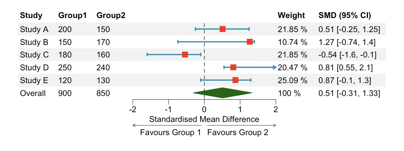
Interpret Forest Plots
The following is an explanation of how to interpret the figure above.
- Study: results source.
- Group 1/2: number of participants in the study. Normally the two groups are split between
treatmentandcontrolgroups. - Squares (red): effect size of the indvidual studies. In this example, the effect size is represented by the
standardised mean differencebetween the averages of the two groups. Other possible effect sizes aremeandifference,oddsratio, orhazardratio. - Horizontal (blue) lines:
95%confidenceintervals(CI). The interpretation is that we are 95% confident that the true value of the effect size lies between the lower and upper bounds. The wider the CI the less precise the study. - Diamond (green):
pooledsummaryeffectof all the studies included in the meta-analysis. The middle points of the diamond represent the pooled effect, while the points on the sides its 95% confidence interval. - Dotted Line: this line is known as
lineofnoeffectand it is plotted at the exact point where, relative to the effect size chosen in the analyis, there is no difference between the estimates of the two groups. If the effect size is based on a difference, the line of no effect will be at 0, whereas if the effect size is based on a ratio, the line of no effect will be at 1. This line is very useful tointerprettheresults, in fact, if the CI intersects the line, the results are NOT significant. In this case the pooled summary effect is not significant. - Weight: study weight is proportional to study precision and it represents the
influenceof each individualstudyon the pooled effect size. More practically, when the standard error of the estimate of a study increases, its weight decreases. An alternative approach is to use a weight that is positively correlated with sample size. - SMD (95% CI): summary of effect size and confidence intervals in the graphical representation.