


Overview
This article outlines the use of ggplot2 in R for visualizing time series data, focusing on how to effectively format scales and utilize grouping and faceting to examine trends and patterns across categorical variables. Grouping allows for the comparison of different categories within a single graph, offering insights into how different variables interact over time. Faceting, meanwhile, splits the data into separate panels, providing a detailed look at each category on its own.
The dataset featured includes six US tech stocks, which are accessed through the tidyquant library in R.
Why Use ggplot2 for Time Series Visualization?
ggplot2 stands out for its ability to handle date variables in time series visualization. It simplifies the process by automatically recognizing date formats, which means there's no need for manual conversions or specifications of date data. This feature is part of what makes ggplot2's syntax and functions user-friendly, especially when it comes to adjusting the axes and the time periods that are displayed within the visualizations. As a result, you can work with the initial dataset as is, without having to create a custom manipulated dataset beforehand.
Setup

# Install necessary packages for data visualization and financial analysis
install.packages("tidyquant") # For fetching financial data
install.packages("ggplot2")   # For creating visualizations

# Load the installed packages into the R session
library(ggplot2)
library(tidyquant)

# Define stock tickers for six major tech companies
tickers = c("AAPL", "NFLX", "AMZN", "TSLA", "GOOGL", "MSFT")

# Retrieve historical stock prices using tidyquant
prices <- tq_get(tickers, get = "stock.prices")
Single Variable Time Series Visualization
Time series visualization is a useful method for understanding and analyzing data trends over time. It involves plotting data points against time intervals, allowing for the identification of patterns, trends, and anomalies within the dataset.
Variables Needed in the Dataset
To create a single variable time series visualization with ggplot2, your dataset should include two types of variables:
- Date Column: This column should contain the dates corresponding to each data point in the time series. Ensure that the dates are properly formatted to be recognized as date objects by R.
- Values Column: This column captures the variable you're interested in tracking over time, this must be a numeric variable.
Syntax for Creating Time Series Plots in ggplot2
To create a time series plot in ggplot2, you'll use the ggplot() function to specify the data and aesthetics mappings, followed by one or more geom_*() functions to add layers to the plot.
Here's a basic syntax outline:
ggplot(data = your_data_frame, aes(x = date_column, y = values_column)) +
  geom_line()
In this structure: - your_data_frame is your dataset. - date_column and values_column denote the columns of your dates and your variable of interest, respectively.
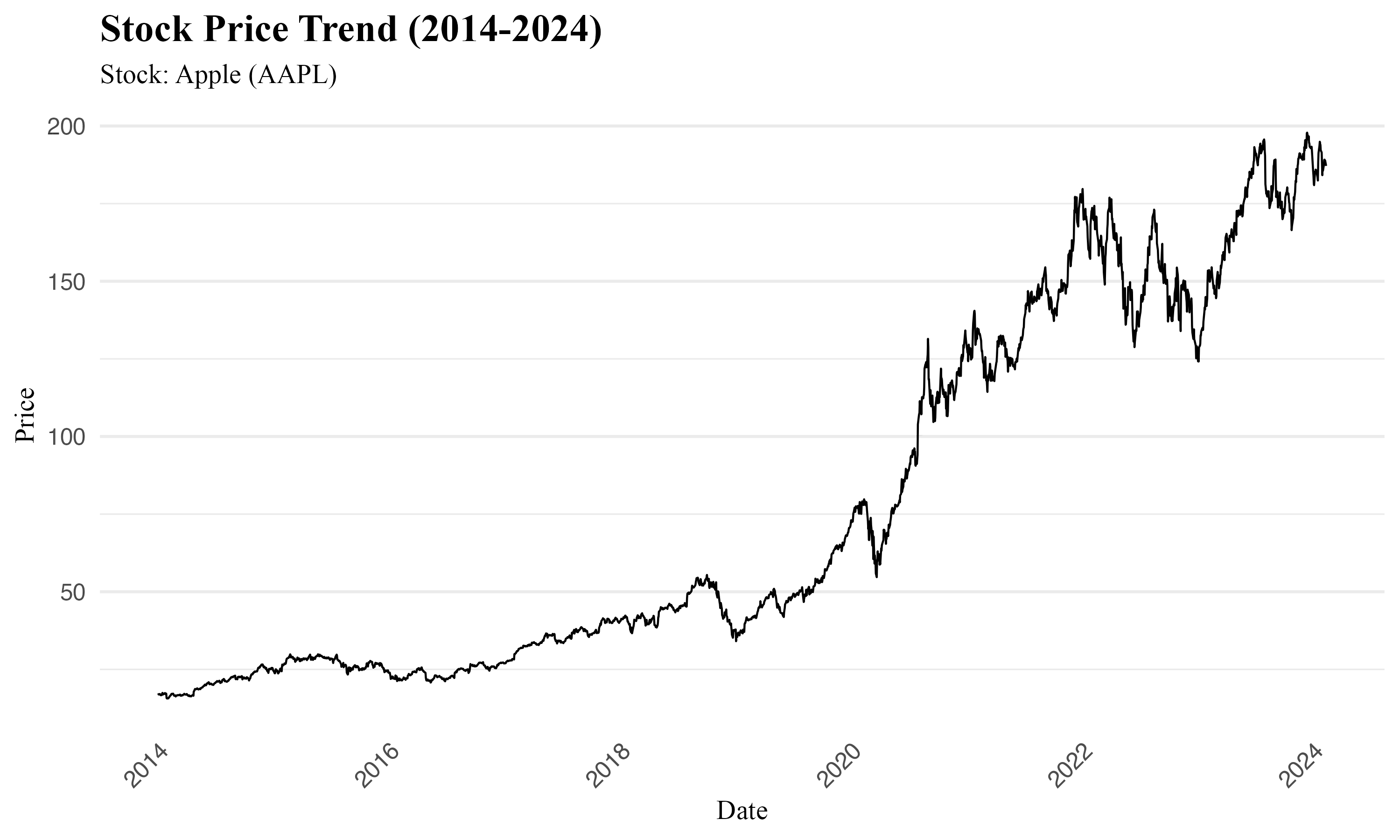
Consider this practical example for visualizing Apple (AAPL) stock prices post-January 1, 2014:
# Filter the data for Apple (AAPL) stock prices after January 1, 2014
AAPL <- prices %>%
  filter(symbol == "AAPL" & date > as.Date("2014-01-01"))

# Create a line chart using ggplot2
ggplot(data = AAPL, aes(x = date, y = adjusted)) +
  geom_line() +
  #  customization (Shown in the source code)
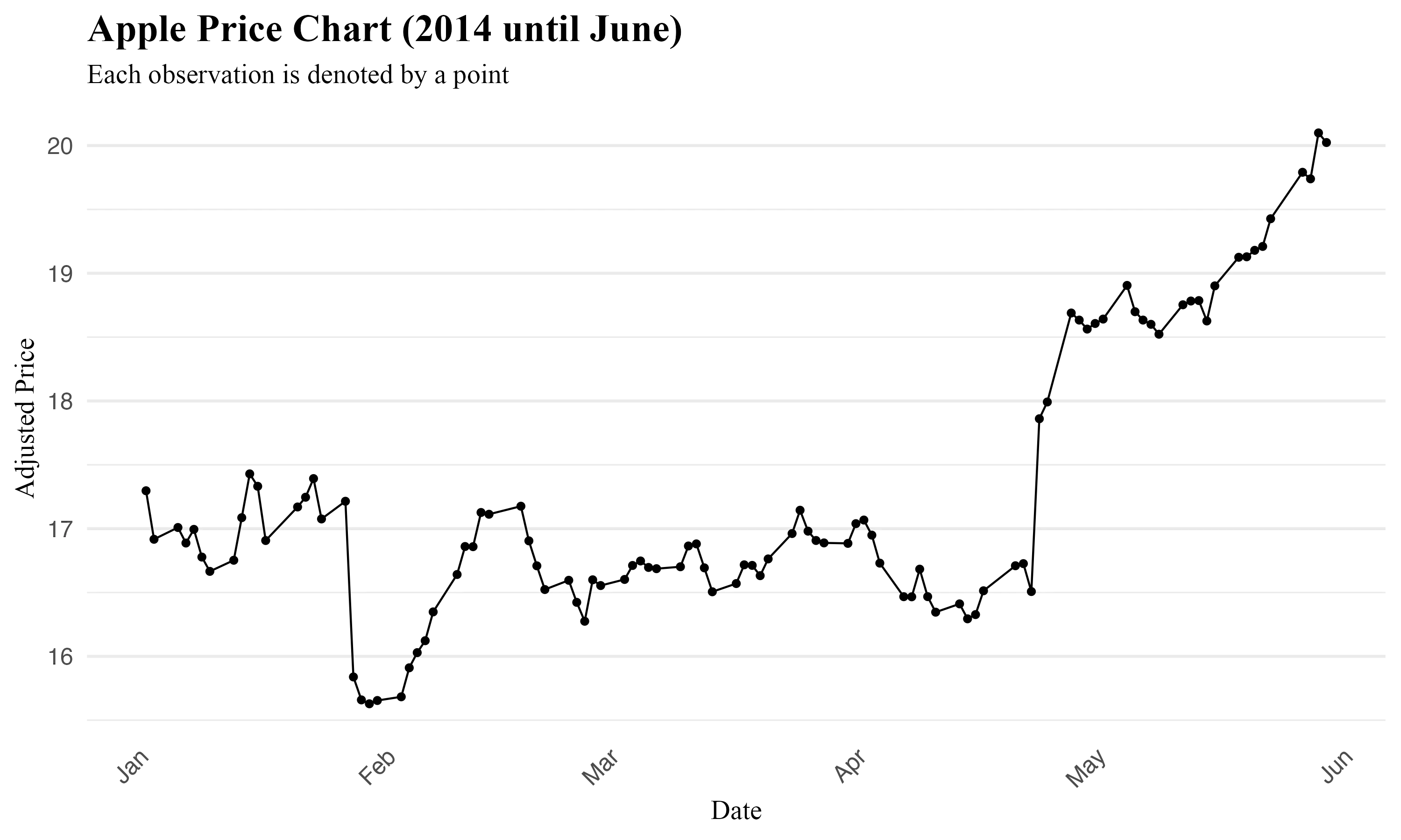
For a more in depth view, the geom_point function can introduce data points to your line chart. However, with numerous points, readability may decrease.
AAPL_point <- prices %>%
  filter(symbol == "AAPL" & date > as.Date("2014-01-01") & date < as.Date("2014-06-01"))

# Line chart with data points
ggplot(data = AAPL, aes(x = date, y = adjusted)) +
  geom_line() +
  geom_point() +
  # Customization
 Tip
TipTip for Date Formatting:
To ensure your dates are correctly plotted, they should be in the Date class. The lubridate package is the best practice for date conversions, alongside the as.Date() or as.POSIXct() functions. Confirm your date column's format with class() or str() checks.
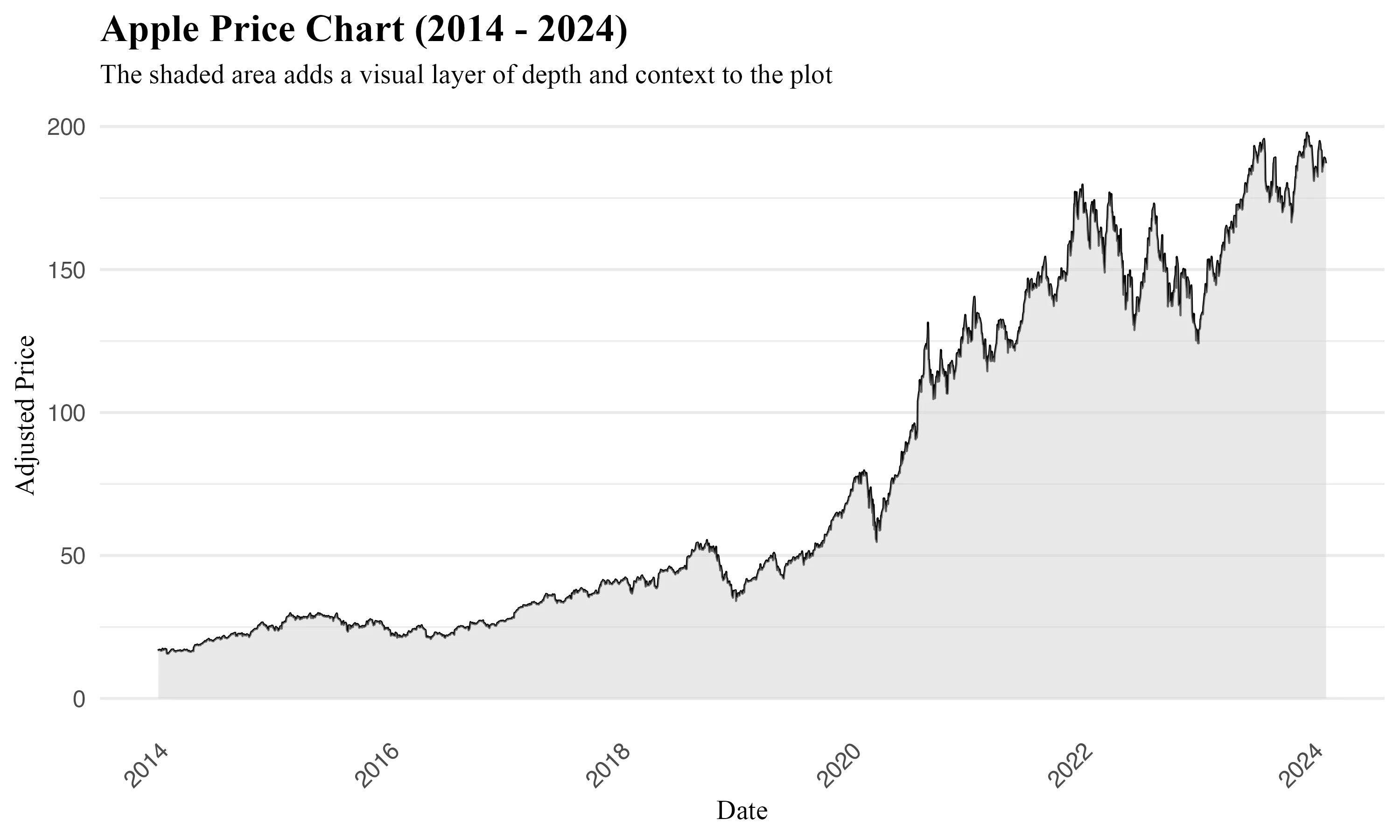
To incorporate a shaded area beneath the time series use the geom_area() function, this adds a visual layer of depth and context to the plot:
# Create a line chart with shaded area using ggplot2
ggplot(data = AAPL, aes(x = date, y = adjusted)) +
  geom_area(fill = "lightgrey", alpha = 0.5) +  # Add shaded area with transparency
  geom_line() +  # Add line plot
  # Customization
Adjusting Dates on the X-Axis with scale_x_date
Building on ggplot2's capability to automatically recognize date formats, adjusting dates on the X-axis becomes valuable when the default settings do not convey the most valuable or easy-to-interpret information. The scale_x_date() function in ggplot2 provides control over how date scales appear on the X-axis of time series plots. It enables customization of the date format displayed, in addition to defining intervals and setting specific limits within your data.
Syntax Overview:
scale_x_date(date_breaks = "interval", date_labels = "strftime_format", limits = NULL)
date_labels
The date_labels parameter specifies the format for date labels on the X-axis, utilizing formatting strings to tailor the appearance of dates. This flexibility allows for precise representation of time in the visualization.
Here is a reference table for commonly used formatting symbols:
| Symbol | Meaning | Example |
| ------ | ---------------------- | ------- |
| %d | day as a number (0-31) | 01-31 |
| %a | abbreviated weekday | Mon |
| %A | unabbreviated weekday | Monday |
| %m | month (00-12) | 00-12 |
| %b | abbreviated month | Jan |
| %B | unabbreviated month | January |
| %y | 2-digit year | 24 |
| %Y | 4-digit year | 2024 |
To apply specific date formats, modify the scale_x_date() function accordingly:
scale_x_date(date_labels = "%b") # Jan, Feb, Mar, ..., Dec
scale_x_date(date_labels = "%Y %b %d") # 2024 Jan 01, 2024 Feb 01, ..., 2024 Dec 31
scale_x_date(date_labels = "%W") # Week 01, Week 02, ..., Week 52
scale_x_date(date_labels = "%m-%Y") # 01-2024, 02-2024, ..., 12-2024
date_breaks
The date_breaks argument controls the interval between ticks on the axis. It accepts strings defining time intervals (e.g., "1 month" or "5 years") or specific dates.
limits
By setting limits, you can define the start and end dates for the plot, streamlining the visualization process without manually filtering the dataset.
# Adjusting dates on the X-axis using scale_x_date()
# This approach is useful for directly controlling the plot's date range appearance.
scale_x_date(limits = c(as.Date("2018-01-01"), as.Date("2024-01-01")))

# Filtering data based on a date range with filter()
# This method is applied to the dataset to restrict the data before plotting.
filter(date > as.Date("2018-01-01") & date < as.Date("2024-01-01"))
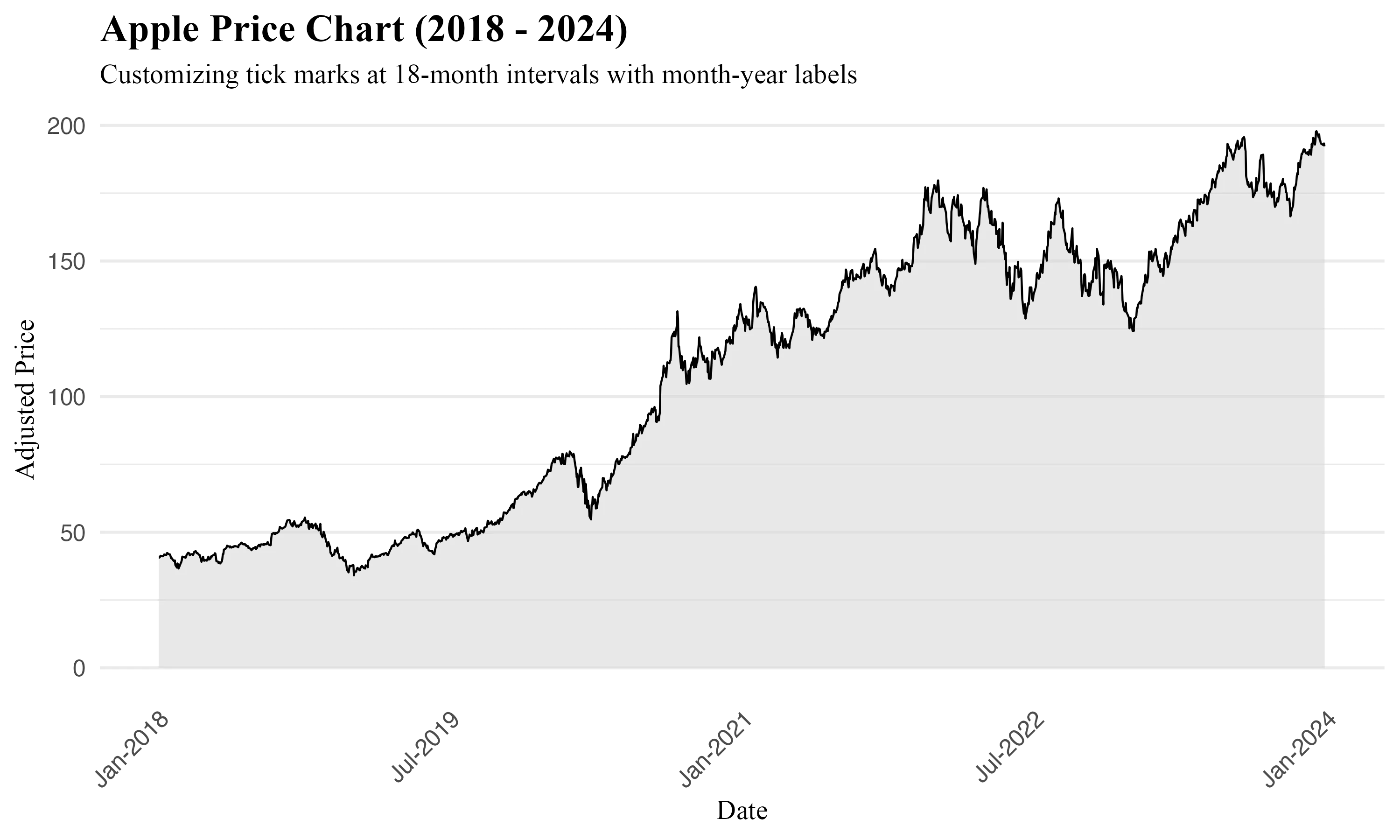
Combining these features, you can visualize a more tailored time series plot in ggplot2 that precisely fits your analytical needs:
#  Customizing tick marks at 18-month intervals with month-year labels
ggplot(data = AAPL, aes(x = date, y = adjusted)) +
  geom_area(fill = "lightgrey", alpha = 0.5) +
  geom_line() +
  scale_x_date(date_labels = "%b-%Y",
               limits = c(as.Date("2018-01-01"), as.Date("2024-01-01")),
               breaks = seq(as.Date("2018-01-01"), as.Date("2024-01-01"),
                            by = "18 months"))
  # Customization
Multivariate Time Series Visualization with ggplot2
Multivariate time series visualization enables the comparison of multiple time-dependent variables within a single plot, offering a broad view of how different categories interact and evolve over time.
General Syntax:
ggplot(data, aes(x = timeVariable, y = valueVariable, color = categoryVariable)) +
  geom_line()
Arguments: - data: Your dataframe containing the time series data. - timeVariable: The column representing time, formatted as dates. - valueVariable: The numerical value plotted over time. - categoryVariable: A categorical variable differentiating multiple categories.
Grouping Variables
grouping variables enables the comparison of specific subsets of data within the same plot. By specifying a grouping variable, you can highlight similarities or differences among various data subsets over time. When specifying a grouping variable within aes(), ggplot2 plots each group with distinct aesthetics, enabling the identification of patterns or anomalies among the groups.
Example arguments for Grouping:
- color: Assigns distinct colors to each group for visual differentiation.
- linetype: Alters the line type for each group, enhancing clarity, particularly useful for black-and-white vizualizations.
- shape: VDifferentiates groups by varying point shapes in scatter plots.
Here's how to apply these concepts, including the customization of date scales as previously discussed:
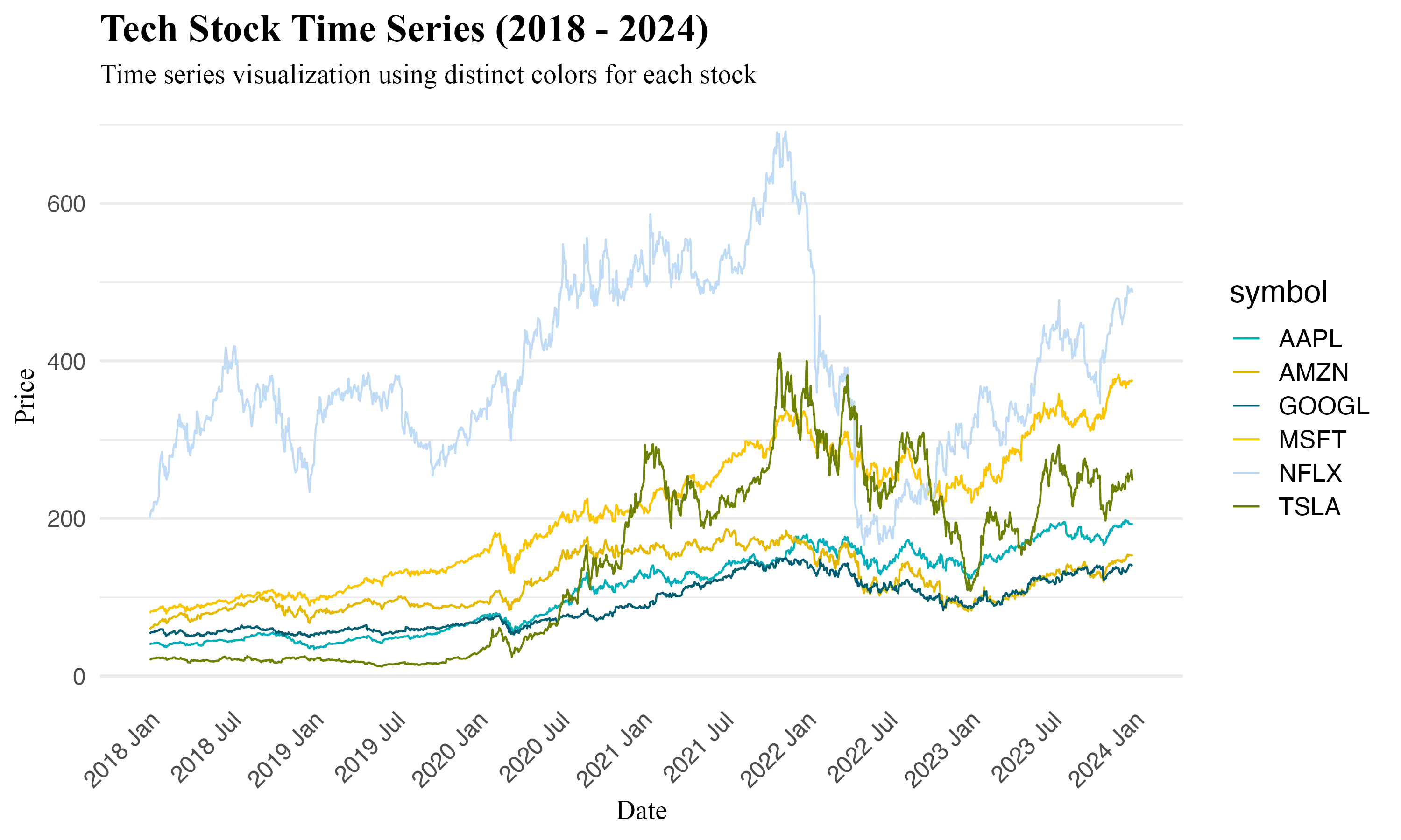
# Line plot with distinct colors for each symbol
ggplot(prices, aes(x = date, y = adjusted, color = symbol)) +
geom_line() +
scale_color_manual(values = c("#00AFBB", "#E7B800", "#005F73", "#FFC300", "#BFDBF7", "#6D8000")) +
scale_x_date(
date_labels = "%Y %b", # Year Month format
limits = c(as.Date("2018-01-01"), as.Date("2024-01-01")), # Plot's date range
breaks = seq(as.Date("2018-01-01"), as.Date("2024-01-01"), by = "6 months") # Axis ticks every 6 months
)
# Customization
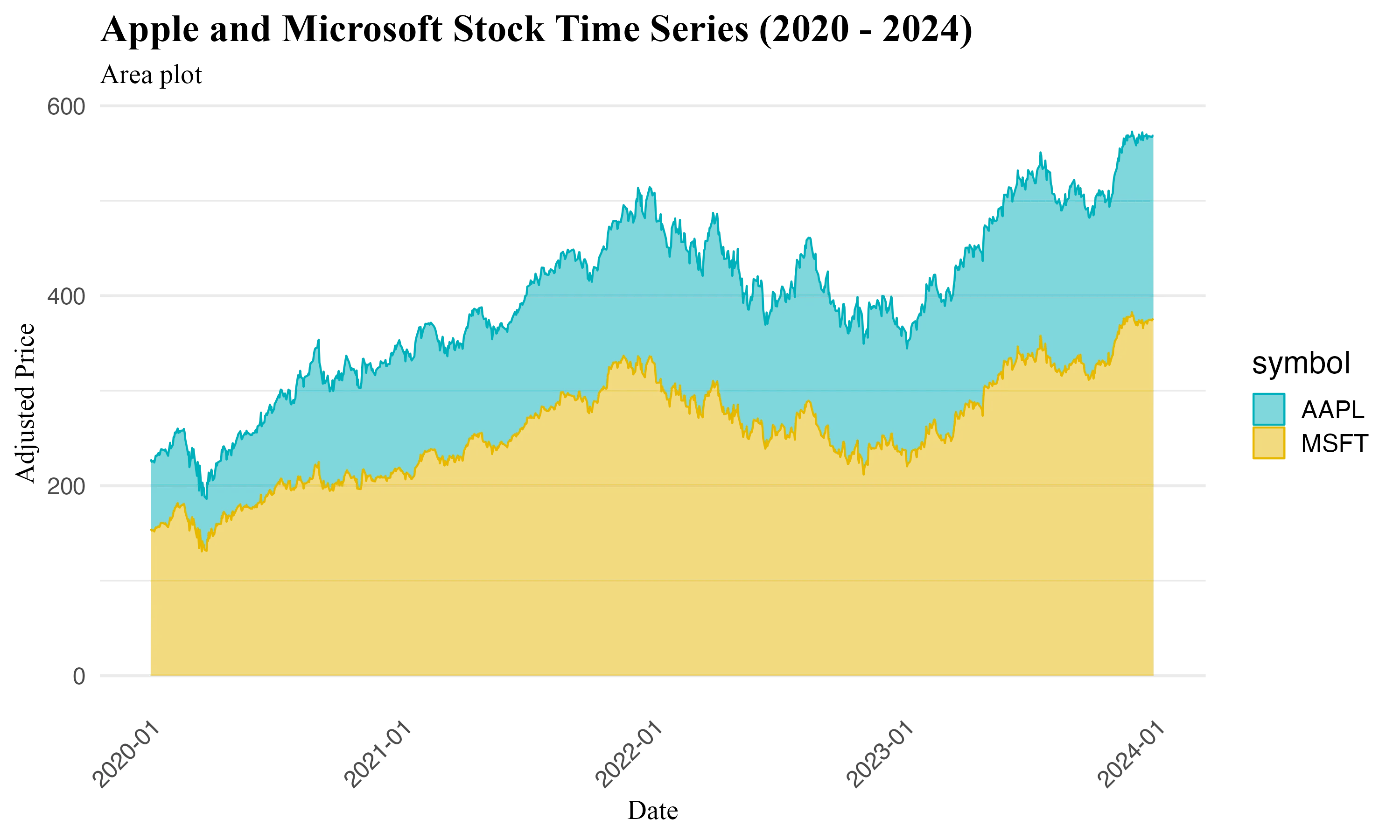
# Area plot with customized colors and fills
ggplot(data_area, aes(x = date, y = adjusted, color = symbol, fill = symbol)) +
geom_area(alpha = 0.5) +
scale_color_manual(values = c("AAPL" = "#00AFBB", "MSFT" = "#E7B800")) +
scale_fill_manual(values = c("AAPL" = "#00AFBB", "MSFT" = "#E7B800")) +
scale_x_date(
date_labels = "%Y-%m", # Year-Month format
breaks = seq(as.Date("2020-01-01"), as.Date("2024-01-01"), by = "1 year"), # Yearly intervals
limits = c(as.Date("2020-01-01"), as.Date("2024-01-01")) # Focus from 2014 to 2024
)
# Customization
TipTips for Effective Multivariate Time Series Visualization
- Distinct Colors: Use the scale_color_manual() function to assign distinct colors to each category, improving clarity.
- Clear Legends: Ensure your legend accurately describes each category. Use descriptive names for each series.
- Avoid Clutter: To prevent visual overload when displaying numerous series, consider displaying a subset of categories.
Faceting Variables
Faceting divides data into individual panels, each showcasing a segment of the dataset based on a categorical variable. This technique enables llows for side-by-side comparisons across various data segments.
Facet Grid and Facet Wrap
- facet_grid(): This function arranges plots in a grid that is defined by variables for rows and/or columns. It's effective for examining two-dimensional relationships, allowing for a comprehensive exploration of interactions between two categorical variables.
- facet_wrap(): Designed for handling a single categorical variable with multiple levels, facet_wrap() organizes plots into a series of panels. These panels are laid out in a manner that can extend across multiple rows and columns, making it useful for datasets with numerous categories.
 Example
Example: Faceted Wrap Chart by Stock Symbol
This examples illustrate the monthly returns of various stocks throughout 2023. Using facet_wrap(), we can create individual plots for each stock symbol, allowing for an immediate visual comparison of their performance within the same timeframe.
# Data preparation: Adding 'year' and 'Return' columns
prices <- prices %>%
  mutate(
    year = year(date),  # Extracting the year for faceting
    Return = Delt(adjusted)  # Calculating returns on adjusted prices
  )

# Plot
ggplot(prices, aes(x = date, y = Return, group = symbol, color = symbol)) +
  geom_line() +
  facet_wrap(~ symbol, ncol = 3) +  # Arrange in 3 columns by stock symbol
  scale_x_date(
    date_labels = "%b",  # Month abbreviations for x-axis labels
    limits = c(as.Date("2023-01-01"), as.Date("2023-12-31")),  # Year 2023 focus
    breaks = seq(as.Date("2023-01-01"), as.Date("2023-12-31"), by = "1 month")  # Monthly intervals
  ) +
  # Customizations
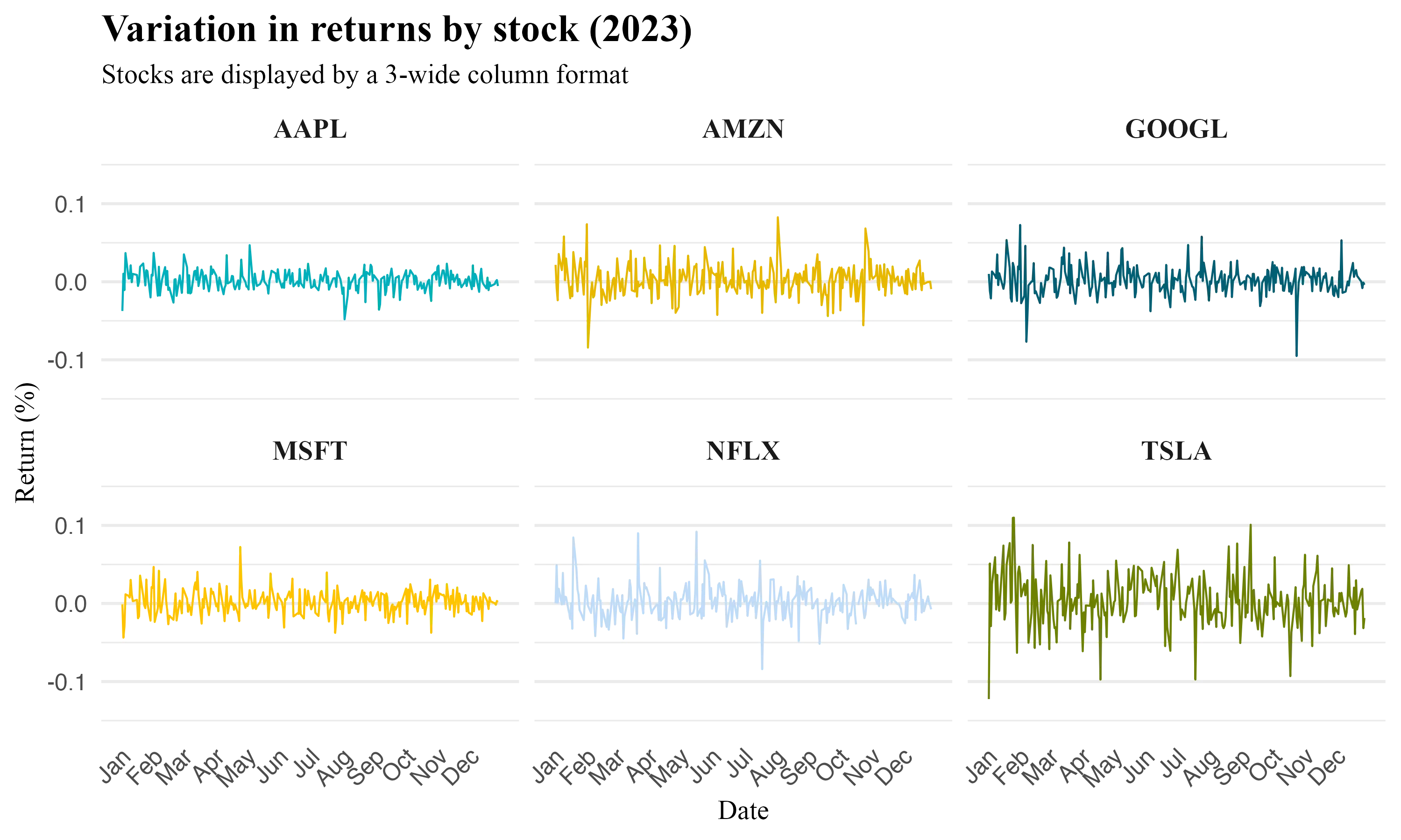
Key Arguments for Faceting
scales: Controls whether scales and axes are shared ("fixed"), independent ("free"), or independently set along the x or y dimension ("free_x", "free_y").nrowandncol: Specify the number of rows and columns infacet_wrap()orfacet_grid(), impacting the overall layout and presentation.
ExampleFaceted Line Chart by Year This example demonstrates the comparison of stock prices across 2014 and 2015, with scales set to "free" and scales set to fixed.
filtered_prices <- prices %>%
  filter(year(date) %in% c(2014, 2015))

base_plot <- ggplot(filtered_prices, aes(x = date, y = adjusted, color = symbol)) +
  geom_line() +
  scale_color_manual(values = c("#00AFBB", "#E7B800", "#005F73", "#FFC300", "#BFDBF7", "#6D8000")) +
  theme_minimal(base_size = 14) +
  labs(
    title = "US Stocks Price Chart (2014-2015)",
    x = "Date",
    y = "Adjusted Price"
  )

# Without 'scales = free'
plot_without_free_scales <- base_plot + facet_wrap(~year)
plot_without_free_scales

# With 'scales = free'
plot_with_free_scales <- base_plot + facet_wrap(~year, scales = "free")
plot_with_free_scales
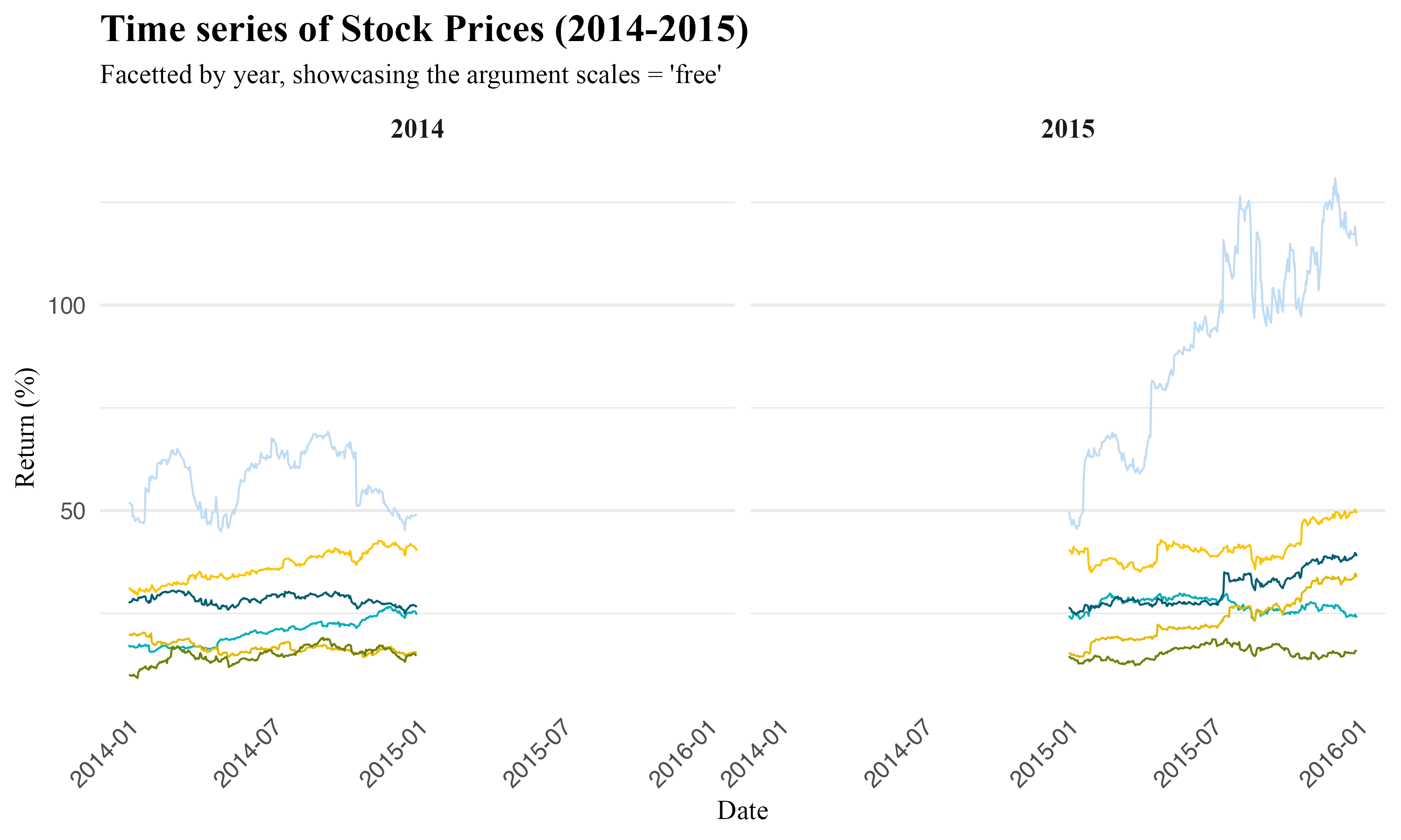
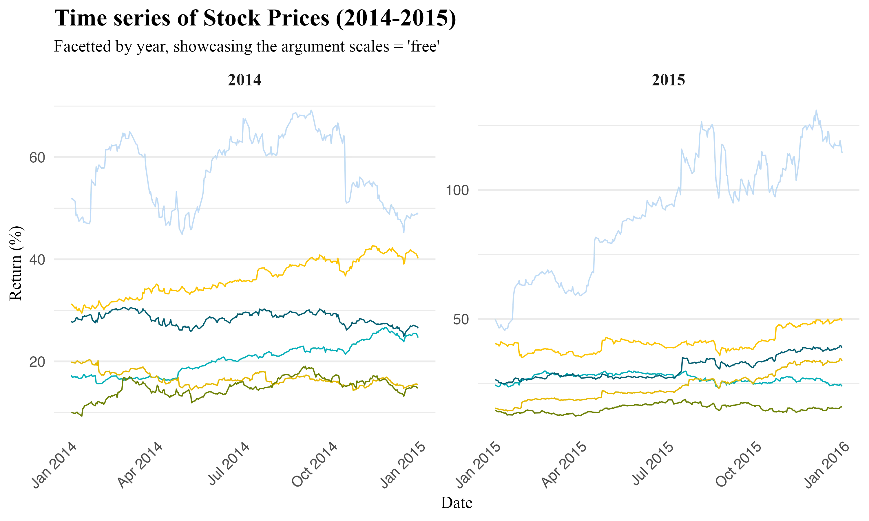
TipImportance of scales = "free" when working with dates
Visualizing plots with and without the argument scales = "free" underscores the inner workings of this argument. Using scales = "free" with date variables in ggplot2 ensures each facet adjusts its time scale independently, eliminating gaps.
Facet_grid()
facet_grid() creates a grid of plots based on the combination of two variables, typically one for rows and one for columns.
Syntax Comparison:
- facet_grid() syntax is facet_grid(rows ~ cols), where rows and cols represent the variables by which the data is split vertically and horizontally, respectively. This arrangement creates a matrix-like layout of plots, each representing a unique combination of row and column factors.
- facet_wrap(), in contrast, uses facet_wrap(~ variable, nrow=..., ncol=...), focusing on a single categorical variable and arranging the plots in a specified number of rows and columns. It's more suited for scenarios where you have one categorical variable and want a flexible layout.
ggplot(filtered_prices, aes(x = date, y = adjusted)) +
  geom_line(aes(color = symbol), size = 2) +  # Enhance visibility with thicker lines
  geom_smooth(aes(color = symbol), method = "lm", se = FALSE, size = 1)  + # Trend lines without shading
  facet_grid(symbol ~ year, scales = "free") +  # Separate plots for each symbol and year
  scale_x_date(
    date_labels = "%b",  # Month abbreviations for x-axis
    breaks = "1 month") + # Monthly intervals for x-axis ticks
  # Customization
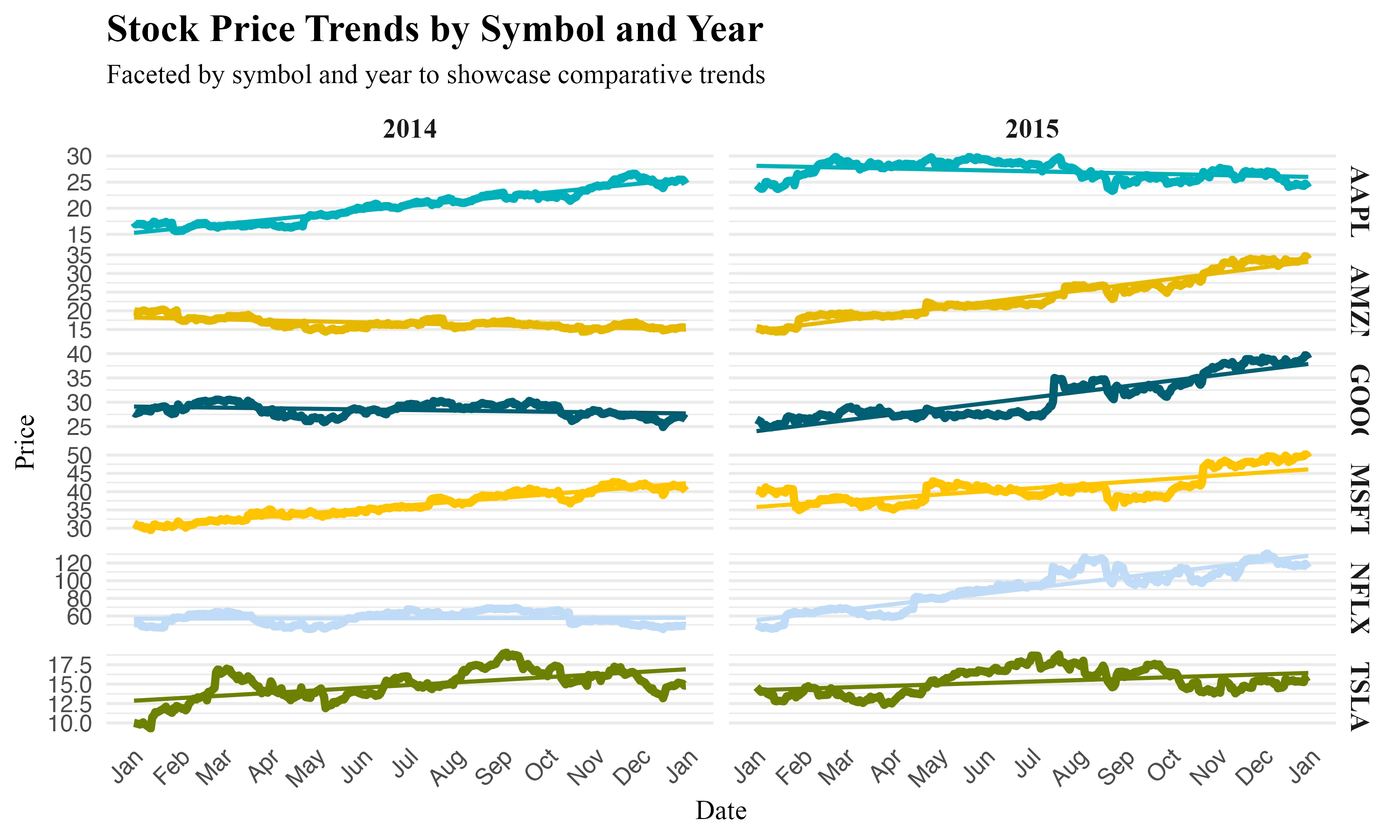
Tip- A common pitfall with
facet_grid()is overplotting when dealing with categories that have a wide range of values. This can make some plots crowded and others sparse. Best practice is to preprocess data to ensure meaningful comparisons or usescales = "free"to adjust scales independently for each facet. - Inconsistent Axis Scales: Using
scales = "fixed"(the default) can sometimes obscure trends in subsets of data with smaller variations. Applyingscales = "free"orscales = "free_x"/"free_y"allows each plot to adjust its scales, enhancing clarity. - Increase the readability of faceted plots by adjusting the theme settings, such as
theme(strip.text.x = element_text(angle = 90)), to make long facet labels more legible.
 Summary
This article demonstrate how to use ggplot2 for time series data visualization in R, featuring:
- The automated handling of date variables by
ggplot2 - Examples of single and multivariate time series visualizations, incorporating
ggplot(),geom_line(), and adjustments withscale_x_date()for improved date representation on the x-axis. - Highlighting the
groupingargument, e.g.(aes(color = variable))and faceting (facet_wrap()andfacet_grid()) to understand trends across categorical variables. ggplot2plot customization techniques, functions likescale_color_manual()for color theming andscale_x_date(date_breaks = "1 month", date_labels = "%b")for detailed x-axis control.

# Interested in the source code used in this analysis? Download it here