


Overview
This article is designed to guide you in the process of creating bar charts using ggplot2. Starting with the basics, we'll guide you through each step to evolve a simple bar chart into one that meets academic standards.
Effective data visualization requires both accuracy and aesthetics, a balance that can be achieved with the use of the R package: ggplot2. This package is the best practice and a versatile tool for custom styling of your visualizations. We'll explore customizing colors, themes, and labels, and provide practical tips for academic presentations. This includes handling standard errors, black-and-white formatting, and effective data grouping. Additionally, we'll cover saving charts in high-quality PNG or PDF formats, ensuring they're ready for academic publication.
 Tip
TipData Retrieval
In this article we will use the PIAAC dataset to examine the wage premium of obtaining a higher education level. We will illustrate the variance in wage across different education levels and later on between genders in the Netherlands. Let's first load the required packages and download the data.

# Install the tidyverse package, which includes dplyr and ggplot2
install.packages("tidyverse")

# Load the tidyverse package into the R session
library(tidyverse)

# Load data
data_url <- "https://github.com/tilburgsciencehub/website/tree/master/content/topics/Visualization/data-visualization/graphs-charts/piaac.rda"

load(url(data_url)) #piaac.rda is loaded now
Step-by-Step Guide: Crafting Publishable Bar Charts
Step 1: Data Manipulation
A bar plot effectively displays the interaction between numerical and categorical variables.
The preparation of our dataset includes several steps:
- Using
mutate()andfactor()to order the categorical variable. - Applying
group_by()to group the data by the categorical variable, facilitating summary statistics. - Calculating mean, standard deviation (SD), count (N), and standard error (SE) of the numerical variable for each group.
# Using dplyr for data manipulation
data_barplot <- data %>%
  # Organizing the categorical variable
  mutate("Categorical Variable" = factor("Categorical Variable", levels = c("A", "B", "C"))) %>%
  # Grouping data by the categorical variable
  group_by("Categorical Variable") %>%
  # Summarizing statistical measures for the numerical variable
  summarise(
    mean = mean("Numerical Variable"),
    sd = sd("Numerical Variable"),
    N = length("Numerical Variable"),
    se = sd / sqrt(N) # Calculating Standard Error (SE) for error bars
  )
The code above transforms a specified categorical variable into a categorical data type, orders its levels, and then groups the data by this variable. It calculates summary statistics (mean, standard deviation, count, and standard error) for a numerical variable within each category (level). These steps prepare the dataset for creating a bar plot with error bars, useful for visualizing differences between categories.
TipRefactoring Categorical Variables Refactoring categorical variables is important for bar plot visualizations, as it allows you to decide in which order particular labels appear.
- Using the
fct_relevel()function. This function allows for reordering factor levels using character strings, ensuring the categorical data is displayed in a preferred sequence. - Utilizing Base R's
factor()Function: Our approach involvesfactor(), where the levels argument sets the desired order
Step 2: Creating your first barchart
With the data in place, let's visualize it using a bar chart. The code snippet below demonstrates how to create a bar chart with error bars using ggplot2:
data_barplot %>%
  ggplot(aes("Categorical Variable", "mean")) +  # Basic ggplot setup with x-axis as 'Categorical Variable' and y-axis as 'mean'
    geom_col(aes(fill = "Categorical variable")) +  # Creating bars for each category and filling them based on the categorical variable
    geom_errorbar(aes(ymin = mean - se, ymax = mean - se), width = 0.85)  # Adding error bars to each bar
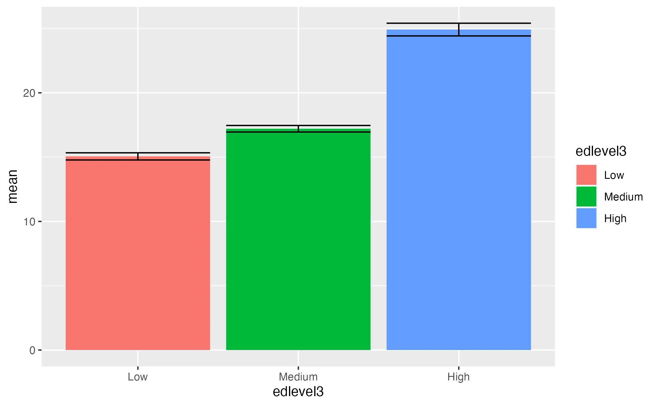
 Example
Key Points:
- geom_col() vs. geom_bar(): We use geom_col() here, as it's suitable when bar heights need to directly represent data values. In contrast, geom_bar() is used when you want to count cases at each x position, as it employs stat_count() by default.
- Adding Error Bars: geom_errorbar() is utilized to add error bars to the bar chart. This function takes ymin and ymax aesthetics, calculated here as mean - se and mean + se, respectively. The width parameter controls the width of the error bars.
- Error bars are essential in reporting the "confidence" of particular estimates (e.g., whether they are closer or further away from zero).
- Aesthetics: The fill aesthetic within aes() is set to Categorical Variable to color the bars based on the categorical groups.
Step 3: Enhancing Aesthetics
The initial visualization is a solid starting point, but to meet publication standards, we need to refine it further. The primary issues are:
- Redundant x-axis text: The legend duplicates information already conveyed by the x-axis labels.
- Non-Descriptive Axis Titles: Axis titles need to be more informative for clarity.
- Lack of Contextual Information: The plot lacks a title.
- Color Scheme: The default color palette does not meet the academic rigor.
Let's address these issues with the following enhanced visualization:
data_barplot %>%
  # [Insert previous code here]
  scale_fill_manual(values = c("COLOR1", "COLOR2", "COLOR3")) +  # Customizing bar colors
  scale_y_continuous(limits = c(0, 40), expand = c(0, 0)) +      # Adjusting y-axis limits
  theme_minimal() +                                              # Applying a minimalistic theme
  labs(
    x = "Description of Categorical Variable",
    y = "Description of Numerical Variable",
    title = "Descriptive Title"
  )
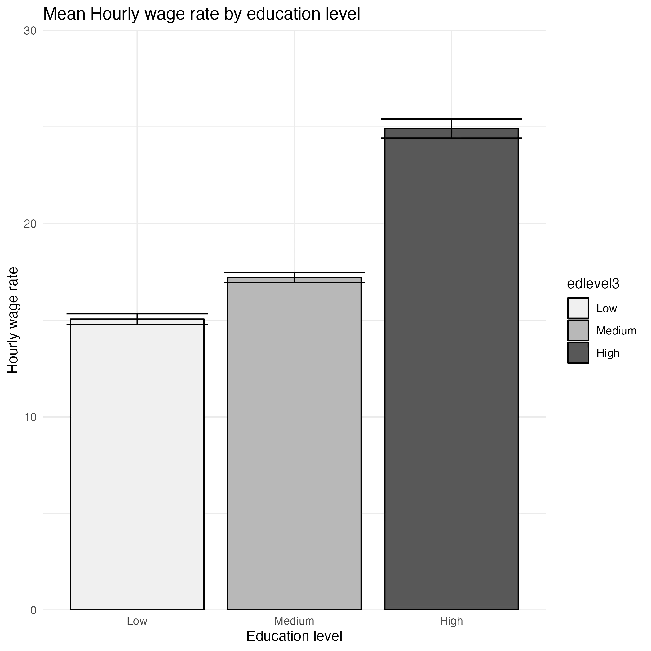
Let's go over these changes.
- scale_fill_manual: This function customizes bar colors to specified ones.
- theme_minimal(): It removes the grey background panel, creating a cleaner look.
- scale_y_continuous: Adjusts the y-axis scale.
- limits sets the y-axis limit. Since we still have to add the p-values, we need more space above the highest bar.
- expand sets the axis to start precisely at 0.
- labs() Function: Adds informative titles for axes, and the plot itself.
Step 4: Enhancing Bar Chart Aesthetics with Theme Customization
After the initial setup, further customization using the theme() function in ggplot2 can significantly enhance the visual appeal and clarity of your bar chart. Here's how you can apply these enhancements:
data_barplot %>%
  # [Insert previous code here]
theme(
    plot.title = element_text(
        size = 15,                    # Increase title font size for visibility
        face = "bold",                # Make title text bold for emphasis
        margin = margin(b = 35),      # Add a bottom margin to the title for spacing, especially for p-values
        hjust = 0.5                   # Horizontally center the plot title
    ),
    plot.margin = unit(rep(1, 4), "cm"),  # Set uniform margins of 1cm around the plot for balanced white space
    axis.text = element_text(
        size = 12,                    # Set axis text size for readability
        color = "#22292F"             # Define axis text color for clarity
    ),
    axis.title = element_text(
        size = 12,                    # Ensure axis titles are sufficiently large
        hjust = 1                     # Horizontally align axis titles to the end
    ),
    axis.title.x = element_blank(),      # Remove x-axis title for a cleaner look
    axis.title.y = element_blank(),      # Remove y-axis title to avoid redundancy
    axis.text.y = element_text(
        margin = margin(r = 5)        # Add right margin to y-axis text for spacing
    ),
    axis.text.x = element_blank(),      # Remove x-axis text for simplicity
    legend.position = "top",            # Place the legend at the top of the plot
    legend.title = element_blank()      # Remove the legend title for a cleaner appearance
)
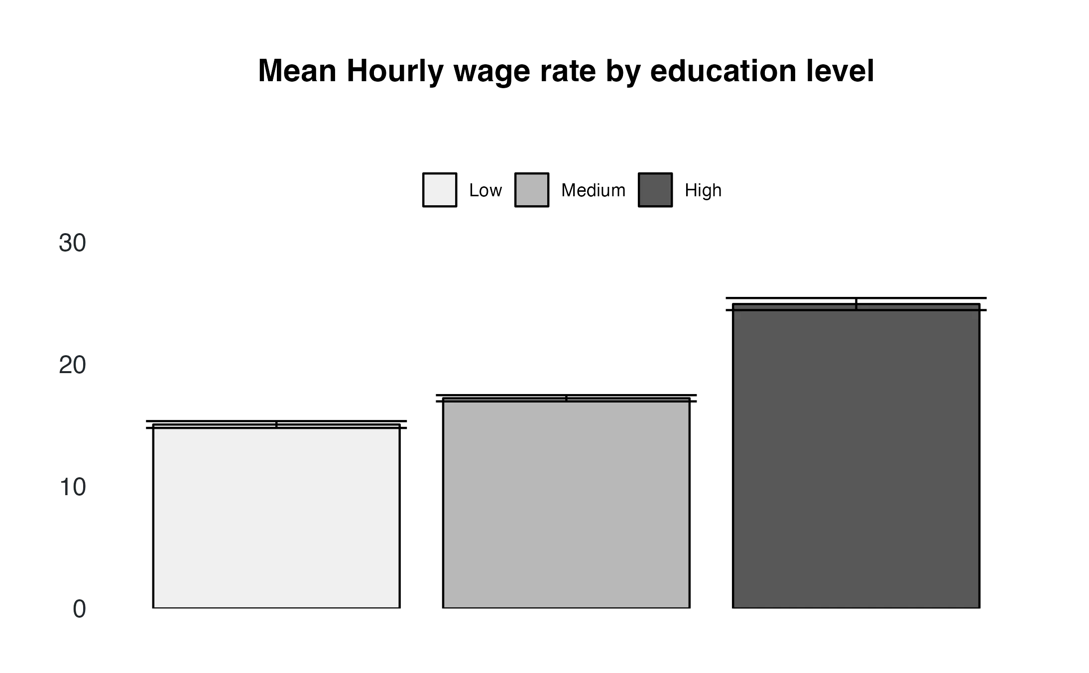
Now the barchart is closer to the academic standards. In the code the function theme() allows to adjust:
- Plot Title: Enhanced with a larger font size, boldface, and added bottom margin for clarity and spacing.
- Plot Margins: Uniform margins added around the plot to create balanced spacing.
- Axis Text and Titles: Changed text size and color for better readability; additional margins for x-axis text and removal of the y-axis title to simplify the plot.
- Legend Customization: Removed the redundant legend title and repositioned the legend to the top for a cleaner layout and easier comparison.
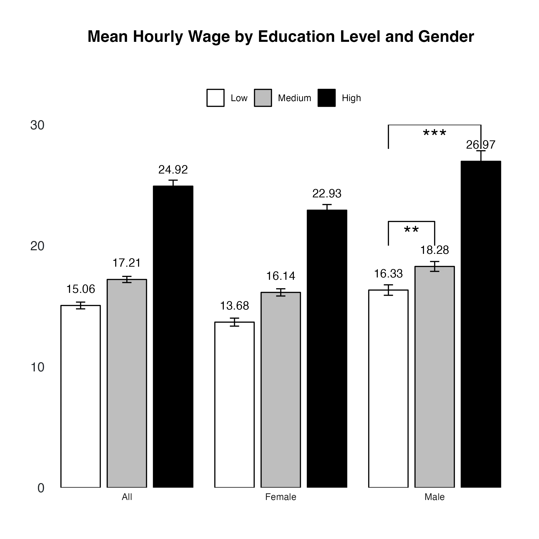
Step 5: Visualizing Statistical Significance in Bar Charts
Suppose you've analyzed how education levels and gender influence mean hourly wages and found significant differences. To effectively communicate these results in your bar chart, it's essential to visualize the statistical significance.
TipAutomating statistical tests and visualization with ggpubr streamlines the process, making it more efficient, as explained here. However, customizing visualizations directly in ggplot2 offers greater flexibility and control over the final output. Let's dive into the latter.
Creating Data for Confidence Bounds
First, we need to set up data points to draw lines indicating significance. These lines typically connect the relevant categories with a central peak to denote significance.
# General code
p_value_one <- tibble(
  x = c("A", "A", "B", "B"),
  y = c("Value 1", "Value 2", "Value 2", "Value 1"))

# Example code
p_value_one <- tibble(
  x = c("Low", "Low", "Medium ", "Medium"),
  y = c(20, 22, 22, 20)
)
This setup creates a line that starts at the center of the 'Low' bar at y = 20, peaks at y = 22 (indicating significance), travels across to the 'Medium' bar, and descends back to y = 20.
Adding Significance Lines and Annotations**
Next, we add these lines and annotations (like asterisks) to highlight the significance levels found in your statistical analysis.
# [Insert previous ggplot() + geom_() code here]
  geom_line(data = significance_data, aes(x = x, y = y, group = 1)) +
  annotate("text", x = "1.5", y = 23.5, label = "***", size = 8, color = "#22292F") +
  geom_text(aes(label = round(mean, 2)) , vjust = -1.5) + # Add the average value for more information
  # [Insert previous customization code here]
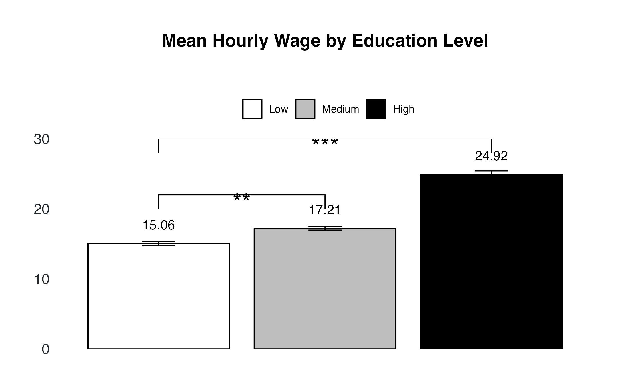
In this code:
- geom_line() uses the p_value_one data to draw the line. Setting group = 1 ensures it's treated as a continuous line.
- annotate() adds asterisks (***) at a specified point (here, x = "1.5", y = 23.5) as a common symbol for statistical significance.
- geom_text() adds the mean value of each category in the plot.
Remember, the positions and labels are adjustable based on your specific data and results. Experiment with the x and y values in the annotate function to achieve the best placement in your bar chart. This approach provides a clear, customized way to denote significant findings in your visualization.
TipSaving Your Plots
Transferring plots via copy-paste can degrade their quality, but our article on about saving plots in R provides a solution. It discusses how to use use ggsave() from the ggplot2 package to save your visuals in high-quality formats. Discover how to maintain clarity in presentations and publications by customizing plot dimensions and resolutions.
Advanced Techniques for Multi-Group Bar Charts in ggplot2
When working with ggplot2 to visualize complex datasets with multiple categorical variables, creating faceted plots can pose unique challenges. This section focuses on the effective use of p-value annotations in such scenarios.
Visualizing Wage Differences by Education and Gender
Imagine plotting the mean hourly wage by education level, segmented by gender. Our goal is to highlight significant differences between education levels using p-values.
Step 1: Grouping the Data
Begin by organizing your data using group_by() to focus on the interaction between the chosen categories.
grouped_barplot <- data %>%
  group_by("Categorical Variable 1 ", "Categorical Variable 2") %>%
  summarise(
    mean = mean("Numerical Variable"),
    sd = sd("Numerical Variable"),
    N = length("Numerical Variable"),
    se = sd / sqrt(N) # Calculating SE for error bars
            )
Step 2: Faceted Visualization with facet_wrap
Employ facet_wrap() to create distinct plots for each gender, allowing for a clear comparison across categories.
grouped_barplot <- ggplot(grouped_data, aes(x = edlevel3, y = mean, fill = edlevel3)) +
  geom_col() +
  facet_wrap(~ gender_r) # Faceting by gender
Step 3: Preparing P-Value Data for Annotations
To annotate your plot with p-values, prepare a separate dataset containing these values along with the corresponding coordinates and the faceting variable.
# Example p-value data
p_value_one <- tibble(
  x = c("Low", "Low", "Medium", "Medium"),  # Education levels
  y = c(20, 22, 22, 20), # Y-coordinates for annotations
  label = c("**","***"), # P-value annotations
  gender_r = c("Male", "Male", "Male", "Male")) # Corresponding to facets

# Example Annotation data
annotations <- tibble(
  x = c(1.5, 2),
  y = c(21, 29),
  label = c("**", "***"),
  gender_r = c("Male", "Male")
Step 4: Adding Annotations in ggplot2
Incorporate these annotations into your ggplot2 chart, ensuring they align accurately with the respective facets.
geom_line(data = p_value_one, aes(x = x, y = y, group = 1)) +
 geom_line(data = p_value_two, aes(x = x, y = y, group = 1)) +
 geom_text(data = annotations, aes(x = x, y = y, label = label, group = gender_r), size = 7) +
 Summary
This article uses ggplot2 for effective bar chart styling, crucial in academic data presentation.
- Bar charts in ggplot2 are ideal for categorical data, showcasing groups and their quantitative measures.
- Key functions covered include ggplot() for initial plot creation and geom_col() for constructing bar charts.
- Advanced customization is achieved using geom_errorbar()for error bars and scale_fill_manual() for color themes.
- Showcases how to add p-values inside your ggplot.
Interested in the source code used in this analysis? Download it here.