


Overview
This article delves into the integration of ggpubr and rstatix packages in R, providing step-by-step guidance on (a) conducting statistical tests and (b) automating the results into your visualizations.
ggpubr is a R package is a package well suited to create elegant, publication-quality plots. Its strength lies in integrating statistical analysis results, such as significance testing, directly into plots. This building block will delve into using functions like compare_means(),ggbarplot(), and stat_p_value() to create a bar plot that not only displays data but also its statistical significance.
Furthermore we will use the rstatix package. rstatix provides functions for statistical tests and data preparation, while ggpubr is used for creating plots. Together, they streamline and automate the process of visualizing statistical comparisons.
Step-by-Step Guide: Crafting Publishable charts with ggpubr
Step 1: Installing and Loading ggpubr and rstatix
First, ensure that you have ggpubr and rstatix installed and loaded in your R environment:

install.packages("ggpubr")
install.packages("rstatix")
library(ggpubr)
library(rstatix)
Step 2: Data Cleaning and Preparation
The next step is to clean your data and prepare it for statistical analysis and visualization.
Generalized Example
Use Case Example
Step 3: Statistical Analysis using rstatix
rstatix offers functions for conducting statistical tests, such as t-tests and ANOVA, which can then be directly incorporated into ggpubr for creating informative visualizations. This integration within the ggplot2 ecosystem combines the familiar sytnax of ggplot2 and enhances the efficiency of the analysis process.
We will now use the compare_means() function from the rstatix package, designed to compare the mean values of a specific variable across different groups.
 Tip
TipHow does the compare_means function work?
-Syntax: - compare_means(formula, data, method, ref.group)
Components: - formula: This is where you specify the comparison you want to make. - This similar to the formula specification within the lm() function. - Example: height ~ gender implies comparing the average height across different genders. - data: This parameter is used to specify the dataset in which the comparison is to be made. - method: This parameter defines the statistical test to be used for comparison. - ref.group: This is the reference group against which other groups are compared. - Example: If you have groups 'A', 'B', and 'C', and 'A' is set as the reference group, the function will compare 'B' and 'C' with 'A'.
This function is a powerful tool for conducting and interpreting various statistical comparisons, particularly useful in data analysis and research.
# Performing a statistical t-test using the compare_means function from the `rstatix` package
stat.test <- compare_means(
  earnhr ~ edlevel3,     # Formula indicating we compare 'earnhr' across 'edlevel3' groups
  data = `ggpubr`_data,    # The dataset used for the test
  method = "t.test",     # Specifies that a t-test is used for the comparison
  ref.group = "Low"      # The reference group for the comparison is the 'Low' education level
)

# Display the results of the statistical test
stat.test

Step 4: Data Visualization using ggpubr
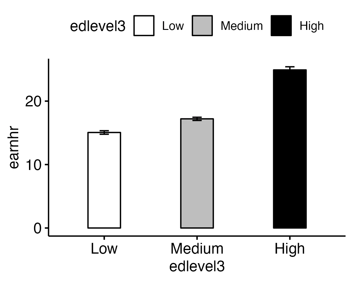
For this analysis, we have chosen to use ggbarplot() from the ggpubr package. This function is used to create bar plots, however ggpubr incorporates many more types of visualization. Examples are gghistogram(), ggdensity() and ggline().
TipKey Features of ggbarplot():
Simplicity:
One of the main advantages of the ggpubr package and therfore the function ggbarplot() is its simplicity. It allows you to create bar plots with minimal coding, making it user-friendly, especially for those new to data visualization in R.
Customization:
Despite its simplicity, ggbarplot() offers a wide range of customization options. You can change colors, add labels, adjust the width of the bars, and much more.
Integration with ggplot2:
ggpubr, the package that includes ggbarplot(), is built on top of ggplot2, a powerful and popular plotting system in R. This means that ggbarplot() benefits from the robustness and flexibility of ggplot2.
Let's look at a practical example next.
ggbarplot(
  data = `ggpubr`_data,   # The dataset used for the plot
  x = "edlevel3",       # The variable on the x-axis, here 'edlevel3' representing education levels
  y = "earnhr",         # The variable on the y-axis, here 'earnhr' representing hourly earnings

  # Visual and aesthetic settings:
  fill = "edlevel3",    # Sets the fill color of the bars based on 'edlevel3' categories
  add = "mean_se",      # Adds error bars to each bar, showing mean and standard error
  width = 0.35,         # Sets the width of the bars in the plot
  color = "black",      # Sets the color of the bar outlines to black

  # Positional adjustments:
  position = position_dodge(0.8),  # Adjusts the position of the bars to avoid overlap

  # Color palette for the bars:
  palette = c("white", "grey", "black")  # Sets a color palette ranging from white to black
)
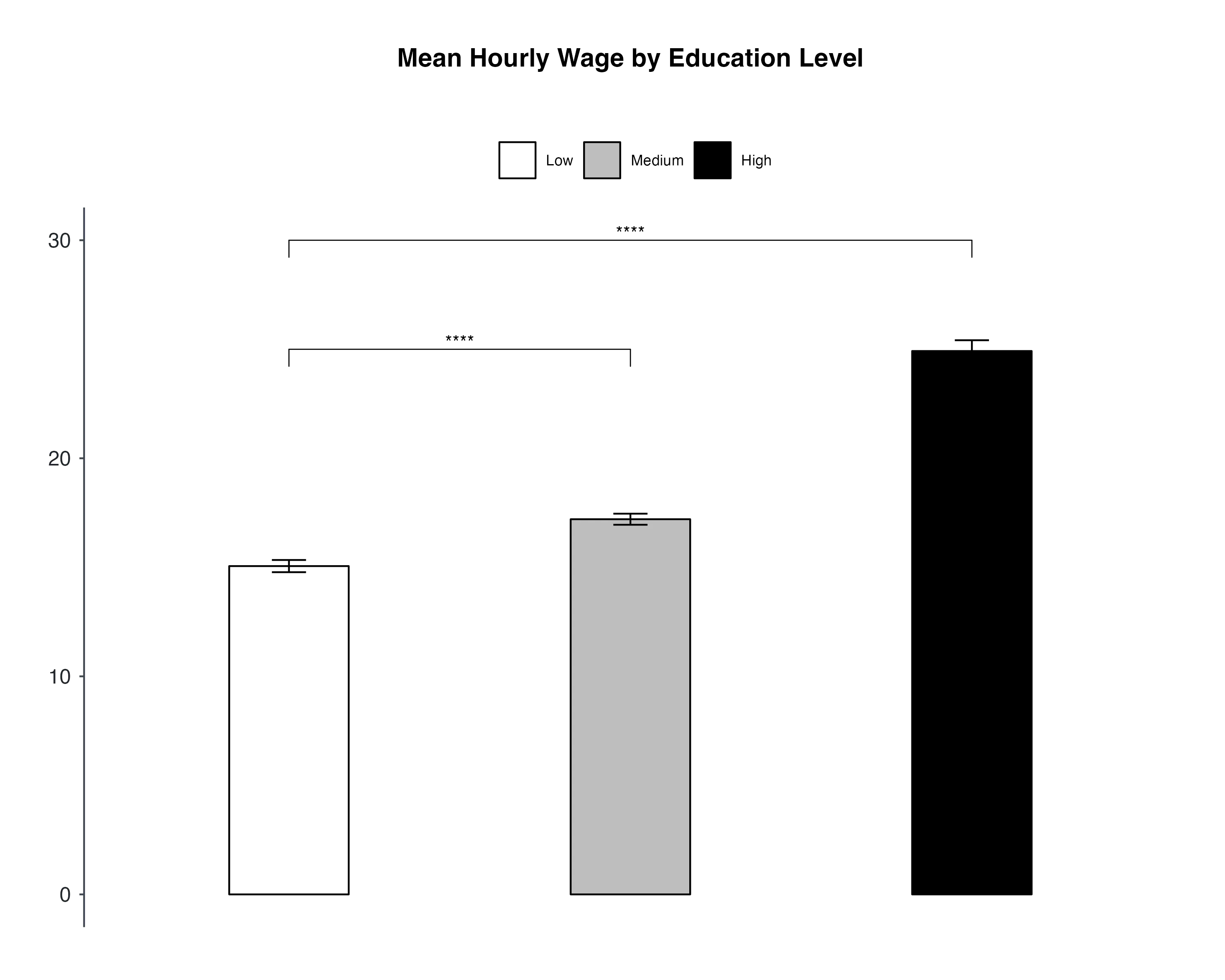
Step 5: Adding Statistical Significance with stat_p_value()
Now, integrate the test results (step 3) into the bar plot (step 4) using stat_p_value().
The stat_pvalue_manual() function comes from the ggpubr package, and it's used in conjunction with bar plots or other types of plots to add statistical annotations, specifically p-values, to the plot.
Adding these to a plot can provide a visual cue about the statistical differences between groups.
TipBreaking Down the Syntax of stat_pvalue_manual():
- stat.test: This is your statistical test result that you want to annotate on the plot. The function uses information from this result to create the annotations.
- tip.length: This parameter controls the length of the 'tips' or the small lines that point to the bars or groups being compared.
- y.position: It sets the vertical (y-axis) position of the p-value labels on the plot. You can adjust these numbers to position the labels higher or lower relative to the bars.
- label: Here, you specify what kind of label you want to use for your p-value.
- For example, "p.signif" will automatically convert the p-value into a significance level. Like '**' for highlight significant results.
ggbarplot(# Setup) +
# Adding p-value annotations to the plot using stat_pvalue_manual
stat_pvalue_manual(
  stat.test,               # The statistical test result to annotate on the plot
  tip.length = 0.002,      # Controls the length of the 'tips' pointing to the bars
  y.position = c(25, 30),  # Sets the vertical position of the p-value labels on the plot
  label = "p.signif"       # Specifies the label format for p-values (e.g., '**' for significance)
)
TipFor a step-by-step guide on creating professional bar charts and saving them, refer to this article. It provides a detailed walkthrough of the process to help you create publishable bar charts with ease.
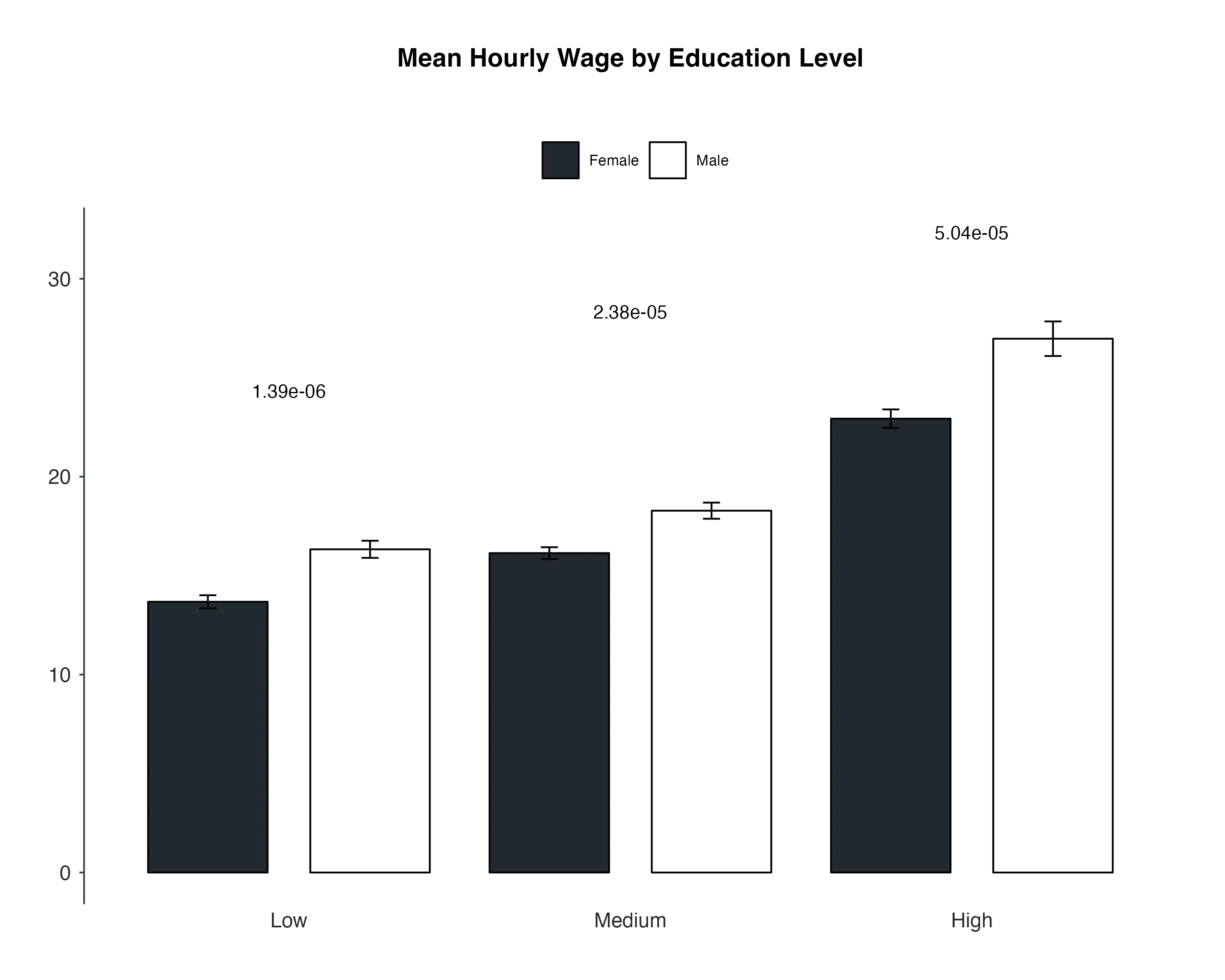
Advanced case with Multiple Categorical Variables
In our previous analysis, we delved into the relationship between education levels and hourly earnings, focusing on a single categorical variable, which was education level. Now, let's take our analysis a step further by considering the influence of not just one, but two categorical variables. Specifically, we aim to understand how both education level and gender collectively impact the mean hourly wages of individuals.
# Step 1: Prepare the data
grouped_data <- data %>%
  # Remove missing values
  drop_na(earnhr, edlevel3, gender_r) %>%
  # Filter data for the Netherlands and remove earnings outliers
  filter(cntryid == "Netherlands",
         earnhr > quantile(earnhr, 0.01) &
         earnhr < quantile(earnhr, 0.99)) %>%
  group_by(edlevel3) %>%
  # Prepare variables
  mutate(
         earnhr = as.numeric(earnhr),
         edlevel3 = factor(edlevel3, levels = c("Low", "Medium", "High")),
         gender_r = factor(gender_r, levels = c("Female", "Male")))

# Step 2: Perform statistical tests and adjust p-values
res.stats <- grouped_data %>%
  group_by(edlevel3) %>% # Grouping the data by education level ('edlevel3'), This step allows us to analyze each education level separately.
    t_test(earnhr ~ gender_r) %>% # Next, we conduct a t-test comparing hourly earnings ('earnhr') between different genders ('gender_r'), within each education level.
  adjust_pvalue() %>% # After obtaining the test results, we adjust the p-values to account for multiple comparisons
  add_significance() # add significance labels to the results to visually indicate which comparisons are statistically significant.

# Step 3: Create a stacked bar plot with error bars
p <- ggbarplot(
  grouped_data, x = "edlevel3", y = "earnhr", add = "mean_se",
   fill = "gender_r", error.plot = "errorbar", position = position_dodge())

# Step 4: Add p-values to the bar plot
p + stat_pvalue_manual(
  res.stats,
  x = "edlevel3",
  position = position_dodge(0.9),
  y.position = c(24, 28, 32),
  label = "p"
) +
# Theme settings (hidden for simplicity)
# ... (theme settings here)

ggsave("my_plot.png", plot = p)
 Summary
This article explores the integration of R packages, ggpubr and rstatix, to blend statistical analysis with data visualization. These combination of packages are builiding on the ggplot2 syntax, assuring visualizations are created within a familiar syntax.
- It covers all the steps, from data preparation and package installation to conducting statistical tests and creating academic publication-quality bar plots.
- The process involves loading data, cleaning it, and performing tests using
compare_means()fromrstatix. Then, an example ofggbarplot()fromggpubris employed to create bar plots. To enhance the plots, statistical significance is added withstat_p_value(). - An advanced case considers the influence of multiple categorical variables on mean hourly wages.
This guide empowers users to produce informative and visually appealing charts in R.