


Overview
This building block is an introduction to Plotnine and Altair, two libraries used for data visualisation in Python. For each library, we provide a guide covering:
* Installation
* Syntax
* Plotting
Plotnine
Plotnine uses a syntax that is similar to that of the R package ggplot2 and is built on the principles of grammar of graphics. In this approach, plots are constructed incrementally, layer by layer.
Installation
To install plotnine we can either use pip or conda:

pip install plotnine

# to include extra packages
pip install 'plotnine[all]'
conda install -c conda-forge plotnine
Syntax
The base syntax of plotnine is:
ggplot(data = ) +         # to create the background layer containing the dataset as input
  (              # main layer to build a chart type
     mapping = aes(),
     stat = ,
     position =
  ) +
   +       # layer for axes, titles, etc
  (
     title = ,
     subtitle = <subtitle>,
     caption = <caption>
  )+
  <facet_function>              # optional layer</facet_function></caption></subtitle>
Plotting
We illustrate how to visualize data with plotnine by using the Iris dataset from sklearn:
# Importing needed packages and dataset
import pandas as pd
import sklearn
from sklearn import datasets
import plotnine
from plotnine import *

iris = datasets.load_iris()

# Transforming Iris into a data frame
iris_df = pd.DataFrame(data=iris.data, columns=iris.feature_names)
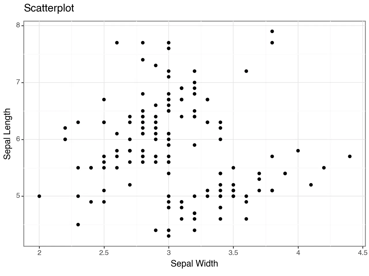
(ggplot(iris_df, aes(x = "sepal width (cm)", y = "sepal length (cm)"))
  + geom_point()
  + coord_cartesian()
  + labs(title = "Scatterplot", x = "Sepal Width", y = "Sepal Length")
  + theme_bw())
Alternative geometric functions are geom_bar(), geom_line(), geom_boxplot(), and geom_histogram().
Altair
Vega-Altair is a declarative visualization library, built on Vega-Lite visualisation grammar, which allows for easy interactivity and customisation.
Installation
We can install altair using pip or conda:
pip install altair
conda install -c conda-forge altair
Syntax
The basic syntax for plotting with altair is:
alt.Chart(data).mark_markname().encode(
       encoding1 = "column1",
       encoding2 = "column2")
We identify 3 basic elements: - data: input dataset used to make the plot - mark: to specify the type of graphical representation (bar, point, line, etc..) - encoding: visual properties of the chart (axes values, position channels, color, etc..)
Plotting
We illustrate how to visualize data with altair by using the same dataset used for the plotnine example (Iris). However, this time, we import it from the vega_datasets library.
pip install altair vega_datasets
import altair as alt
from vega_datasets import data
iris_df = data.iris()
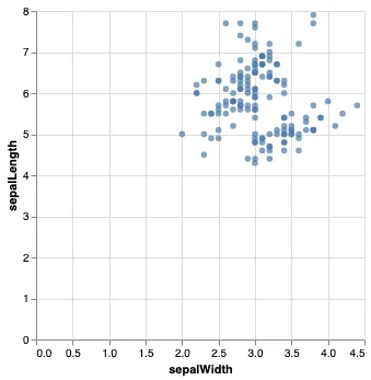
To create a scatterplot change the mark argument to mark_circle().
alt.Chart(iris_df).mark_circle().encode(
    x = "sepalWidth",
    y = "sepalLength"
)
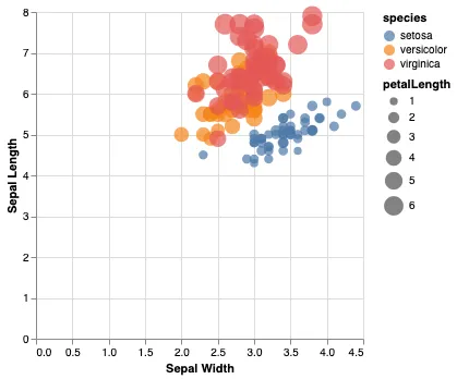
To add a different colour for every unique species add the argument color to encode(). In addition, the argument size allows to change the size of each data point conditional on the length of the petals.
alt.Chart(iris_df).mark_circle().encode(
    x = alt.X("sepalWidth", axis = alt.Axis(title="Sepal Width")),
    y = alt.Y("sepalLength", axis = alt.Axis(title="Sepal Length")),
    color="species",
    size="petalLength"
)
To create a different type of plot, you can change mark_circle() to mark_bar(), mark_point(), or mark_line().
 Summary
How to efficiently visualise your data with plotnine and altair:
-
Identify variables of interest within your dataset;
-
Select ideal type of plot (e.g., scattarplot, bar plot) according to chosen variables;
-
Install relevant packages;
-
Starting from the basic syntax of each package, generate insights on your data and efficiently communicate them to others.