


Overview
In this article, we will explore the inner workings of ggplot2, which is widely considered the best R package for plotting. We will zoom in on the core principle of ggplot2, known as the "Grammar of Graphics". This concept views a plot as a composition of distinct, independent layers.
We will provide practical examples to illustrate these concepts, starting with creating a basic plot and gradually introducing color, size, layering geoms, refining aesthetics, incorporating facets for multi-dimensional analysis, and adding labels and annotations.
By the end of this article, you'll have a solid understanding of ggplot2's framework, layering, and best practices. Setting you up to create all kinds of visualizations: scatterplots, barplots, boxplots, and line graphs, and how to adapt them as required.
Grammar of Graphics
The term "gg" in ggplot2 stands for "Grammar of Graphics", reflecting its core philosophy. The main idea behind the Grammar of Graphics is that a plot is made up of several layers and that each layer consists of at least:
- A dataset
- A geometric object
- A mapping of variables to aesthetics
Here, a geometric object is a shape that you can use to represent data on a plot, like a point, a line, or a bar, while an aesthetic is some aspect of that shape, like its position, its thickness, or its color.
Plots are thus constructed through a series of layers, which are appended with the + operator. While initially, this approach may seem less intuitive than generating a plot with a single function call, it's precisely this layer-by-layer construction that grants ggplot2 its versatility. This kind of methodology allows you to build a wide range of plots, from simple bar charts to complex multi-layered visualizations.
 Example
Analogy Example:
The Grammar of Graphics intuition extends to the procedure of painting. First, you will start with making a sketch (your dataset). Then you will add layers of paint to your canvas (aesthetics and geoms). Therefore, each stroke of the brush (layer) adds a layer to your painting (plot), making it more detailed and colorful. This is, in short, the essence of ggplot2's grammar of graphics. You build plots layer by layer, each adding new dimensions to your data visualization.
Basic Ingredients of a ggplot:
The ggplot() function
The basis of any ggplot visualization is the ggplot() function. This function sets the base for defining a default dataset and default aesthetics, which are inherited by all subsequent layers unless explicitly overridden.
These default aesthetics, or in simpler terms, mapping variables, define how data variables are represented in terms of visual properties such as axes, colors, shapes, and sizes.

# install package `ggplot2`
install.packages("ggplot2")
library(ggplot2)

# Creating the stage
ggplot(data = mpg, aes(x = displ, y = hwy))
ExampleThe code above uses the ggplot() function to create an initial plot framework. In this visualization, the dataset mpg is used, and the aesthetic arguments map the mpg's displ variable to the x axis and the hwy variable to the y axis.
To animate the visualization, we need to employ a geom_() function to specify the type of plot we wish to create.
Geometric Objects (geoms):
A geometric object is a visual representation used to display data on a plot, such as a point, line, or bar. Thus, geoms determine the specific type of plot being created.
Adding one or more geometric objects is achieved through the geom_ functions. This could be a bar plot (geom_bar), a line plot (geom_line), a scatter plot (geom_point), or any other graphical representation.
Each geom layer refers back to the initial ggplot() setup and visually interprets the data according to its specific geom_ type.
ggplot(data = mpg, aes(x = displ, y = hwy)) +
    geom_point() # Adds a scatter plot layer
    geom_bar() # Adds a bar plot layer
 Tip
TipData Visualization Best Practices
Explore the theory of data visualization in this post, where we describe the most common chart types and conclude with best practices for plotting.
Aesthetic Layering in ggplot2
Besides setting the x and y variables within the aes() function, you can also define arguments like color, shape, and size. Each of these aesthetic properties can be mapped onto different variables in the dataset, enabling multivariable plotting.
Understanding how the aes() function works is important. It includes two key concepts:
- Aesthetic Inheritance: The aesthetics defined in the initial
ggplot()function are inherited by all subsequent layers, making it practical to define a default dataset and the aesthetics if they are consistently used across most layers. -
Overwriting Aesthetics: New layers can overwrite aesthetic settings from earlier ones. By specifying
aes()in a new layer, you override the default aesthetic settings established in theggplot()function. TipA key point about the aesthetics of geometric objects: defining them inside an
aes()function means they should map to a variable, while defining them outside anaes()function sets the appearance for an entire layer.
Aesthetic Inheritance in Layering
Aesthetics set in the initial ggplot() function act as a base layer and are inherited by subsequent layers. This sets a consistent application of aesthetics like color or fill across the entire plot unless specifically overridden in later layers. For example:
ggplot(data = mpg, aes(x = displ, y = hwy)) +
    geom_point() +
    geom_smooth(aes(color = class))  # Only affects geom_smooth layer
ExampleHere, we use the ggplot() function with the mpg dataset. We set the default aesthetics to map engine displacement (displ) to the x-axis and highway mileage (hwy) to the y-axis. Our geometric object is a cloud of points (geom_point()).
The subsequent geom_smooth() layer, which includes a color mapping to the class variable, demonstrates that aesthetic settings can be specific to each layer and do not affect the geom_point() layer.
Overwriting Aesthetics with New Layers
As we have discussed above in ggplot2, aesthetics set in the ggplot() function serve as global settings for the entire plot, while aesthetics specified in a geom_() function apply only to that specific layer. This can lead to unexpected results if not managed carefully.
When adding new layers, be mindful as they can overwrite the aesthetic settings from earlier layers. This is especially relevant when incrementally building a plot and aiming to maintain certain aesthetic features throughout. For instance:
ggplot(mpg, aes(x = displ, y = hwy, color = class)) +
  geom_point(aes(color = "red"), size = 3)
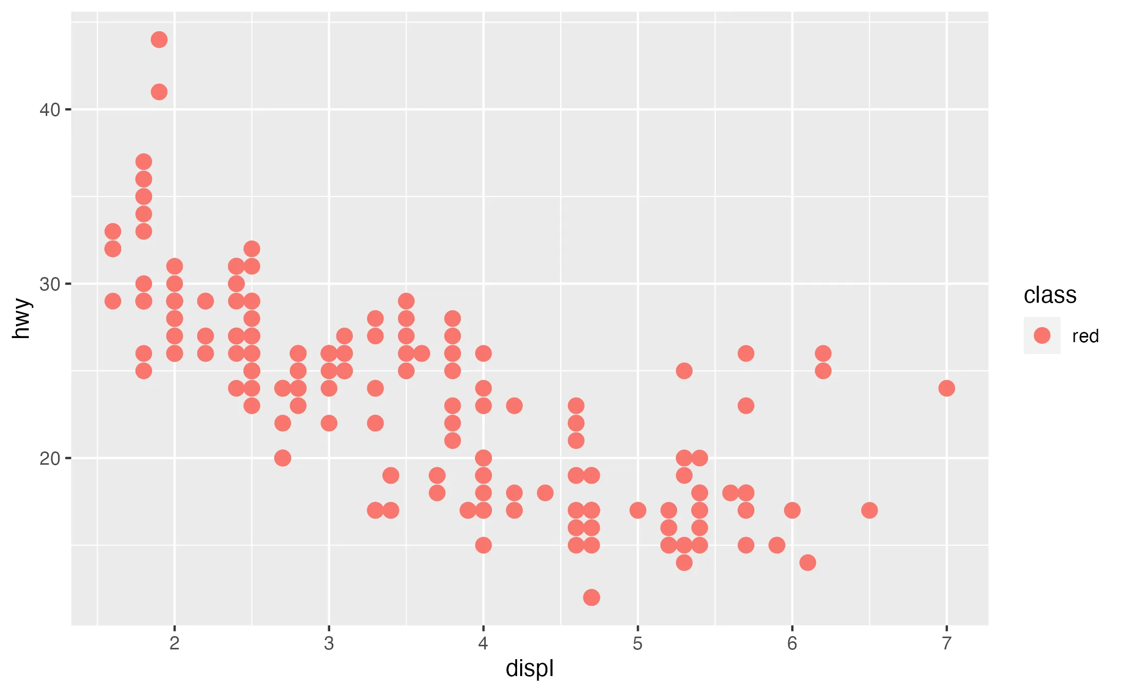
ExampleIn this example, initially, a geometric object layer uses the global aesthetic defined in ggplot(), coloring points by the class variable. However, when the geom_point() layer is added with the color set to "red" in the aes() function, it overwrites the color for all points, rendering them red regardless of their class.
TipBest Practices for Layering Aesthetics
To effectively use layering in ggplot2:
- Be Consistent: Maintain a consistent theme across layers for a cohesive story.
- Plan Your Layers: Think ahead about how each layer contributes to your plot.
- Simplify: Avoid overcomplicating your plot. Sometimes, less is more.
- Use Comments: Annotate your code with comments for better understanding and readability.
- Visualize Progress: Check the output of your plot as you add layers.
Practical Example
Every ggplot2 visualization begins with a basis layer: the ggplot() function. This initial step involves defining the dataset and optional aesthetics, it always serves as the starting point from which you add additional layers.
Step 1: Creating a Basic Plot
ggplot(data = mpg, aes(x = displ, y = hwy)) +
  geom_point()
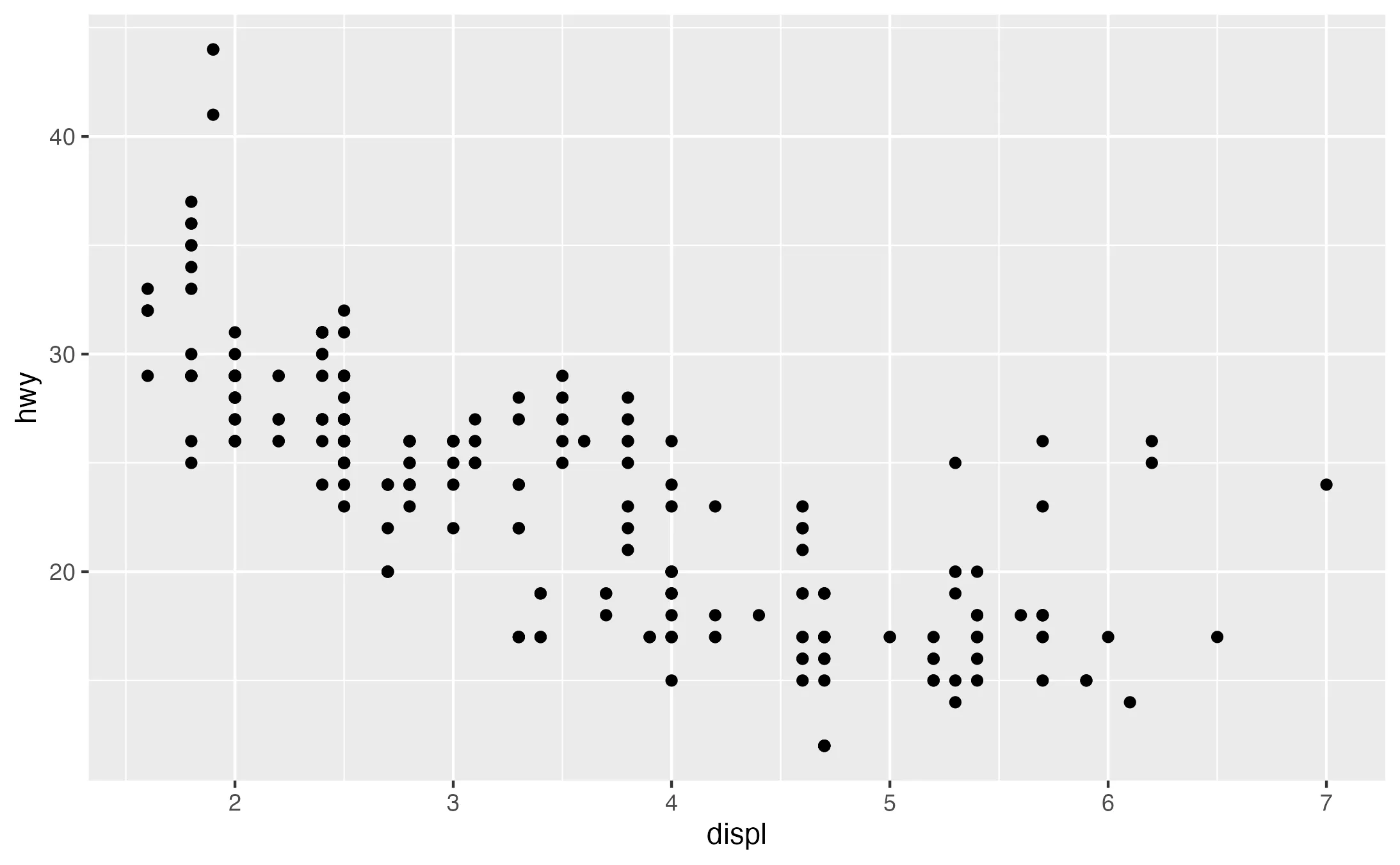
Here, we use the ggplot() function with the mpg dataset. We set the default aesthetics to map engine displacement (displ) to the x-axis and highway mileage (hwy) to the y-axis. Our geometric object is a cloud of points (geom_point()).
Step 2: Introducing Color and Size
Having set up the basis of your visualization, you may wish to include multiple variables. In this context, the aesthetics arguments in ggplot2 are useful for mapping additional variables.
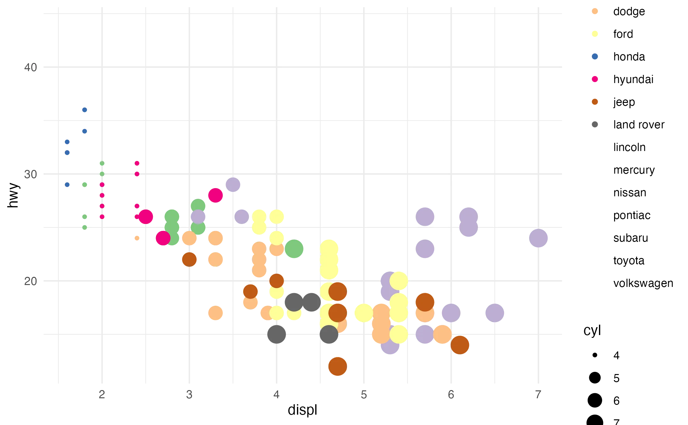
ggplot(data = mpg, aes(x = displ, y = hwy, color = manufacturer, size = cyl)) +
  geom_point()
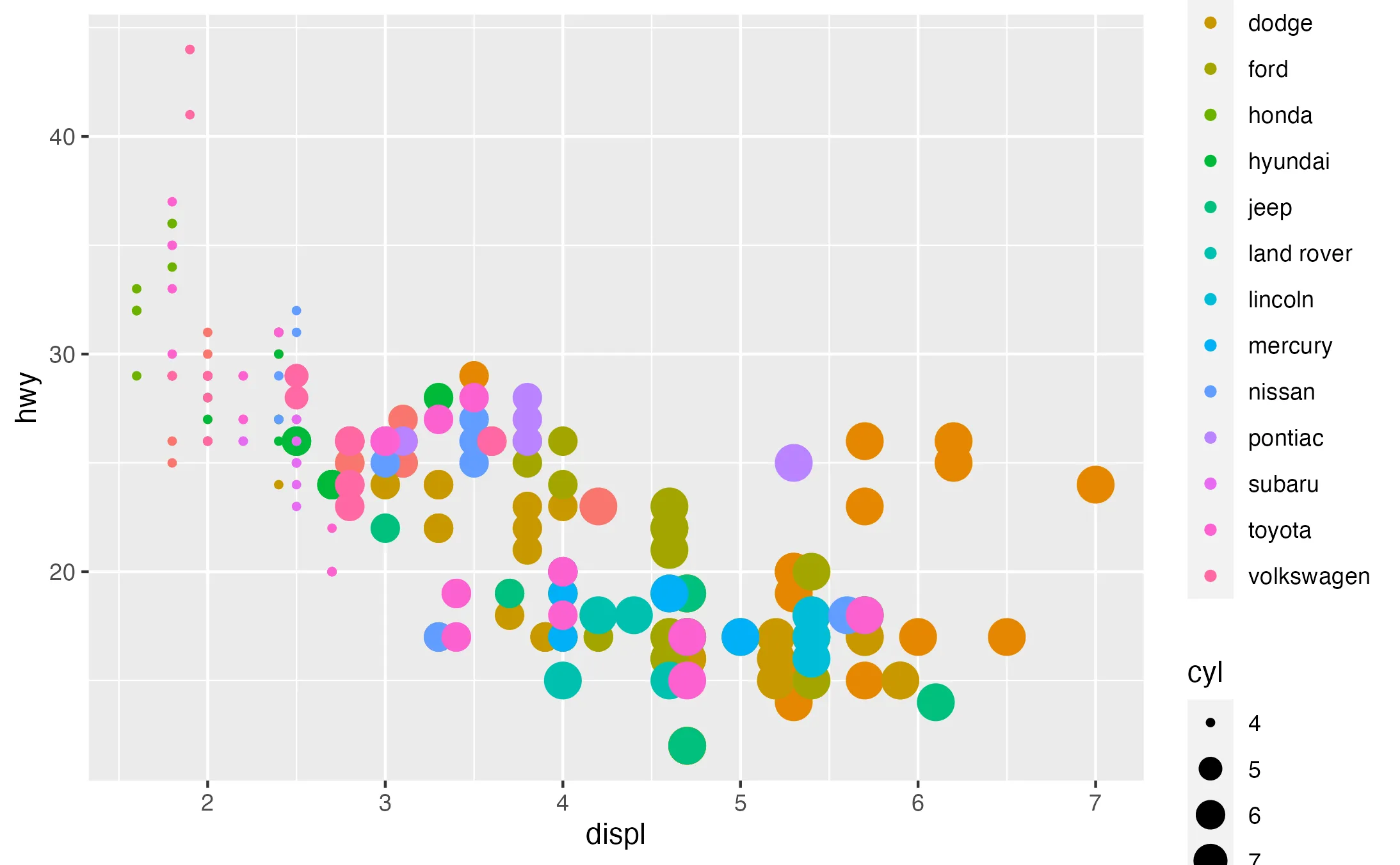
By adjusting the aes() function to include color = manufacturer and size = cyl, we differentiate the data points by manufacturer and cylinder count. This transforms a basic scatter plot into a multifaceted visualization, highlighting the interactions between multiple variables.
Step 3: Layering Geoms
Having specified the base layer and mapped the necessary aesthetics, it is now time to layer different geometric objects, or 'geoms.' By integrating various formats such as lines, bars, or points, layer by layer, you can add more depth to your data visualization, emphasizing relationships and patterns within the data.
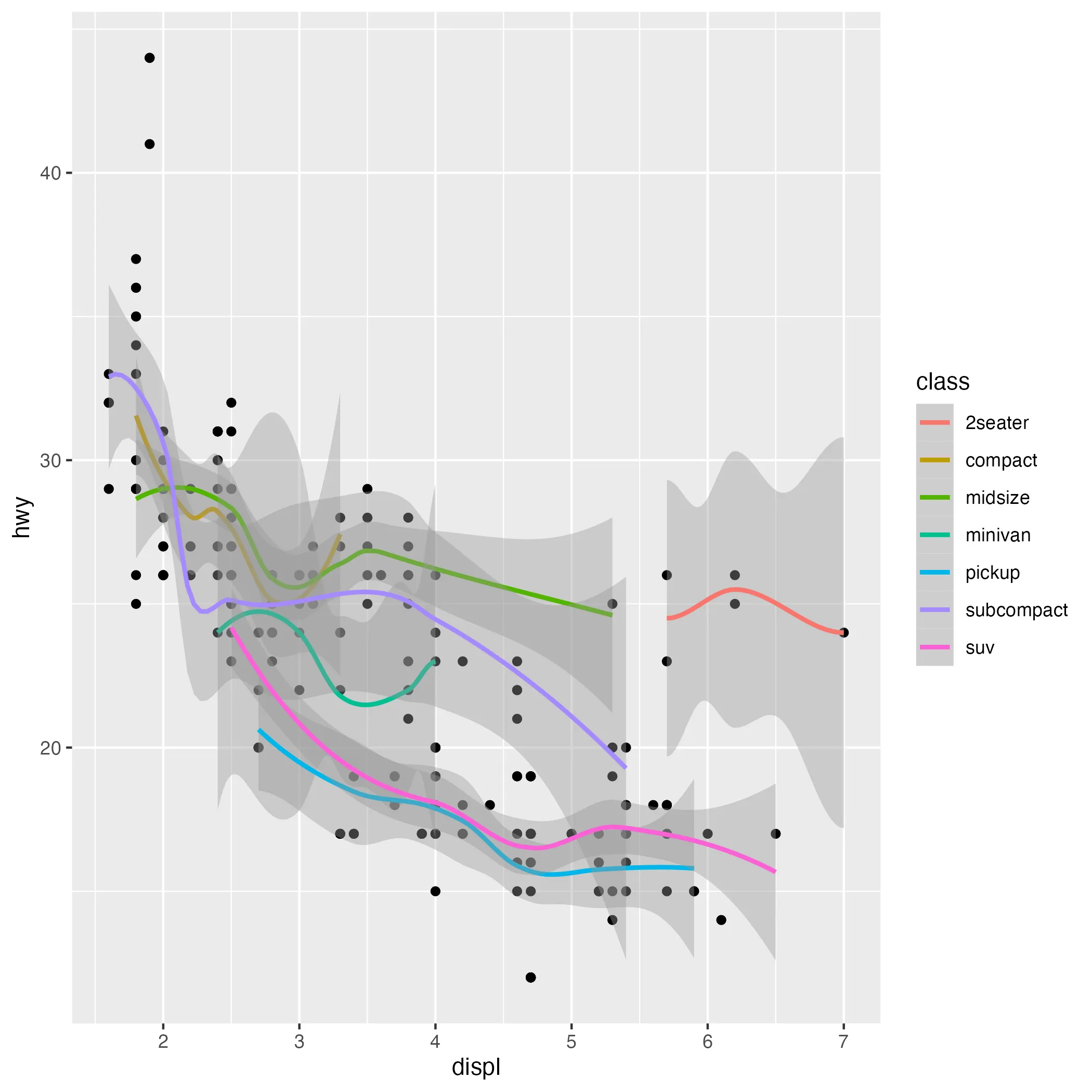
ggplot(data = mpg, aes(x = displ, y = hwy)) +
  geom_point() +
  geom_smooth()
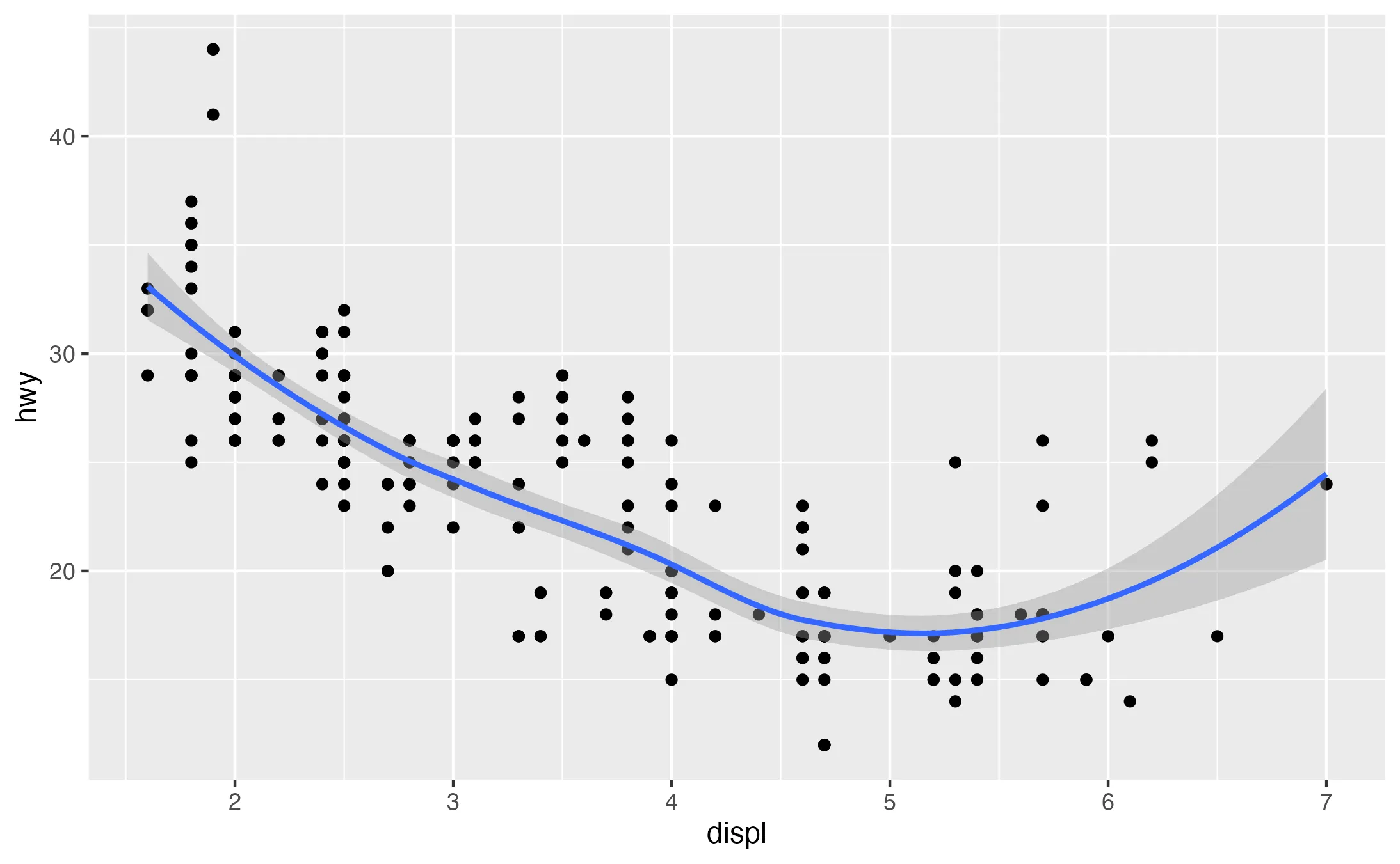
Adding a smooth line (geom_smooth()) to the scatter plot offers an overview of the general trend. This layer aids in visualizing the relationship between displacement and highway miles per gallon (MPG) across various vehicle segments.
Step 4: Controlling Plot Appearance
Having specified the geometric objects, let's zoom in how to refine the visual aesthetics of plots. Inside ggplot2 there are two primary tools for this purpose: scales and themes.
Scales
In ggplot, each aesthetic is connected to a scale that defines its appearance. Scales control how your data are mapped to the graph. By default, ggplot selects appropriate scales based on the aesthetic and the data type. However, you have the option to override these defaults to customize aspects such as axis limits, legend label names, and the colors used in the color aesthetic. This customization is achieved by adding specific scale_..._...() functions to your plot. The first word after the scale_ gives you the name of the aesthetic which is then followed by the name of the scale.
Themes
You can also change the complete non-data elements of your graph by applying the theme function. You have the following themes available:
theme_bw: white background with grid linestheme_classic: classic theme; axes but not grid linestheme_dark: dark background for contrasttheme_gray: default theme with grey backgroundtheme_light: light axes and grid linestheme_linedraw: only black linestheme_minimal: minimal theme, no backgroundtheme_void: empty theme, only geoms are visible
ggplot(data = mpg, aes(x = displ, y = hwy, color = manufacturer, size = cyl)) +
    geom_point() +
    scale_color_brewer(type = "qual") +
    theme_minimal()
By using scale_color_brewer(type = "qual"), we introduce a qualitative color palette from Color Brewer, ideal for differentiating categories like manufacturers. Following this, theme_minimal() creates a cleaner, less cluttered look, highlighting the data.
Step 5: Incorporating Facets for Multi-Dimensional Analysis
So far, we've covered how to create different types of plots, and how to customize their appearance. let's look how to incorporate multiple plots within a single figure through the use of facets in ggplot.
A plot's facet specification splits it up into multiple plots based on a specific (categorical) variable, or combination of two variables. Essentially, it repeatedly creates the same plot for a different subset of the data.
The facet_grid() function accomplishes this; its input is a formula, like x ~ y, where x is the variable that will vary across rows, and y the one that will vary across columns; a . leaves an empty dimension. While The facet_wrap()function, another facetting option in ggplot2, wraps the facets into a single row or column, providing a compact grid of related plots.
ggplot(data = mpg, aes(x = displ, y = hwy, color = manufacturer)) +
    geom_point() +
    facet_wrap( ~ class)
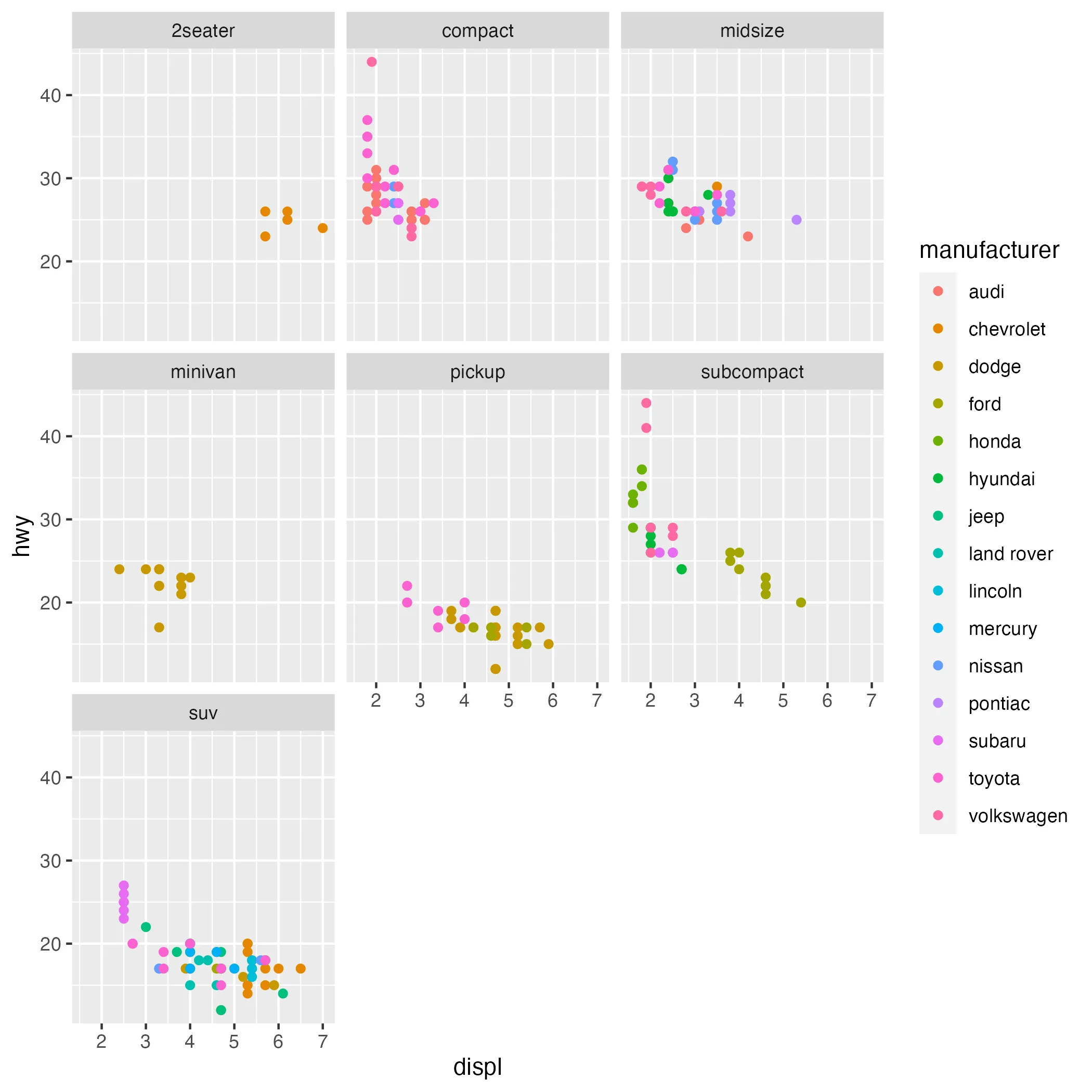
Faceting based on vehicle class creates a grid of plots, each focusing on a different class.
Step 6: Final Touches, Adding Labels and Annotations
The last step, is to apply the final touches to your plot. Labels and annotations bring clarity and context to a plot, making it more informative and reader-friendly.
ggplot(data = mpg, aes(x = displ, y = hwy, color = manufacturer)) +
    geom_point() +
    labs(title = "Engine Displacement vs. Highway MPG",
         x = "Engine Displacement (L)",
         y = "Highway Miles per Gallon",
         color = "Manufacturer") +
    theme_minimal()
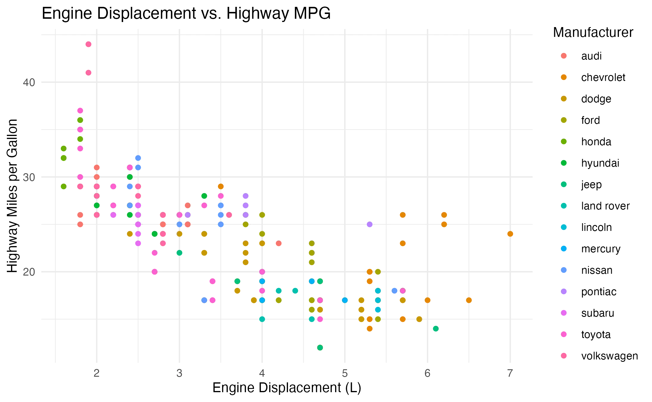
The final step involves adding informative labels and annotations. A clear title, axis labels, and a legend make the plot self-explanatory.
 Summary
Wrapping up our exploration of the inner workings, "Grammer of Graphics" of ggplot2, let's take a moment to recap the key principles we've uncovered:
- Layering Principle: The layering principle in ggplot2 allows the construction of a diverse array of plots, ranging from simple bar charts to complex multi-layered visualizations.
- Aesthetic Layering: We've look at concepts as aesthetic inheritance and the potential for overwriting aesthetics.
- Best Practices: We've discussed effective strategies for layering, emphasizing the importance of consistency, planning, simplicity, commenting, and visualizing progress.
- Practical Example: Through a hands-on example, we've demonstrated how to create basic plots, introduce color and size, layer geometric objects (geoms), refine aesthetics, incorporate facets, and add labels and annotations.