


Overview
In this second article in the R Shiny series, we delve into the Shiny app’s user interface. We will be focusing on aesthetics and user experience. You'll learn how to effectively arrange inputs and outputs using layout functions and customize the app's visual appeal. We’ll also explore interactive control widgets to create responsive interfaces.
By the end of this article, you'll be equipped with skills to design dynamic, engaging, and user-centred Shiny applications.
Layout Functions
Let's first discuss layout functions, these function allow inputs and outputs to be visually arranged (or "laid" out) in the UI. A well-chosen layout makes a Shiny app aesthetically more appealing, easier to navigate, and more user-friendly. Layout functions establish the high-level visual structure of an app and work through a structured hierarchy of function calls in R.
Page Functions
fluidPage() is the most important layout function and is almost exclusively applied across all examples. While standalone use results in a rather plain-looking app, as there is nothing to be displayed specified. fluidPage() plays a vital role behind the scenes, it is responsible for establishing the foundational HTML, CSS, and JavaScript required for a Shiny application to function properly.
 Tip
TipAdditional Page Functions
When designing your Shiny app, consider these page functions beyond the commonly used fluidPage():
- fixedPage():
Has a fixed maximum width, which prevents your app from stretching too wide on larger screens.
- fillPage():
Fills the entire height of the browser window and is useful for designs where a plot or element needs to occupy the full screen.
Page with Sidebar
For creating more complex layouts in R Shiny, you need to specify layout functions within fluidPage().
A common and practical design is the sidebar layout, which provides a sidebar for inputs and a main area for outputs.
For instance, to design a two-column layout where inputs are on the left and outputs on the right, you can employ sidebarLayout(). Within this function, you can use functions like titlePanel(), sidebarPanel(), and mainPanel() to structure your app effectively.
The code below exemplifies the basic framework for such a layout:

# Define the User Interface layout using fluidPage
ui <- fluidPage(
    titlePanel("App Title"), # Title of the app
    sidebarLayout(
        position = "right", # Position the sidebar on the right (default is left)
        sidebarPanel("Input Controls"), # Sidebar for input controls
        mainPanel("Output Display") # Main panel for displaying outputs
    )
)
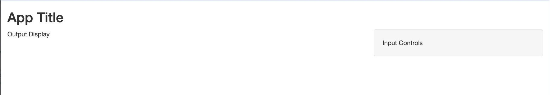
Despite not being familiar with these functions, their descriptive names offer a good hint about their roles. The ability to easily see hierarchy is one of the reasons it’s a good idea to use a consistent style.
Page with Multiple Rows
In R Shiny, advanced layouts go beyond basic side-by-side designs achievable with sidebarLayout(). At the core of Shiny's layout capabilities is a flexible, multi-row system that allows for complex and visually appealing applications.
The fluidRow() function, nested within fluidPage(), enables the creation of such multi-row layouts. Each row is essentially a grid of 12 columns. You can manipulate these columns using the column() function, offering substantial design flexibility. This 12-column structure allows for various configurations, like 2-, 3-, or 4-column layouts, and even the use of narrow columns as spacers. The width of each column is defined by the first argument in the column() function, providing precise control over the layout.
Here's a practical example to illustrate a multi-row layout in Shiny:
# Define the User Interface layout using fluidPage
ui <- fluidPage(
    # First row with two columns
    fluidRow(
        column(4, "Content for the first column"),  # First column occupies 4 out of 12 parts of the row
        column(8, "Content for the second column")  # Second column occupies 8 parts, completing the row
    ),
    # Second row with two columns
    fluidRow(
        column(6, "Content for the third column"),          # Third column occupies half the row
        column(5, offset = 1, "Content for the fourth column")  # Fourth column offset by 1, occupies 5 parts
    )
)

This code snippet demonstrates how to set up a simple multi-row app, giving you a clear structure to work with.
TipYou can adjust the position of columns within a row using the offset parameter in the column() function. Each unit of offset effectively moves a column to the right, increasing the left margin by the width of a single column.
Multipage Layout
For complex Shiny applications, where fitting all content on a single page is impractical, a multipage layout becomes the best practice.
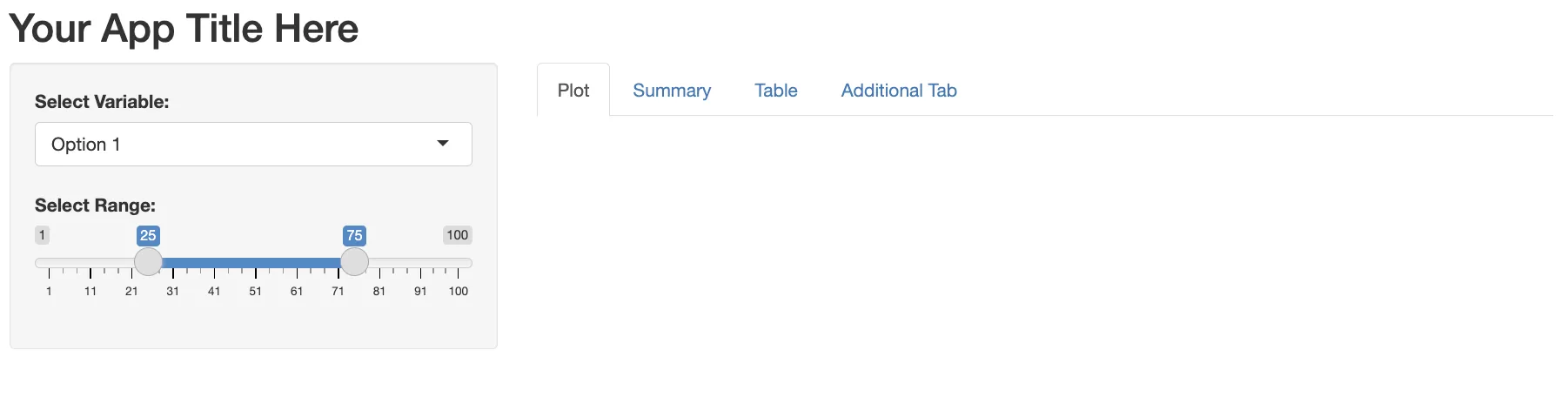
The tabsetPanel() function, used in combination with tabPanel(), provides a way to organize your R Shiny application into distinct sections, similar to having multiple pages. This approach organizes content within a single file, simplifying navigation and layout management.
tabsetPanel(): Acts as a container for multipletabPanel()elements.tabPanel(): Each panel can house various UI components, providing a user experience of navigating through different pages.
Each of these panels can contain different components, creating an experience of moving between various pages, without requiring any knowledge of HTML.
tabsetPanel(
        tabPanel("Plot", plotOutput("plot")),
        tabPanel("Summary", verbatimTextOutput("summary")),
        tabPanel("Table", tableOutput("table")),
        tabPanel("Additional Tab", "More content here...")
      )
Alternative Layouts
Navbar Pages
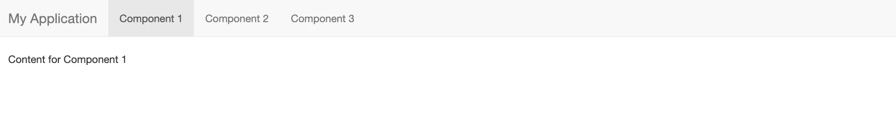
The navbarPage() function in R Shiny is used for creating a navigation bar at the top of the application. This layout is especially beneficial for complex apps with multiple sections or functionalities. Unlike the basic tabset panel, the navbar layout offers a more website-like feel. The function creates a layout allowing the multiple distinct sub-components to have their own sidebar, tabsets, or other layout constructs.
ui <- navbarPage("My Application",
  tabPanel("Component 1", "Content for Component 1"),
  tabPanel("Component 2", "Content for Component 2"),
  tabPanel("Component 3", "Content for Component 3")
  # You can add more tabPanels as needed
)
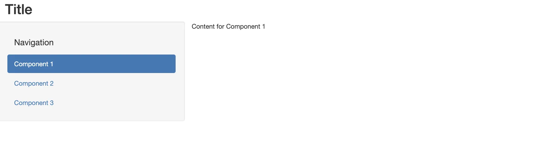
Navlist Panel
The navlistPanel() is an alternative to tabsetPanel(), organizing tab titles vertically in a sidebar. This layout is particularly useful for apps with many components. It's also helpful when you have long or descriptive titles for your tabs.
ui <- fluidPage(
  titlePanel("Title"),
  navlistPanel(
    "Navigation",
    tabPanel("Component 1", "Content for Component 1"),
    tabPanel("Component 2", "Content for Component 2"),
    tabPanel("Component 3", "Content for Component 3")
    # Additional tabPanels can be added here
  )
)
Key Points:
- The navlistPanel() creates a sidebar for navigation.
- Like navbarPage(), each tabPanel within the navlistPanel() can be customized with specific content.
- The navlistPanel()is similar to tabsetPanel() but arranges tab titles vertically instead of horizontally in a sidebar, allowing for headings and better organization for apps with numerous components.
Customization
When it comes to styling your R Shiny web app or dashboard, there are several approaches you can take, each approach aimed at different needs and expertise levels.
"I'm Just Happy It Works" (Accept the Defaults)
For those who prioritize functionality over aesthetics, the simplest approach is to accept the default styles provided by Shiny. This is particularly suitable for applications focused on data analysis or exploratory plotting, where the main goal is to use Shiny's interactivity to understand datasets.
"I Want a Different 'Pre-Packaged' Look" (shinythemes)
For those looking to enhance their R Shiny app's visual appeal with minimal effort, shinythemes is an suitable option . This package provides a variety of pre-designed themes, enabling you to quickly change the overall look of your app without delving into custom styling.
You can easily implement a theme from shinythemes in a single-file app. In the UI specify the theme argument, using the shinythemes() function.
# Install and load the shinythemes package
install.packages("shinythemes")
library(shinythemes)
# Define UI and Server
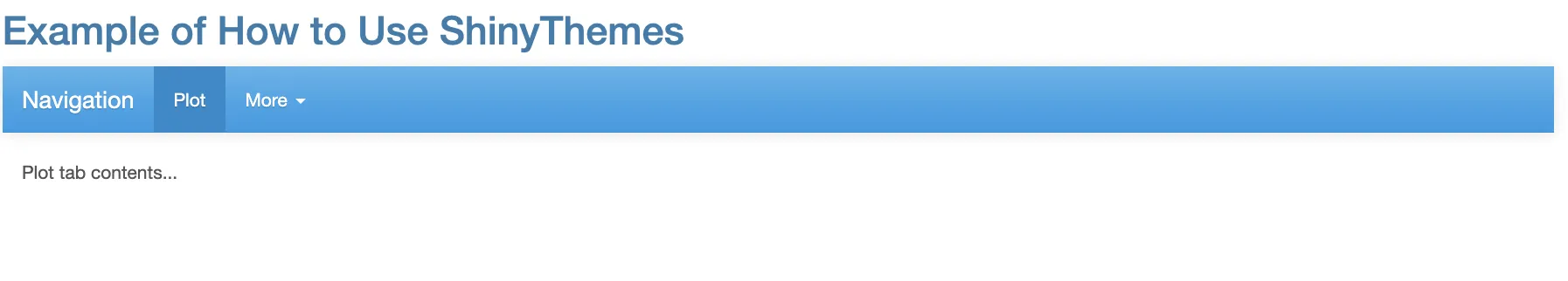
ui <- fluidPage(
theme = shinytheme("cerulean"), # Replace "cerulean" with your chosen theme
titlePanel("Example of How to Use ShinyThemes"),
navbarPage("Navigation",
tabPanel("Plot", "Plot tab contents..."),
navbarMenu("More",
tabPanel("Summary", "Summary tab contents..."),
tabPanel("Table", "Table tab contents...")
)
)
)
server <- function(input, output) {
# Server logic goes here
}
# Run the Shiny app
shinyApp(ui = ui, server = server)
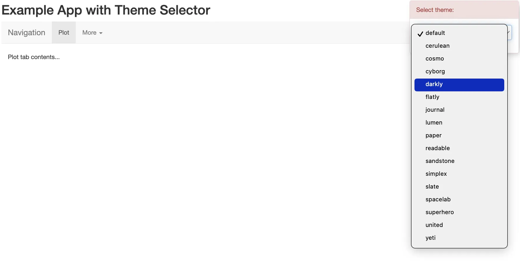
TipLive Theme Selector
An interesting feature of the shinythemes package is the themeSelector() widget. This widget allows you to dynamically test different themes directly in your app without needing to reload or restart your app. It adds a dropdown box to the UI, letting you switch themes on the fly.
It's a flexible widget that can be inserted anywhere within your application, though placing it right under the fluidPage() definition is a common practice. The themeSelector() is only for development purposes. Once you settle on a theme, you should define it using the shinytheme() function in your final app.
Here's an example app with the theme selector:
# Define UI
ui <- fluidPage(
  themeSelector(),  # Adds a dropdown for theme selection
  titlePanel("Example App with Theme Selector"),

  navbarPage("Navigation",
    tabPanel("Plot", "Plot tab contents..."),
    navbarMenu("More",
               tabPanel("Summary", "Summary tab contents..."),
               tabPanel("Table", "Table tab contents...")
    )
  )
)

# Define Server
server <- function(input, output) {
  # Server logic can be added here
}

# Run the Shiny app
shinyApp(ui = ui, server = server)
"I Want Specific Fonts/Colors/Styles" (Custom CSS)
To gain full control over the appearance of your Shiny app, custom CSS is the ideal solution. CSS allows you to precisely define the styles for various UI elements, including fonts, colors, layouts, and more.
Inline CSS: involves adding CSS code directly within your Shiny UI elements. Use tags$style() to include CSS rules.
ui <- function(){
  tag$List(
    tags$style( # Specify that for a header level 2, use the font color blue
      "h2{
        color:blue;
      }"
    ),
    h2("This is blue") # Create a header level 2
  )
}
 Warning
Challenge of Custom CSS
Writing and maintaining custom CSS can be tedious and prone to errors. This practice would work for some small adjustments, but if you specify large amounts of CSS code in your apps, your code can become cluttered, causing readability issues.
External CSS File:
Creating a separate CSS file and linking it to your Shiny app.
This method keeps your UI code concise and makes maintenance easier, as it separates the style from the app's logic.
To include an external CSS file, you will have to use another tag: tags$link(). This tag contains three elements which need to be specified:
ui <- fluidPage(
  tags$head(
    tags$link(
      rel = "stylesheet",
      type = "text/css",
      href = "style.css"  # Replace with the actual location of your CSS file
    )
  )
)
Styling Shiny using bootstrap with bslib & thematic
For an advanced case of customizing your UI using Bootstrap in R Shiny, look at this article.
Interactive UI
In this part, we will dive into control widgets. Widgets are interactive web elements that allow your app users to communicate with the Shiny application. These widgets are essential in creating dynamic and interactive apps.
Each widget is created with a transparently named R function in Shiny. For example, the actionButton function creates an Action Button, and sliderInput creates a slider bar. These widgets are instrumental in collecting values from users and triggering responses in the app.
We have already considered control widgets in the first article of the series, where we discussed some basic widgets and their arguments. So for the basic instruction check this article.
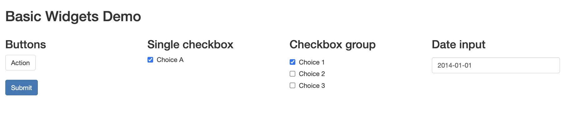
library(shiny)

# Define UI
ui <- fluidPage(
  titlePanel("Basic Widgets Demo"),
  fluidRow(
    column(3,
           h3("Buttons"), # Add a level 3 heading
           actionButton("action", "Action"), # Action Button, ID = "action", displayed in app: "Action"
           br(), # Empty Row for spacing
           br(),
           submitButton("Submit")), # Submit button
    column(3,
           h3("Single checkbox"),
           checkboxInput("checkbox",
                        "Choice A",
                        value = TRUE)),
    column(3,
           checkboxGroupInput("checkGroup",
                              h3("Checkbox group"),
                              choices = list("Choice 1" = 1, "Choice 2" = 2, "Choice 3" = 3),
                              selected = 1)),
    column(3, dateInput("date",
                        h3("Date input"),
                        value = "2014-01-01"))
  ),
)
TipGo Further with the Shiny Widgets Gallery
For more advanced examples and templates, visit the shinyWidgets package. shinyWidgetsGallery() opens a pre-built Shiny app that allows you to explore these pre-built inputs and gives you the code for implementing them.
Within the gallery, simply choose a widget and click on the “See Code” button located beneath it. You'll be directed to a detailed example app that provides insights into the widget's functionality. To incorporate the widget into your Shiny app, just copy the provided code and paste it into your app.R file.
Here’s how you can get started with the Shiny Widgets Gallery:
install.packages("shinyWidgets")
library(shinyWidgets)
shinyWidgets::shinyWidgetsGallery() # Run the Shiny Widgets Gallery
Summary
 Summary
In this article of the R shiny series we have discussed User Interace:
- Aimed at enhancing app UI for improved visual appeal, intuitiveness, and user-friendliness.
- Explores advanced layout options, including sidebar layouts and multipage layouts.
- Discusses various customization approaches, from using default Shiny styles to applying shinythemes and integrating custom CSS.
- Covers control widgets, teaches how to create responsive interfaces, and highlights the shinyWidgets gallery for advanced examples.
This article is aimed to learn the techniques for building user-oriented Shiny applications, making them not only functional but also visually attractive and intuitive. In the next article we will dive into the concept of reactivity.