


Overview
Shinydashboard, an extension of the Shiny web application framework in R, is a specialised package for creating dashboards.
At its heart, Shinydashboard operates on the two fundamental elements of every Shiny app: the User Interface (UI) and the server function. These components are integrated using the shinyApp function, similar to a standard Shiny app. However, Shinydashboard distinguishes itself through its unique UI setup, offering a structured, customizable environment for data presentation and interaction. This article provides a detailed exploration of Shinydashboard, emphasizing the user interface components, and showcasing their practical applications.
The article will cover the key components of the user interface of a Shinydashboard, including the dashboardHeader, dashboardSidebar, and dashboardBody functions. We will delve into how these functions work together to form a cohesive UI, their customization options, and their relevance in creating an effective dashboard. Additionally, the article will illustrate these concepts with practical examples.
Building the User Interface (UI)
The UI of a dashboard consists of three main components: the header, the sidebar, and the body. These parts are created using dashboardHeader, dashboardSidebar, and dashboardBody functions, respectively. The dashboardPage function then integrates these elements within the UI. This structure offers more flexibility due to its requirement for additional specific arguments and functions.
Camel Case Syntax
Shinydashboard adopts a camel case syntax, noticeable in function names where new words are capitalized (e.g., 'Header' in dashboardHeader). This is a common convention in the shinydashboard ecosystem and aids in differentiating function components.

# Import Libraries
# Install and load the shinydashboard package, which simultaneously loads shiny.
install.packages("shinydashboard")
library(shinydashboard)
# Set Up UI Components
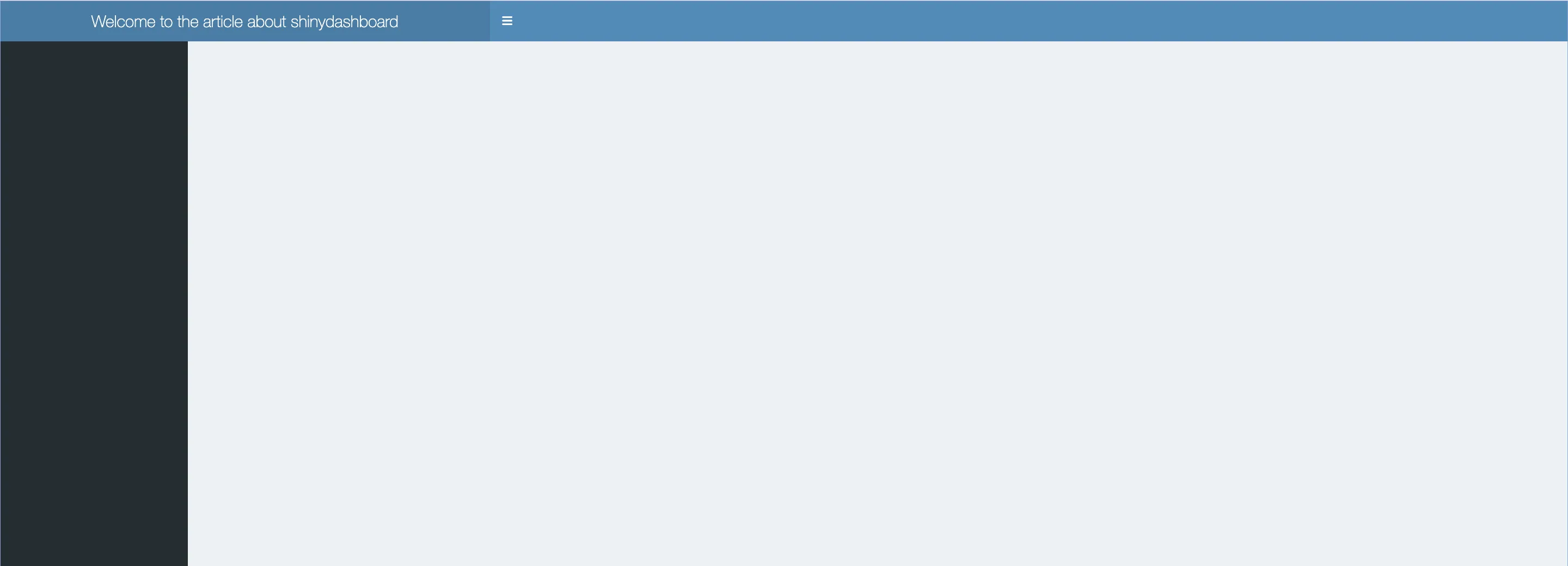
header <- dashboardHeader(title = "Welcome to the article about shinydashboard", # Customizable header with title
titleWidth = 600) # Adjusted with to make the title fit
sidebar <- dashboardSidebar() # Sidebar for navigation
body <- dashboardBody() # Main body for content
# Assemble UI
ui <- dashboardPage(header, sidebar, body) # Combine header, sidebar, and body
# Server Function
server <- function(input, output) {} # Server logic
# Launch Dashboard
shinyApp(ui, server) # Initialize the shinydashboard
Dashboard Header
The dashboard header, created with dashboardHeader, is a visual element in shinydashboard's layout. Typically coloured blue, it can house a title and various dropdown menus. These menus, created via dropdownMenu(), come in three types: messages, notifications, and tasks.
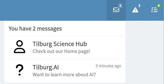
Creating a Message Menu
A message menu is designed to display various messages to the user.
-
Detailed Steps:
- Initiate the Menu: Start by calling
dropdownMenu(type = "messages")to create a message menu. - Compose Messages:
- Use
messageItem()to add individual messages. - Specify the sender with
from, the message content withmessage, and any optional links withhref. - To include multiple messages, simply add more
messageItem()calls.
- Use
- Initiate the Menu: Start by calling
-
Customization Options:
- Icons: Change the default person silhouette icon using the
iconargument. - Time Strings: Include a time string using the
timeargument.- This can be a relative date/time like "5 minutes ago" or an absolute time like "2024-10-01 9:00".
- Icons: Change the default person silhouette icon using the
header <- dashboardHeader(
# Additional arguments
# Message Dropdown Menu
  dropdownMenu(
    type = "messages",  # Specify that this is a messages dropdown.
    messageItem(
      from = "Tilburg Science Hub", # Sender of the first message.
      message = "Check out our Home page!", # Message content.
      href = "https://tilburgsciencehub.com" # Link associated with the message.
    ),
    messageItem(
      from = "Tilburg.AI",
      message = "Want to learn more about AI?",
      href = "https://tilburg.ai",
      icon = icon("question"),  # Custom icon for the message.
      time = "5 minutes ago" # Time since the message was sent.
    )
  )
)
Notification Menu
The notification menu in a Shiny Dashboard is used to display brief alerts or updates to the user.
The syntax for a notification in a shinydashboard is quite similar to messages, with a few key differences:
- Type: Change type to "notifications" in the dropdownMenu() function.
- Content: Use the text parameter instead of message to specify the notification details.
A notificationItem contains a quick message and hence does not require large pieces of information
- Status Argument: Use the status parameter in notificationItem() to visually differentiate notifications. This changes the colour of the notification icon or background.
- For example, "success" implies a positive update (green), "warning" indicates caution (yellow/orange), and "danger" signals a critical issue (red).
# Notification Dropdown Menu
  dropdownMenu(type = "notifications", # Define the menu type as 'notifications'.
    notificationItem(
      text = "5 new learners today", # The content of the notification
      icon = icon("users") # Custom icon for the notification.
    ),
    notificationItem(
      text = "2 articles created",
      icon = icon("truck"),
      status = "success" # Green icon indicating a positive update
    ),
    notificationItem(
      text = "Server load at 86%",
      icon = icon("exclamation-triangle"),
      status = "warning" # Yellow icon indicating caution
    )
  ),

Tasks Menu
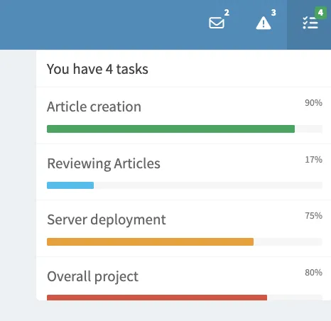
The tasks menu showcases the progress of various tasks and is created using dropdownMenu(type = "tasks").
- Type: Like messages and notifications, tasks menus are created using dropdownMenu(), with the type set to "tasks".
- Progress Indicator: Each task item not only provides text but also visually shows progress using the value parameter.
- BadgeStatus Argument: The badgeStatus parameter sets the overall colour theme for task progress indicators in the menu. It allows users to assess the status of tasks at a glance.
# Tasks Dropdown Menu
dropdownMenu(type = "tasks", # Indicate that this is a tasks dropdown.
             badgeStatus = "success", # Overall theme set to green for progress
  taskItem(value = 90, # Progress of the task in percentage.
           color = "green", # Color of the progress bar
           text = "Article creation" # Description of the task.
    ),
  taskItem(value = 17,
           color = "aqua",
           text = "Reviewing Articles"
    ),
  taskItem(value = 75,
           color = "yellow",
           text =  "Server deployment"
    ),
  taskItem(value = 80,
           color = "red",
           text = "Overall project"
    )
  )
 Tip
TipPractical Tips
- Adjust Title Width in
dashboardHeader: ThetitleWidthargument indashboardHeaderallows customization of the title section's width. A higher value provides more space for longer titles. - Disabling the Header: To hide the header, use
dashboardHeader(disable = TRUE). This can be useful for minimalistic designs or specific use cases where the header is not required.
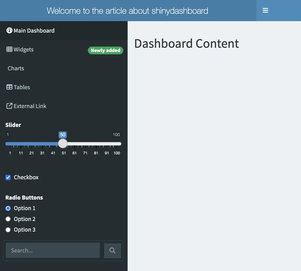
Dashboard Sidebar
Creating the Sidebar
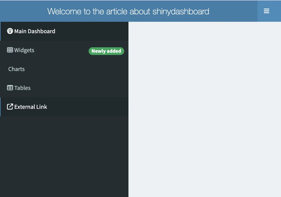
The dashboardSidebar() function is used to create the sidebar. You add tabs to your sidebar using the sidebarMenu function. This function includes the menuItem() function for navigation. Each menuItem can correspond to different content displayed in the main body of the dashboard. Its width can also be adjusted to be in line with the header width. We can also disable the sidebarMenu if it's unwanted, by setting specifying: dashboardSidebar(disable = TRUE)
Key Features of Sidebar:
- Function:
sidebarMenu()withindashboardSidebar()organizes your navigation tabs. - Navigation Tabs: Use
menuItem()withinsidebarMenu()to create tabs similar to tabPanel in Shiny. - Content Linking: Each
menuItem()insidebarMenu()corresponds to atabItem()in the body. Ensure theirtabNameattributes match for proper content display. Optional: - Icons: Use
icon()withinmenuItem()for visual representation. - Badges: Add
badgeLabelandbadgeColorto highlight or categorize menu items.- Note: Badges cannot be added to a tab containing subtabs.
- External Links: Include
hrefinmenuItem()for external URLs. Control tab opening behaviour with thenewtabargument.- By default, external links open in a new browser tab
sidebar <- dashboardSidebar(
  width = 300,  # Adjust sidebar width
  sidebarMenu(
    menuItem("Main Dashboard", tabName = "dashboard", icon = icon("dashboard")),
    menuItem("Widgets", tabName = "widgets", icon = icon("th"), badgeLabel = "Newly added", badgeColor = "green"),
    menuItem("Charts", tabName = "charts", icon = icon("chart")),
    menuItem("Tables", tabName = "tables", icon = icon("table")),
    menuItem("External Link", href = "https://tilburgsciencehub.com", icon = icon("external-link"))
  )
)
Incorporating Inputs and Interactive Elements
- Adding Inputs: Include Shiny inputs like
sliderInputandtextInputin the sidebar for user interaction. - Special Feature - Sidebar Search Form:
- Purpose: Acts as a text input with a search button
- Implementation: Use
sidebarSearchForm()withtextIdandbuttonId. - Server-Side Correspondence: Access input values in the server function using
input$searchTextandinput$searchButton.
# Complete the Sidebar Example with Navigation Tabs and Search Form
# Define the Sidebar with Navigation Tabs and Interactive Features
sidebar <- dashboardSidebar(
  width = 300,  # Set the width of the sidebar
  sidebarMenu(
    # Navigation Tabs: Each tab links to different content in the main body
    menuItem("Main Dashboard", tabName = "dashboard", icon = icon("dashboard")),
    menuItem("Widgets", tabName = "widgets", icon = icon("th"), badgeLabel = "Newly added", badgeColor = "green"),
    menuItem("Charts", tabName = "charts", icon = icon("chart")),
    menuItem("Tables", tabName = "tables", icon = icon("table")),

    # External Link: Opens in a new tab or window
    menuItem("External Link", href = "https://tilburgsciencehub.com", icon = icon("external-link"), newtab = TRUE),

    # Interactive Inputs: Integrated into the sidebar for user interaction
    sliderInput("slider", "Slider", min = 1, max = 100, value = 50),
    checkboxInput("checkbox", "Checkbox", value = TRUE),
    radioButtons("radio", "Radio Buttons", choices = c("Option 1", "Option 2", "Option 3")),

    # Search Form: For enhanced user interaction
    sidebarSearchForm(textId = "search", buttonId = "searchButton", label = "Search...")
  )
)
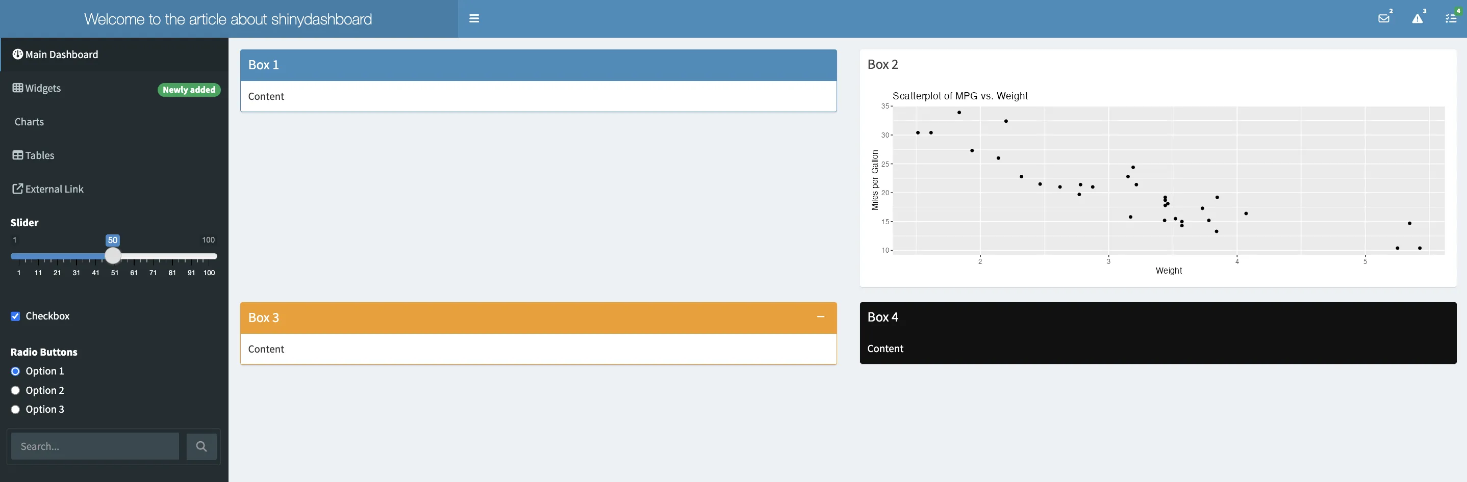
Body
The dashboardBody() function is where the bulk of your Shiny Dashboard's user interface is defined. It's the area to displays outputs and accommodate user inputs. Essentially, the body acts as the main canvas for your dashboard's content.
Integrating Boxes as Building Blocks
- Boxes: Create layout elements with
box(). These containers can hold various UI components. - Placement and Organization: Place boxes within
fluidRow()for a structured layout. - Customization Options:
- Titles: Use the
titleargument for descriptive headings. - Status Colors: Add colour to box headers with the
statusargument (e.g., "primary" for blue, "warning" for yellow). - Solid Headers: Set
solidHeader = TRUEfor a more prominent header. - Collapsibility: Add interactivity with
collapsible = TRUE, allowing users to collapse or expand the box content. - Background Colors: Customize the box's background with the
backgroundargument for a unique look.
- Titles: Use the
# Sample dashboardBody with various box customisations
body = dashboardBody(
  fluidRow(
    box(title = "Box 1", status = "primary", "Content", solidHeader = TRUE),
    box(title = "Box 2", plotOutput("plot1", height = 250), solidHeader = TRUE),
    box(title = "Box 3", status = "warning", "Content", solidHeader = TRUE, collapsible = TRUE),
    box(title = "Box 4", background = "black", "Content")
  )
)
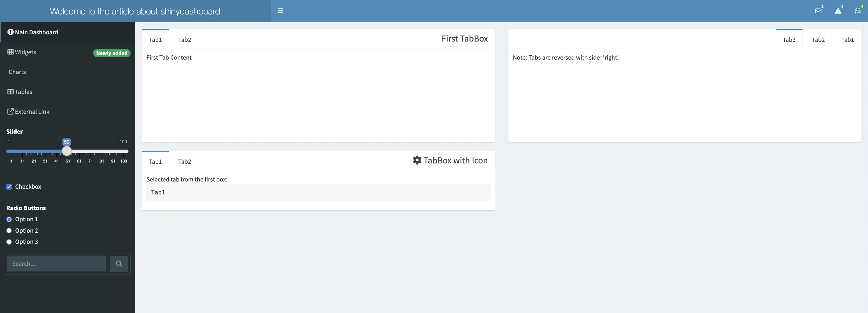
TabBox
tabBox() is for organizing content into tabs, similar to Shiny's tabsetPanel.
Key Features:
- Function: tabBox() within Shiny's UI organizes content into a tabbed interface. It acts as a container for tabPanel() elements.
- Tab Panels: Utilize tabPanel() within tabBox() to create individual tabs. Each tabPanel represents a distinct section for content.
- Use the id argument for dynamic interaction. This allows server-side logic to track and update the active tab using input$<id>.
- Content Customization: Differentiate the content of each tab by adding unique elements to tabPanel().
- Tab Alignment: Set the side argument to "right" to align tabs on the right side. This reverses the order of the tabs.
- Icons in Titles: Enhance tab titles by embedding icons using tagList(shiny::icon("icon_name"), "Title").
- Adjust height, width, and title for layout customization.
fluidRow(
  tabBox(
    # Standard TabBox
    title = "Primary TabBox",
    id = "tabset1", height = "250px",
    tabPanel("Tab1", "Content for First Tab"),
    tabPanel("Tab2", "Content for Second Tab")),
  tabBox(
    # TabBox with Right-Aligned Tabs
    side = "right", height = "250px",
    selected = "Tab3",
    tabPanel("Tab1", "Content for Tab One"),
    tabPanel("Tab2", "Content for Tab Two"),
    tabPanel("Tab3", "Content for Third Tab - Right Aligned")),
  tabBox(
    # TabBox with an Icon in the Title
    title = tagList(shiny::icon("gear"), "Settings TabBox"),
    tabPanel("Tab1",
      "Active Tab in Primary TabBox:",
      verbatimTextOutput("tabset1Selected")
    ),
    tabPanel("Tab2", "Content for Second Tab")
  )
)

# Server Function for Dynamic Interaction
server <- function(input, output) {
  output$tabset1Selected <- renderText({
    input$tabset1  # Retrieves the currently active tab in the first TabBox
  })
}
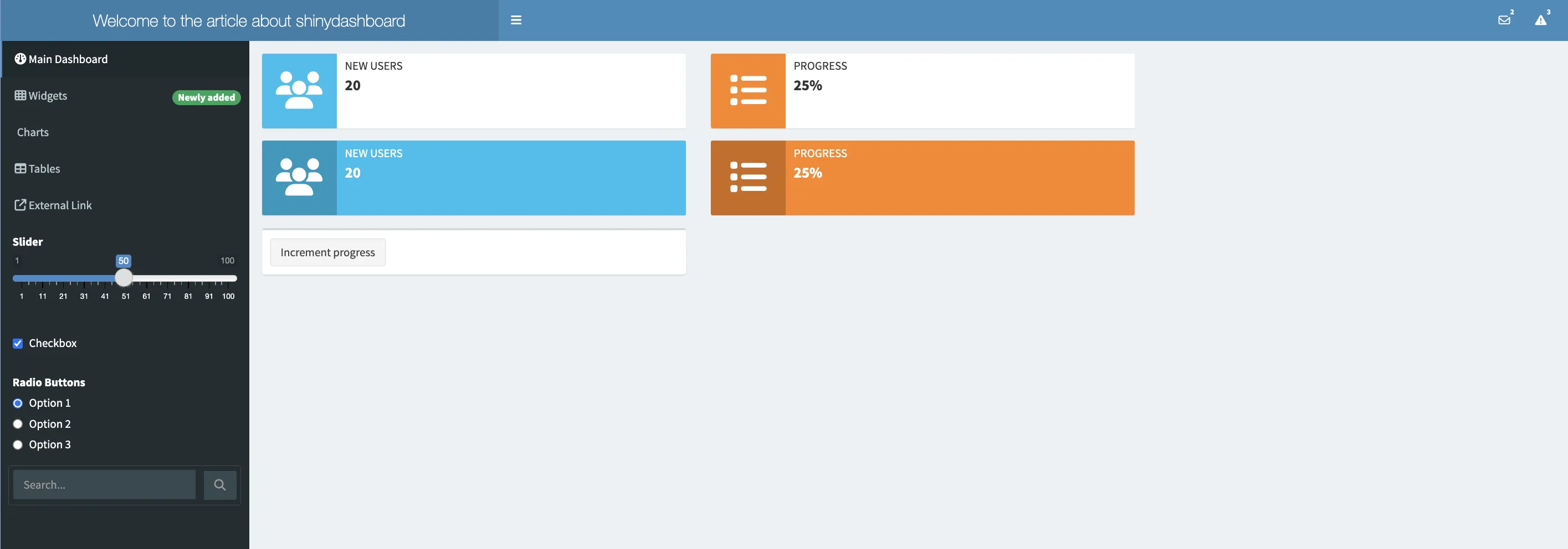
infoBox
infoBox is a UI component in shinydashboard designed to display key metrics, such as numerical or textual values, along with icons for visual emphasis. It's effective for showcasing statistics like user count, sales figures, or progress metrics.
Static vs Dynamic Content:
- Static infoBox displays fixed data, ideal for constants or baseline metrics.
- Dynamic infoBox, enabled through infoBoxOutput and renderInfoBox, updates in response to user interactions or live data feeds.
Appearance Customization:
- The fill parameter alters the background fill. fill=FALSE (default) gives a cleaner look, while fill=TRUE provides a more pronounced, filled background.
# Dashboard Body with infoBox examples
body = dashboardBody(
  fluidRow(
    infoBox("New Users", 20, icon = icon("users")),
    infoBoxOutput("learningBox")
  ),
  fluidRow(
    infoBox("New Users", 20, icon = icon("users"), fill = TRUE),
    infoBoxOutput("learningBox2")
  ),
  fluidRow(
    box(width = 4, actionButton("count", "Increment progress"))
  )
)

# Server logic for dynamic infoBoxes
server <- function(input, output) {
  output$learningBox <- renderInfoBox({
    infoBox("Progress", paste0(25 + input$count, "%"), icon = icon("list"), color = "orange")
  })
  output$learningBox2 <- renderInfoBox({
    infoBox("Progress", paste0(25 + input$count, "%"), icon = icon("list"), color = "orange", fill = TRUE)
  })
}
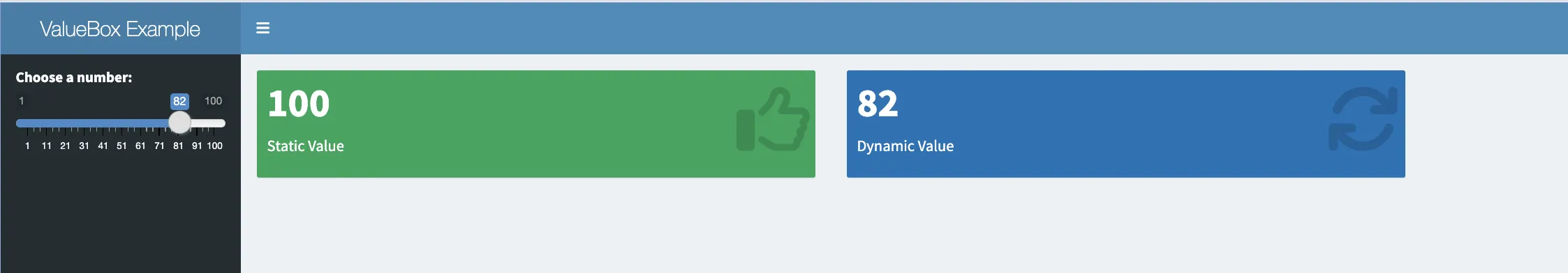
valueBox
valueBox, while similar in purpose to infoBox, offers a different aesthetic. It's another way to present figures or indicators visually.
Usage and Customization:
- valueBox can be static or dynamic, suitable for various data presentation needs.
- Like infoBox, valueBox supports the fill parameter for background customisation.
# Define the sidebar
sidebar <- dashboardSidebar(
  sliderInput("number", "Choose a number:", min = 1, max = 100, value = 50)
)

# Define the body
body <- dashboardBody(
  fluidRow(
    valueBox(100, "Static Value", icon = icon("thumbs-up"), color = "green"),
    valueBoxOutput("dynamicValueBox")
  )
)

# Define the server logic
server <- function(input, output) {
  output$dynamicValueBox <- renderValueBox({
    valueBox(input$number, "Dynamic Value", icon = icon("refresh"), color = "blue")
  })
}
 Summary
This article provides an overview of the Shinydashboard package in R, focusing on the user interface components. It guides through the process of creating a functional and visually appealing dashboard.
Key Points:
- Dashboard Structure: Explains the use of dashboardHeader, dashboardSidebar, and dashboardBody to construct the basic layout.
- Syntax Examples:
- dashboardHeader(): Creates the header section.
- dashboardSidebar(): Sets up the sidebar with navigation options.
- dashboardBody(): Defines the main content area.
- Integration: Demonstrates how these components are integrated using dashboardPage() to form a complete dashboard application.
- Customization: Highlights the customization options for each component, showcasing the flexibility of Shinydashboard in adapting to different data presentation needs.

# Download the code used in the article in the right corner