


Overview
This guide is designed to walk you through the fundamentals of crafting dynamic data visualizations utilizing R Shiny and Plotly. For those with a foundation in ggplot2, Plotly offers the opportunity to enhance your visualizations by integrating a layer of interactivity, thereby transforming your static plots into interactive, narrative-driven experiences. This article aims to demonstrate the distinct advantages of integrating these tools to produce interactive, story-driven visual data presentations.
We will focus on enhancing the interactivity of your visualizations and ensuring they effectively respond to user inputs, a feature that elevates both the analytical and narrative aspects of data storytelling. By the end of this article, you will possess a clear and precise understanding of how to build visualizations that are not only displaying data but also engage users in a meaningful dialogue with the information.
Practical Application: World Bank Data
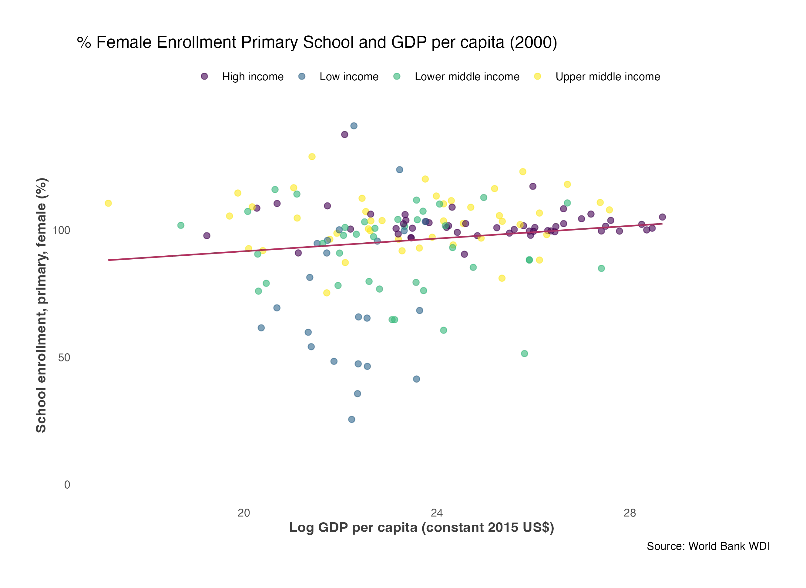
In this article, we'll apply for our examples real-world data, focusing on World Bank statistics. By working with this real-world data, you will develop the ability to create interactive plots that not only showcase information but also tell a story. Beginning with a static ggplot from the year 2000, we will guide you through a transformation into dynamic, multi-year visualizations using R Shiny and Plotly.
The visualizations will illustrate trends in indicators such as female school enrollment, GDP, and fertility rates, offering insights into their development over time.


# Download the static ggplot code in the right corner
 Tip
TipFocused Learning Through Interaction
For a more effective learning experience, actively copy and explore the code. While doing so, keep these concise objectives in mind: - Observe the impact of interactivity on data interpretation. - Explore new insights revealed through manipulating the visualizations. - Identify trends in the multi-year data that become evident with interaction.
Engaging directly with the code will not only help you understand what each line does but also reveal the full capabilities of Plotly in enhancing data storytelling.
Basic Plotly Graphs in Shiny
Utilize ggplotly() for Interactive Plots
The integration of Plotly into Shiny applications is done by the ggplotly() function. This function transforms ggplot2 objects into interactive Plotly plots. It leverages the familiar syntax and powerful visualization capabilities of ggplot2 while bringing them into Plotly's interactive framework.
In the Shiny UI, plotlyOutput() is used to allocate space for these dynamic visualizations, analogous to plotOutput() for static plots. The server function utilizes renderPlotly() to ensure these interactive visualizations are correctly rendered in the allocated UI space.
# install.packages(plotly)
# install.packages(ggplot2)
library(plotly)
library(ggplot2)

# UI definition for the Shiny app
ui <- fluidPage(
  plotlyOutput("interactivePlot")
)
# Server logic for the Shiny app
server <- function(input, output) {
  output$interactivePlot <- renderPlotly({
    # Create a ggplot
    ggplot_object <- "# Add the ggplot code here"

    # Convert the ggplot object to an interactive Plotly plot
    ggplotly(ggplot_object)
  })
}

# Launch the Shiny application
shinyApp(ui, server)
Key Features of ggplotly()
When you enhance ggplot2 visualizations with ggplotly() in Shiny applications, the resulting Plotly object incorporate interactive features. Here is a list of the features and their syntax:
Interactive Hover Tooltips:
- What it Adds:
ggplotly()transformsggplot2's static aesthetic mappings into dynamic hover tooltips. These tooltips appear when users hover over plot elements, providing an interactive layer to the visualization. -
Value Added: This feature offers immediate, detailed insights at each data point, enhancing user engagement and understanding. It allows for a more intuitive exploration of the data, as additional context and information are revealed interactively.
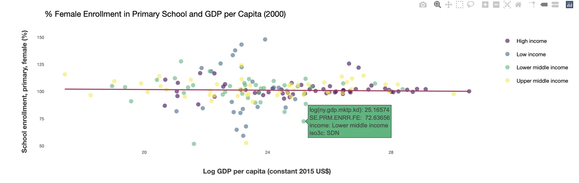
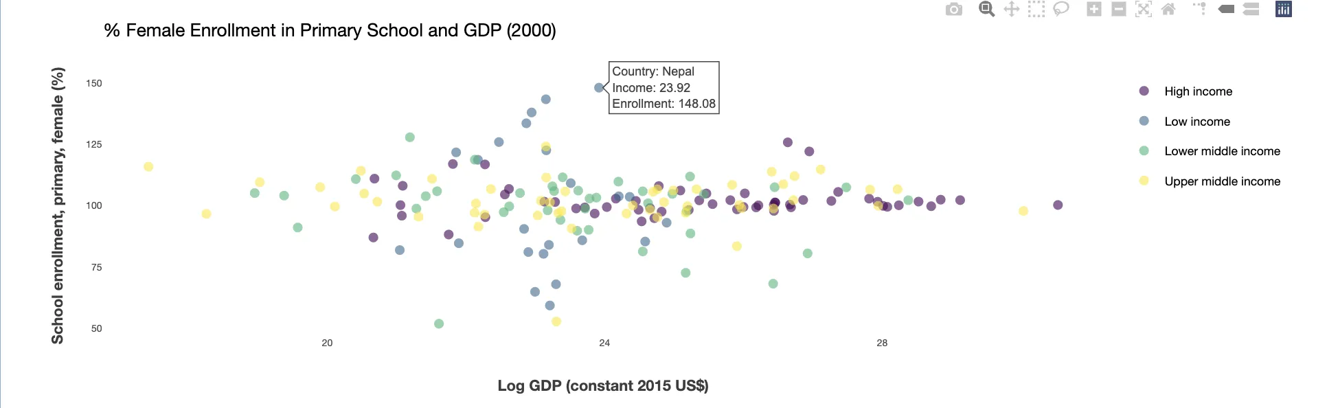
TipCustomizing the Tooltips
Customizing tooltips is beneficial, especially when dealing with less informative variable names, like 'ny.gdp.mktp.kd' in our example. Renaming these variables for clarity significantly improves the visualization's usability. Additionally, employing the layout function allows for further refinement of the tooltip box, making it neater and more user-friendly. These customizations not only enhance the aesthetic appeal of your visualizations but also make the data more accessible and understandable to the viewer.
# Example: Adding interactive hover tooltips
server <- function(input, output) {
    output$plot <- renderPlotly({
        # Step 1: Create a ggplot object. Inside 'aes()', add a 'text' argument to define hover text
        p <- ggplot(sample_data, aes(x = Variable1, y = Variable2,
                                     text = paste("Category:", Category,
                                                  "<br>Var1:", round(Variable1, 2),
                                                  "<br>Var2:", round(Variable2, 2)))) +
            geom_point()  # Add points to the plot

        # Step 2: Convert to Plotly. Use 'tooltip = "text"' to specify custom text for hover
        ggplotly(p, tooltip = "text") %>%
        # layout() can be used to customize the appearance of the tooltips.
         layout(
                hoverlabel = list(
                    bgcolor = "white",  # Background color of the hover tooltip
                    font = list(
                        family = "Arial",  # Font family used in the tooltip
                        size = 12          # Font size used in the tooltip
                    )
                )
            )
    })
}
Zooming and Panning Capabilities
This feature introduces the ability for users to zoom in and out of plots, as well as pan across them. Zooming and panning enable users to focus on specific areas of interest in greater detail. This capability is especially useful in visualizations with dense or complex data, as it allows for a more tailored and in-depth exploration of the plot. Users can easily navigate to different sections, zoom in for a closer look at fine details, or pan out for a broader view, making the data exploration process both efficient and user-centric.
Dynamic Animation in Visualizations
Dynamic animation is the feature that integrates Plotly's animation capabilities into ggplot2 visualizations. It enables the creation of moving graphs that can effectively demonstrate changes and trends over time.
Key Impacts of Dynamic Animation: - Temporal Clarity: Animations offer a depiction of data evolution, making it easier for users to grasp changes, trends, and developments over time. This is particularly beneficial for datasets that span across different periods, as it provides a clear visual narrative of how the data has progressed. - Increased Engagement: Animated visualizations capture the user's attention with their motion and transitions. This not only makes the viewing experience more enjoyable but also aids in better retention and understanding of the data being presented.
 Example
In this example, we utilize Plotly's animation features with a year slider, allowing users to dynamically explore how the plot changes over time. The slider facilitates easy filtering of data by year, revealing trends and changes in a visually engaging way. This interactive tool transforms the plot into a dynamic narrative, making data analysis both intuitive and captivating.
# Dynamic Filtering with Animation in R Shiny
ui <- fluidPage(
  # Slider for selecting year, with animation enabled
  sliderInput("year", "Year", min = 1970, max = 2015, value = 1975, animate = TRUE),
  plotlyOutput("dynamicPlot")
)

server <- function(input, output) {
  output$dynamicPlot <- renderPlotly({
    # Filtering data according to the year selected in the slider
    filtered_data <- sample_data[sample_data$year == input$year, ]

    # Constructing the ggplot
    plot <- ggplot(filtered_data, aes(x = var1, y = var2)) +
      geom_point() +
      labs(title = paste("Data for Year:", input$year), # Dynamic title update
           x = "Variable 1", y = "Variable 2")

    # Converting ggplot to interactive Plotly plot
    ggplotly(plot)
  })
}
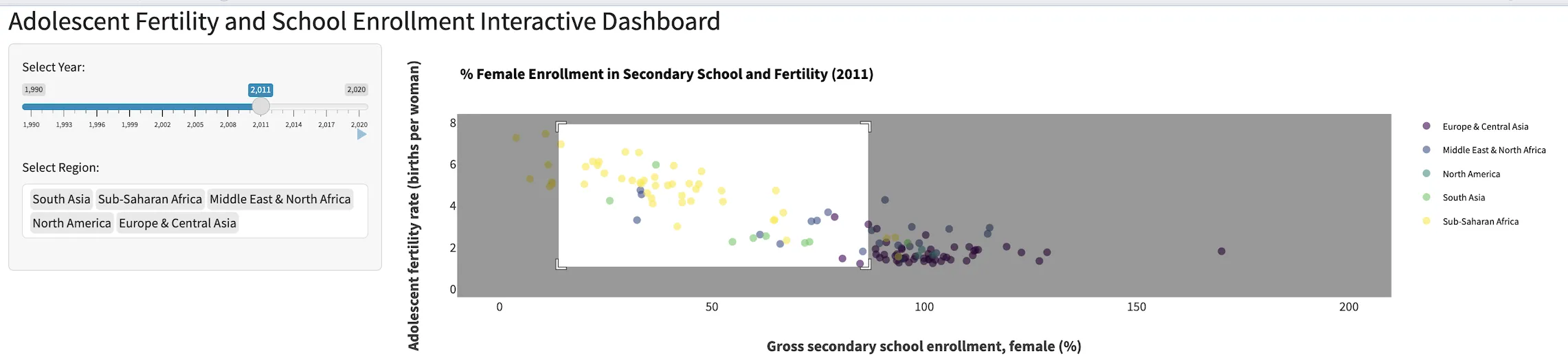
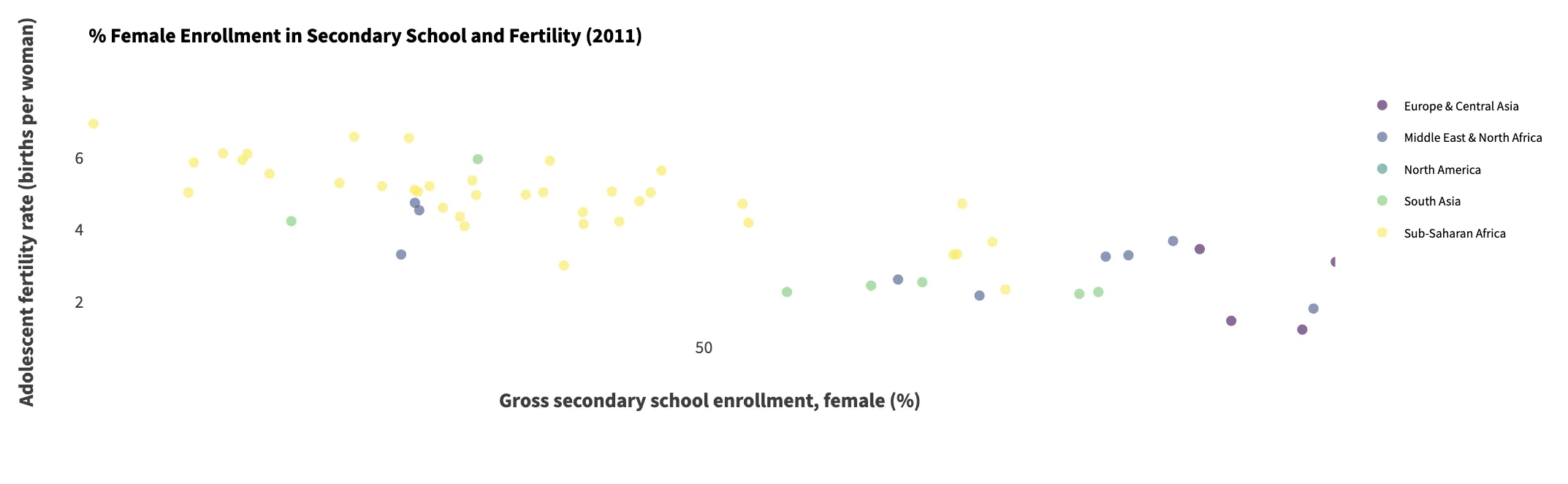
Advanced User Case: Interactive Data Exploration with R Shiny and Plotly
In this section of the article, we merge the interactive strengths of R Shiny with Plotly's dynamic visualization capabilities.
You'll learn how to combine Plotly's features with R Shiny's interactivity to create dashboards that allow users to explore data in an straight forward way. For example, selecting different regions or time periods will dynamically update the visualization to reflect current economic and social trends. This integration not only enhances user interaction with hover tooltips and responsive filtering but also elevates the aesthetic appeal of your visualizations.
ExampleThe provided code guides you through building an interactive dashboard focused on global trends, such as the relationship between adolescent fertility rates and female school enrollment. The dashboard allows for dynamic exploration, enabling users to select specific years or regions and observe the changes in these indicators over time.
# Packages needed
library(shiny)
library(plotly)
library(WDI)
library(dplyr)
library(ggplot2)
library(tidyr)
library(bslib)

# Fetch data outside of the server for efficiency
db <- WDI(country = "all", indicator = c("ny.gdp.mktp.kd", "SE.PRM.ENRR.FE", "SE.SEC.ENRR.FE", "SP.DYN.TFRT.IN"),
          extra = TRUE, start = 2000, end = 2015, language = "en") %>%
  group_by(iso3c) %>%
  fill(names(.), .direction = "downup") %>%
  filter(region != "Aggregates")

ui <- fluidPage(
  theme = bs_theme(bootswatch = "lumen"),
  titlePanel("Adolescent Fertility and School Enrollment Interactive Dashboard"),
  sidebarLayout(
    sidebarPanel(width = 3,
      sliderInput("selectedYear", "Select Year:",
                  min = min(db$year, na.rm = TRUE),
                  max = max(db$year, na.rm = TRUE),
                  value = min(db$year, na.rm = TRUE),
                  step = 1, animate = TRUE),
      selectInput("regionSelect", "Select Region:",
                  choices = unique(db$region),
                  multiple = TRUE, selected = unique(db$region))
    ),
    mainPanel(width = 9,
      plotlyOutput("plot")
    )
  )
)
# Server Logic: Dynamic Plotting and Filtering
# The server logic filters the data based on user selections and renders an interactive plot. The plot updates as the user changes the selected year or regions, providing a dynamic exploration tool.

server <- function(input, output, session) {
  output$plot <- renderPlotly({
    # Filter data based on user selections
    db_filtered <- db %>%
      filter(region %in% input$regionSelect, year == input$selectedYear)

    # Create an interactive plot with ggplot2 and Plotly
    p <- ggplot(db_filtered, aes(x = SE.SEC.ENRR.FE, y = SP.DYN.TFRT.IN, color = region,
                                 text = paste("Country:", country,
                                              "<br>Enrollment:", round(SE.SEC.ENRR.FE, 3),
                                              "<br>Fertility Rate:", round(SP.DYN.TFRT.IN, 3)))) +
      geom_point(alpha = 0.6, size = 2) +
      labs(title = paste("% Female Enrollment in Secondary School and Fertility (", input$selectedYear, ")", sep = ""),
           subtitle = "Analyze the relationship between school enrollment and fertility rates over time.",
           caption = "Source: World Bank WDI",
           x = "Gross secondary school enrollment, female (%)",
           y = "Adolescent fertility rate (births per woman)") +
      theme_minimal() +
      ylim(0, 8) + # Keep axis the same trough animation
      xlim(0, 200) +
      scale_color_viridis_d() +
      theme(
        legend.position = "top",
        plot.title = element_text(size = 14),
        plot.subtitle = element_text(size = 12),
        plot.caption = element_text(size = 10),
        axis.title = element_text(size = 14),
        axis.text = element_text(color = "grey24"),
        axis.ticks = element_blank(),
        plot.margin = margin(1, 1, 1, 1, "cm")
      )

    # Enhance interactivity with Plotly
    ggplotly(p, tooltip = c("text")) %>%
      layout(hoverlabel = list(bgcolor = "white", font = list(family = "Arial", size = 12)))
  })

  # Update the region selection options based on data changes
  observe({
    updateSelectInput(session, "regionSelect", choices = unique(db$region))
  })
}

# Launch the Shiny application
shinyApp(ui, server)
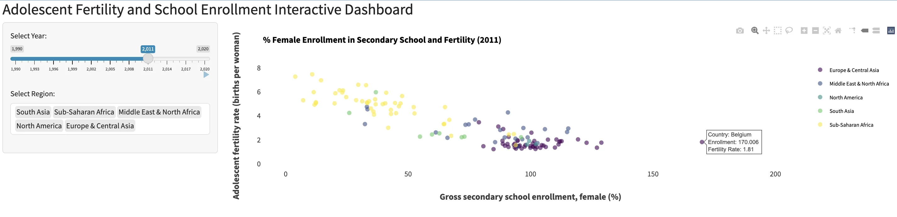
The Data Story
This advanced visualization tells a compelling story:
As global female secondary school enrollment increased from 1990 to 2014, adolescent fertility rates declined. This narrative goes beyond mere data display, highlighting the transformative impact of education on young women's lives and illustrating the powerful correlation between educational access and societal change.
 Summary
This article of the R Shiny series focusses on using the interactive and dynamic visualization capabilities of Plotly within Shiny applications. Key elements of this building block included:
- An introduction to enhancing ggplot2 visualizations with ggplotly(), enabling the transformation of static plots into interactive experiences.
- Detailed exploration of Plotly's features like interactive hover tooltips, zooming, and panning capabilities, and dynamic animations, each contributing to a more engaging data exploration.
- An practical application using World Bank data to illustrate significant socio-economic trends through interactive dashboards, demonstrating how user selections dynamically update visualizations.
This article is aimed to learn the skills to create visually appealing and interactive data narratives, showcasing the power of combining R Shiny and Plotly in data visualization.