


Overview
In this article, we explore a hands-on application of R Shiny's reactivity feature through a practical example: constructing live your “perfect” plot. While the concept of reactivity in R Shiny has been discussed in this article, here we bring it to life by demonstrating how it enables the real-time creation of data visualizations. Thereby allowing users to construct and customize their own plots live within the app.
We'll walk you through a step-by-step process of building your 'perfect plot', using Shiny's responsive widgets like sliders, dropdowns, and color pickers. Thereby looking at adjustments of the colors, size and even themes in one go.
Dataset Introduction
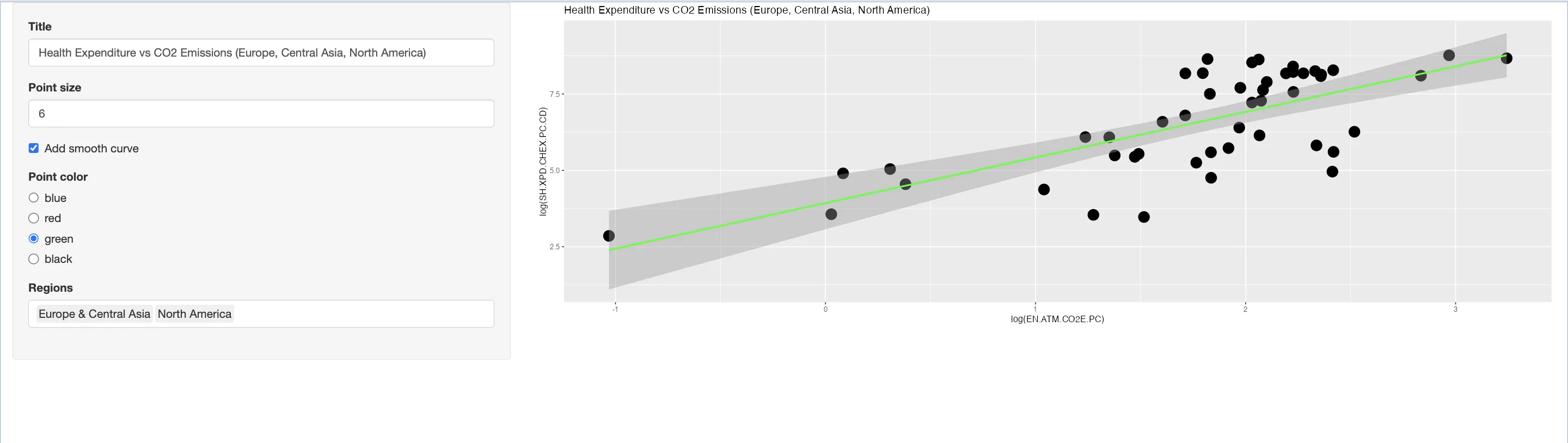
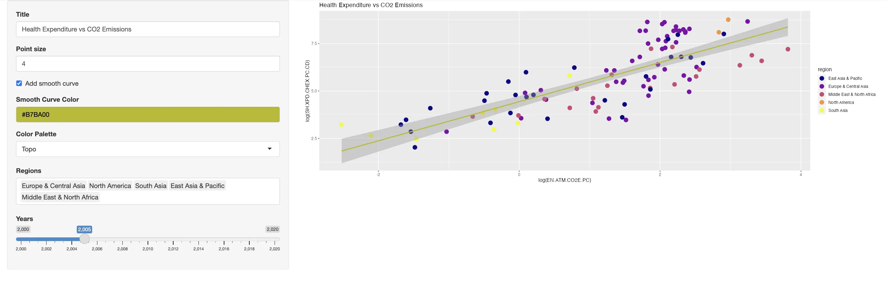
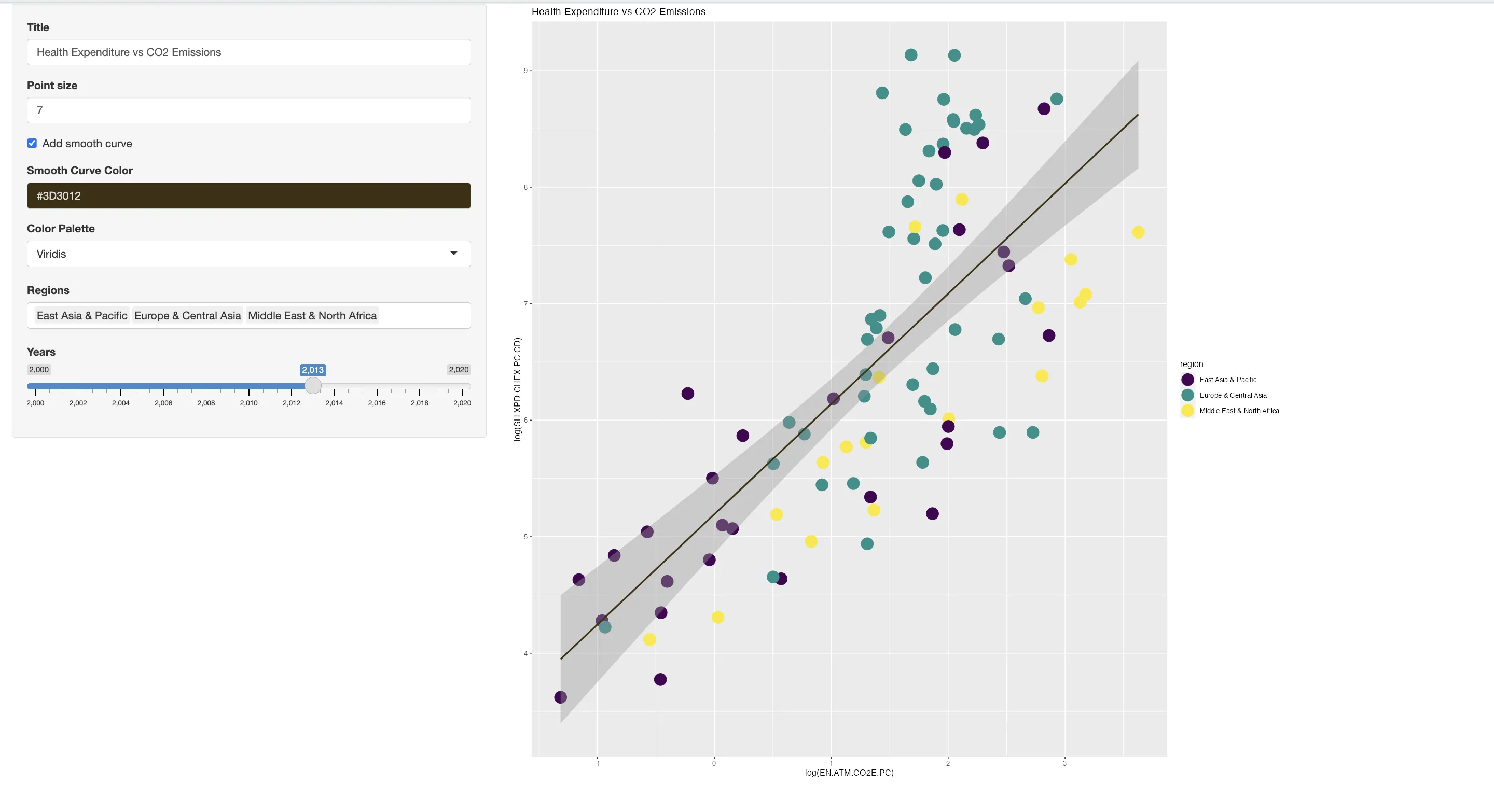
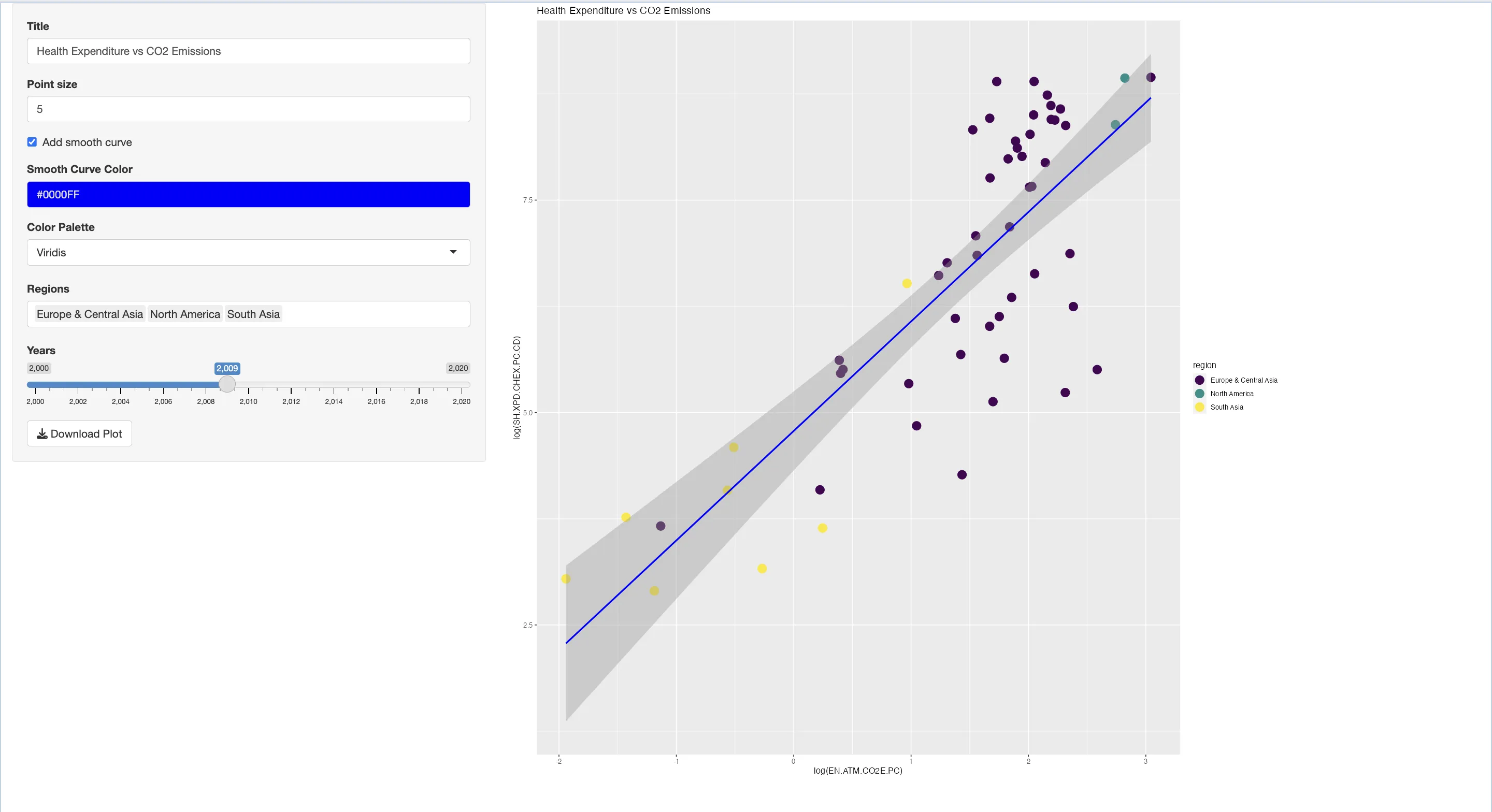
We will use a dataset from the World Bank, to examine the relationship between health expenditure and CO2 emissions per country. Through this analysis, we aim to explore if there are any correlations between a nation's healthcare spending and its environmental footprint.

# Install the WDI package for the World Bank data
install.packages("WDI")
library(WDI)

# Specify the indicators: CO2 Emissions and Health Expenditure per capita
indicators <- c("EN.ATM.CO2E.PC" = "CO2 Emissions (metric tons per capita)",
                "SH.XPD.CHEX.PC.CD" = "Health Expenditure per capita (current US$)")

# Fetch data from the World Bank for the years 2000-2020
data <- WDI(country = "all", indicator = indicators, start = 2000, end = 2020, extra = TRUE)
data$region <- as.factor(data$region)
data$year <- as.numeric(data$year)
Interactive Plot Customization
Text Input: Personalizing Plot Titles
The textInput widget is used to create an interactive text input field in the Shiny user interface.
Its basic syntax is textInput(inputId, label, value), where: inputId is a unique identifier for the widget. label provides a descriptive label for the input field. value sets an initial default text within the field, which is useful for initializing your app with pre-defined settings.
# Incorporating ggplot2 for advanced plotting capabilities
library(ggplot2)
# Structuring the UI: A sidebar panel with text input for the plot title
ui <- fluidPage(
sidebarLayout(
sidebarPanel(
# Text input for dynamic plot title customization
textInput("title", "Title", "Health Expenditure vs CO2 Emissions")
),
mainPanel(
# Display area for the plot
plotOutput("plot")
)
)
)
# Server-side logic: Dynamically updates the plot title based on user input
server <- function(input, output) {
output$plot <- renderPlot({
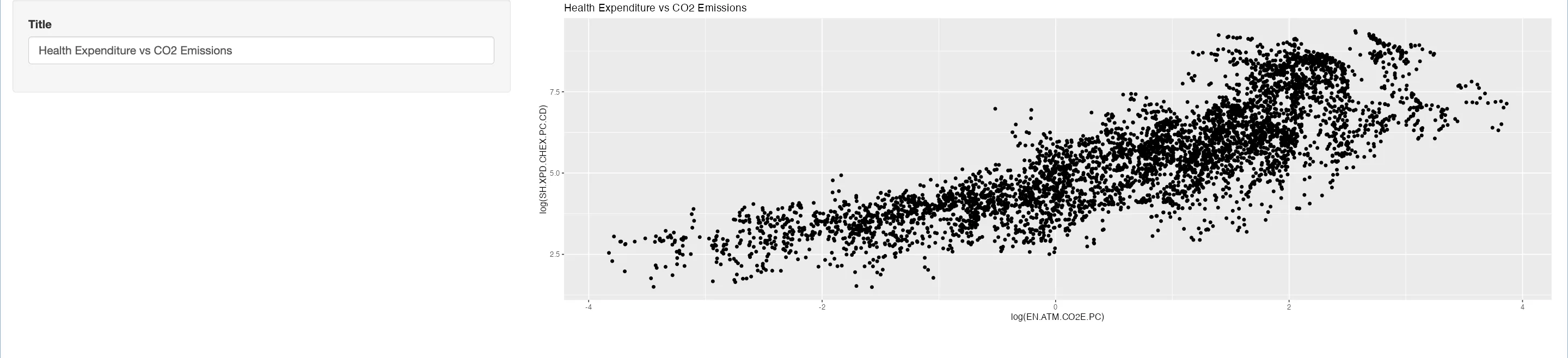
# Constructing the plot with user-defined title
ggplot(data, aes(x = log(EN.ATM.CO2E.PC), y = log(SH.XPD.CHEX.PC.CD))) +
geom_point() +
ggtitle(input$title) # Reflecting the title input in the plot
})
}
# Initiating the Shiny app with defined UI and server components
shinyApp(ui = ui, server = server)
Numeric Input: Adjusting Point Sizes
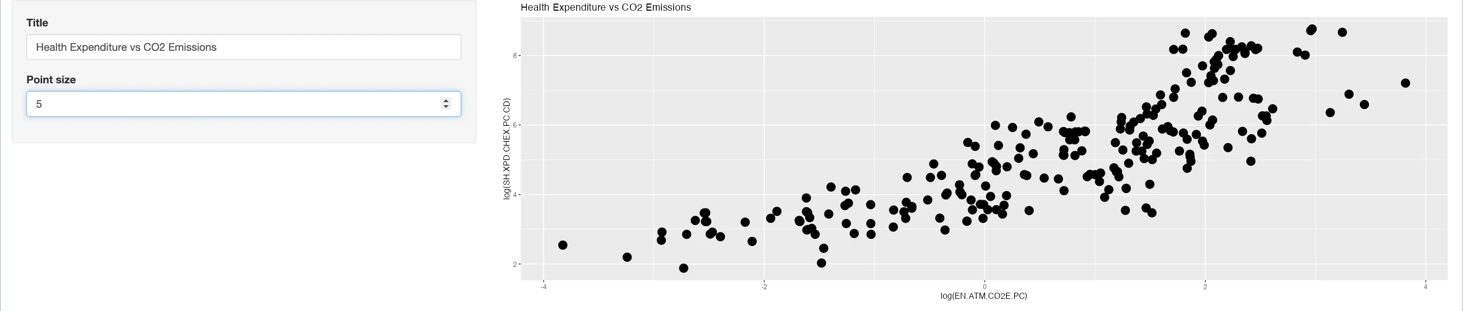
The numericInput widget in Shiny is aimed for numerical user inputs. Its syntax, numericInput(inputId, label, value, min, max, step), includes parameters for setting minimum (min) and maximum (max) values, and an optional step parameter to define the steps between values. This widget is particularly useful for fine-tuning graphical elements like point sizes in plots.
# Add to your existing UI setup
sidebarPanel(
  # Numeric input for point size control
  numericInput("size", "Point Size", value = 1, min = 1, max = 10, step = 1)
  # Additional UI elements
)

# Update your server function
server <- function(input, output) {
  output$plot <- renderPlot({
    # Previous plot code
    geom_point(size = input$size)  # Dynamically adjusts point size
    # Additional plot modifications
  })
}
 Tip
TipUnderstanding Shiny's Input Handling
Shiny's is designed to recognize the type of user input and manage it accordingly in the server-side code. This ensures that the data type of the input is maintained throughout the application. For instance, if a numeric input with the ID size is used, accessing input$size in the server code will automatically return a numeric value. This feature of Shiny significantly simplifies data handling and ensures type consistency.
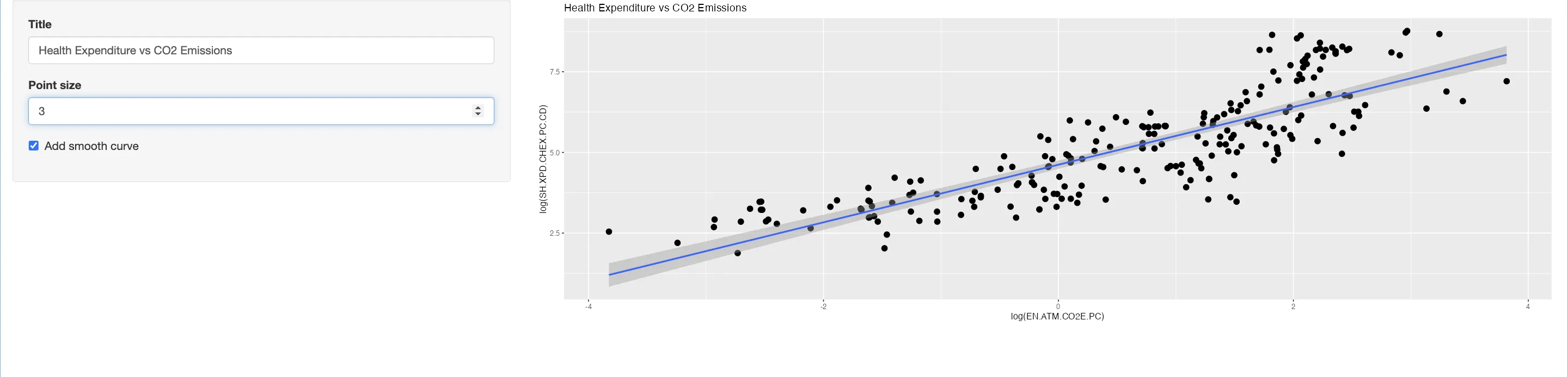
Checkbox Input: Integrating Smooth Curves
The checkboxInput widget in Shiny offers a binary choice (TRUE or FALSE), making it ideal for toggle-like options in your application. The function checkboxInput(inputId, label, value) includes a value parameter that sets the initial state of the checkbox (checked or unchecked). Setting it to TRUE means the checkbox will be checked by default when the application loads, and conversely, setting it to FALSE will leave it unchecked initially.
# In your existing UI configuration
sidebarPanel(
  # Checkbox for adding a smooth curve
  checkboxInput("fit", "Add Smooth Curve", FALSE)
)

# Modify your server function
server <- function(input, output) {
  output$plot <- renderPlot({
    # Base plot code
    if (input$fit) {
      plot <- plot + geom_smooth(method = "lm")  # Conditional smooth curve addition
    }
    plot
  })
}
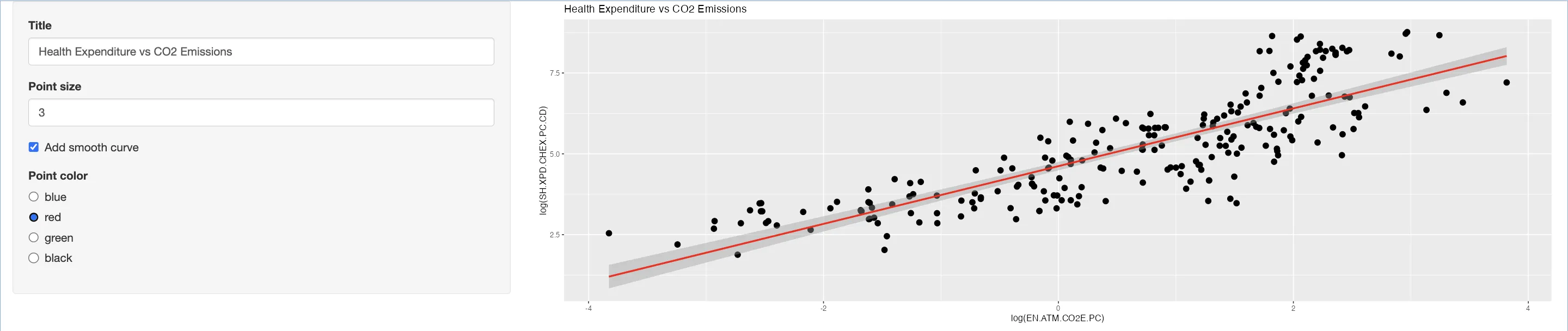
Radio Buttons: Choosing Plot Colors
Radio buttons in Shiny are ideal for offering multiple options while restricting the user to a single choice. These inputs are particularly effective in scenarios demanding exclusive selection. The radioButtons function is structured with choices to list the options and selected to define the default selection. The syntax, radioButtons(inputId, label, choices, selected), offers simplicity and clarity, ensuring a smooth user experience.
Radio buttons are used when you want to present multiple options to the user but restricting them to select only one. This input type is particularly useful for situations where the choice is exclusive and cannot be multiple.
The radioButtons function includes a choices parameter to define the options available for selection and a selected argument to specify which option is selected by default. Unlike other input types, there is no value parameter; the selected argument serves a similar purpose, setting the initial state of the selection.
The basic syntax for radioButtons is radioButtons(inputId, label, choices, selected), where:
- choices is a list of options that the user can select from.
- selected determines which choice is pre-selected when the app loads.
# Add to your existing UI layout
sidebarPanel(
  # Radio buttons for choosing plot colors
  radioButtons("color", "Point Color", choices = c("Blue", "Red", "Green", "Black"))
)

# Update your server function
server <- function(input, output) {
  output$plot <- renderPlot({
    # Your ggplot code
    # Integrating color selection in the plot
    plot + geom_smooth(method = "lm", color = input$color)
  })
}
TipQuick Troubleshooting for Shiny Widgets
- Non-Responsive Widgets: Ensure
inputIdis correctly referenced in the server function and reactive expressions are set up properly. - Data Type Issues: Check and correct the data type returned by widgets. Convert data types if necessary.
- Layout Problems: Ensure consistent use of layout functions and consider CSS for styling.
- Duplicate Input IDs: Assign unique
inputIdsto each widget to avoid overlap issues.
Select Inputs: Managing Lengthy Option Lists
When dealing with a lengthy list of options, selectInput or dropdown lists are the most efficient choice. They conserve screen space while offering a comprehensive selection menu. This widget is versatile, allowing for single or multiple selections (controlled by the multiple argument). The syntax selectInput(inputId, label, choices, selected, multiple) makes it a flexible tool for diverse applications.
# Inside your existing UI setup
sidebarPanel(
  # Other input elements
  selectInput("regions", "Regions", choices = levels(unique(data$region)), multiple = TRUE)  # Dropdown for region selection
)

# Inside your existing server function
server <- function(input, output) {
  output$plot <- renderPlot({
    # Filter data based on selected regions
    data_plot <- subset(data, region %in% input$regions)
    # Previous plot code
  })
}
Numerical Selection: Single and Range Values
Slider inputs are widgets that allow users to select numeric values through a sliding mechanism. They serve a similar purpose to numeric inputs but offer a more interactive and visual approach to value selection. Sliders can be effective for adjusting parameters within a specific range, such as setting thresholds, defining ranges, or filtering data.
Single vs. Range Value Selection with Slider Inputs
The set up of the sliderInput can vary depending on the initial value provided:
- Single Value Selection: If the initial value (specified in the value argument) is a single number, the slider is set up for selecting a single numeric value.
- Range Value Selection: If the initial value is a vector of two numbers, the slider allows the selection of a range of values, represented by the two end points of the vector
# Inside your existing UI setup
sidebarPanel(
  # Other input elements
  sliderInput("years", "Years", min = min(data$year), max = max(data$year), value = c(2005))  # Slider for year selection
)

# Inside your existing server function
server <- function(input, output) {
  output$plot <- renderPlot({
    # Filter data based on selected year range
    data_plot <- subset(data, year == input$years)
    # Previous plot code
  })
}

TipExploring Shiny's Widget Options
The Shiny Widget Gallery from RStudio offers a detailed overview of available input widgets in Shiny, including examples and code snippets. This resource is useful for understanding the functionality and appearance of various widgets such as text inputs, sliders, and radio buttons, which can assist in their integration into Shiny applications.
Colourpicker: Enhancing Color Selection
The colourpicker package enriches Shiny applications by enabling interactive color selection. The colourInput() function is the function to use here, providing a user-friendly color picker. It requires inputId for identification, label for description, and value for setting the initial color, which can be an English color name or a color code.
install.packages("Colourpicker")
library(Colourpicker)

# Inside your existing UI setup
sidebarPanel(
  # Other input elements
  colourInput("smoothColor", "Smooth Curve Color", "blue")  # Color picker for smooth curve
)

# Inside your existing server function
server <- function(input, output) {
  output$plot <- renderPlot({
    # Previous plot code
    if (input$fit) {
      plot <- plot + geom_smooth(method = "lm", color = input$smoothColor)  # Use picked color for smooth curve
    }
    plot
  })
}
Adjusting Plot Dimensions
Shiny's output placeholder functions, like plotOutput(), offer parameters to tailor the appearance of outputs. Adjusting width and height parameters allows for precise control over the dimensions of elements like plots, enhancing their visual appeal and fit within the application layout. By default, the height of the plot is set to 400 pixels.
# Inside your existing UI setup
mainPanel(
  plotOutput("plot", width = "1000px", height = "1000px")  # Adjusting plot size
)
# Server logic remains the same as previous
Plotly Integration: Bringing Plots to Life
Integrating Plotly in Shiny elevates static plots to interactive visualizations. The ggplotly() function converts ggplot2 plots into an interactive format, offering features like zoom, pan, and tooltips, which enhance user engagement and data exploration.
To incorporate Plotly's interactive capabilities into a Shiny app, you will need to make some adjustments to both the UI and server components of your application:
- The plotlyOutput function in the UI defines a space for the interactive plot with specified dimensions.
- The renderPlotly function in the server script takes a ggplot object and converts it into an interactive plot using ggplotly().
# Inside your existing UI setup
mainPanel(
  plotlyOutput("plot", width = "1000px", height = "1000px")  # Interactive Plotly plot
)

# Inside your existing server function
server <- function(input, output) {
  output$plot <- renderPlotly({
    # Convert ggplot to interactive Plotly plot
    ggplotly(plot)
  })
}
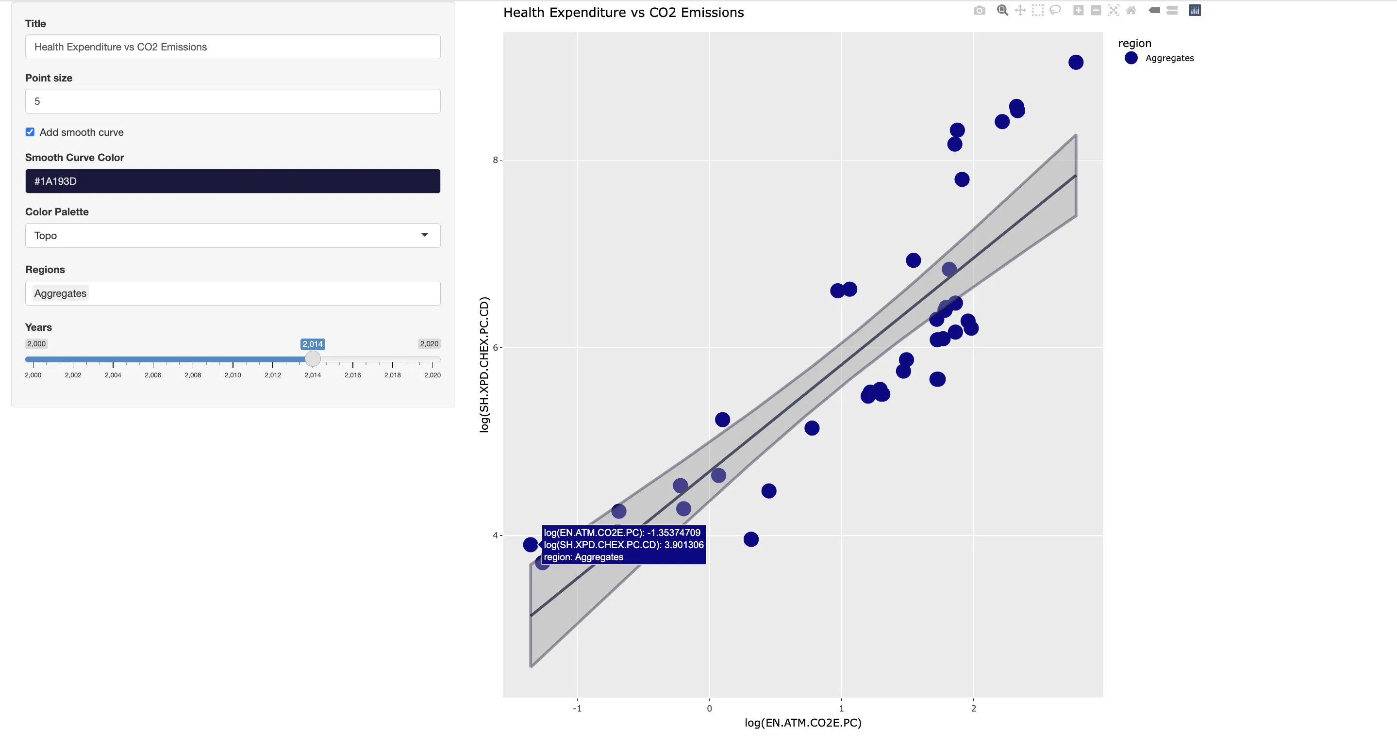
TipAdvantages of Interactive Plots
Interactive plots in Shiny, particularly with Plotly, greatly improve user interaction, allowing for detailed data exploration through features like zooming and tooltips. To learn more, consider reading this article on Plotly.
Implementing Plot Downloads
At last, now that we have a range of options to create live the "perfect" plot. It is important to use Shiny's ability for users to download the plots they interact with. In addition, this can be particularly useful for data analysis and reporting purposes. You can achieve this by implementing a download handler, which allows users to save the plot as an image or other file formats directly from the app.
To add a download function for plots in your Shiny application, you'll need to update both the UI and server components. This involves adding a download button in the UI and defining the server logic to handle the plot download process.
# Inside your existing UI setup
sidebarPanel(
  # Other input elements
  downloadButton("downloadPlot", "Download Plot")  # Button for downloading the plot
)

# Inside your existing server function
server <- function(input, output) {
  # Previous plot logic
  output$downloadPlot <- downloadHandler(
    filename = function() {paste("plot-", Sys.Date(), ".png", sep = "")},
    content = function(file) {ggsave(file, plot = plot, device = "png")}
  )
}
 Example
In this refined Shiny example, we introduce several additional features:
- Color Theme Selector: Users can now choose from a range of color palettes, each offering a unique visual perspective, thereby enhancing plot clarity and appeal.
- Plot Theme Selector: We've added a selector with themes like 'Minimal', 'Classic', 'Light', and 'Dark'. This feature gives the flexibility to adjust the overall look of the plot
- Custom Axis Labels: New
textInputfields have been integrated for X and Y-axis labels. This addition allows users to input descriptive, context-specific titles for axes, making the plots more informative.

# Download the example file in the right corner
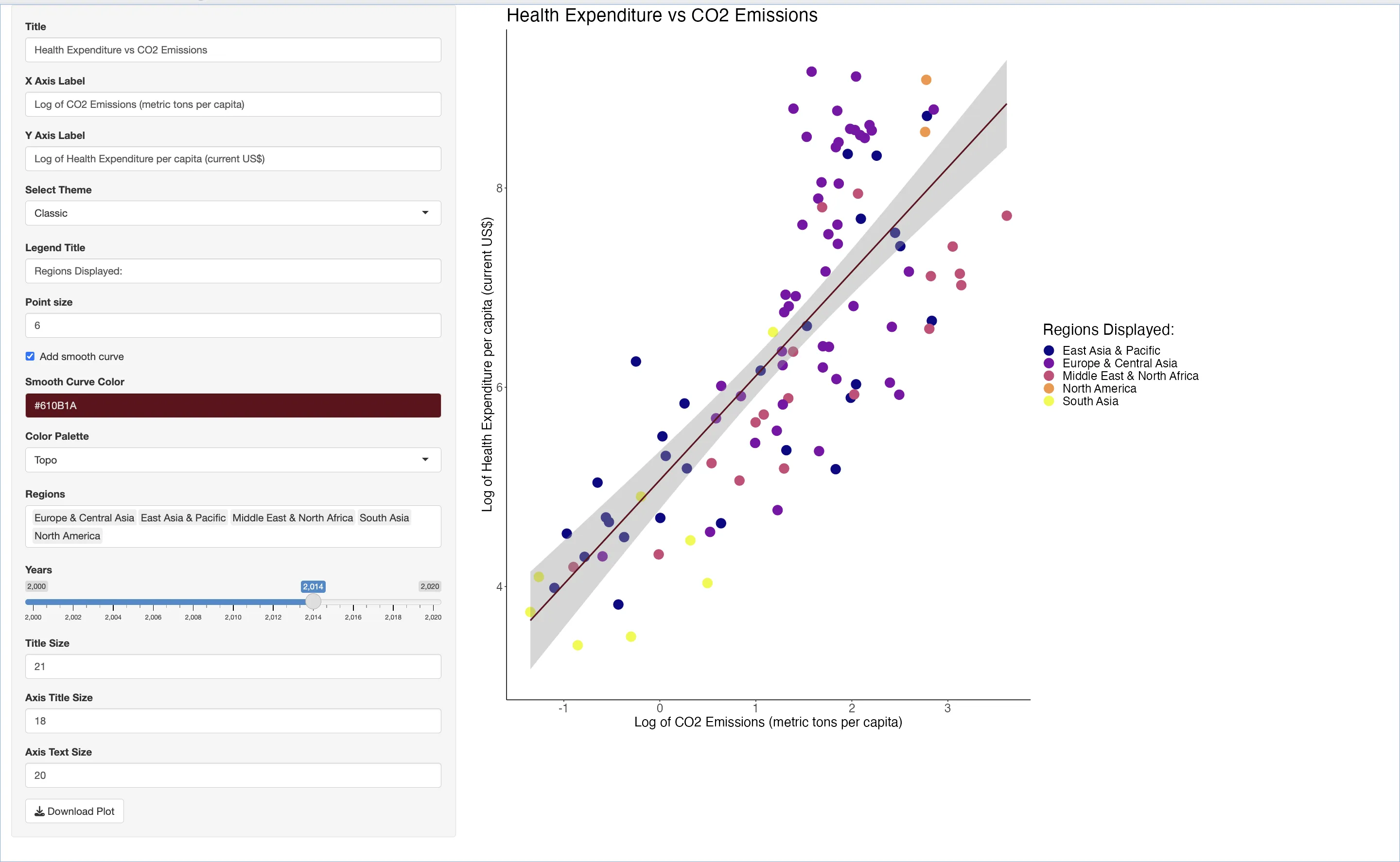
TipUsage of the example code
Consider our Shiny example as a template for your real-time data visualization. While we've covered a variety of real-time plot customization techniques, remember, this is just your starting point. Shiny offers a range of additional features and widgets. Use this code to experiment and expand, adding complexity and sophistication to your applications for any purpose, be it personal, educational, or professional.
 Summary
In this article, we've discussed a specific application of R Shiny's reactivity: enabling users to construct and customize their own plots live within the app. Here's what we've achieved:
- Live Plot Customization: We illustrated how users can dynamically build and modify plots using Shiny's reactive framework. This was demonstrated using a
World Bankdataset, where users can explore the relationship between health expenditure and CO2 emissions. - Enhanced User Interaction: Key to our implementation is the range of
widgetswe introduced.Slidersfor adjusting numerical values,dropdownsfor selecting data categories, andcolor pickersfor aesthetic choices give users full control over the plot's appearance. - Personalization Tools: We added
text inputsfor plot titles and axis labels, allowing users to personalize their visualizations further. Additionally, the inclusion of atheme selectorprovides options for changing the overall look and feel of the plots. - Practical Output Features: The app includes a download function, enabling users to save their customized plots for use in presentations or reports.