


Overview
This guide will walk you through the integration of GitHub Copilot, a powerful code completion tool, within RStudio.
This tutorial is designed for both beginners and experienced R programmers, providing setup guidance and hands-on examples. By the end, you'll be equipped to leverage GitHub Copilot within RStudio for increased productivity and collaborative coding.
What is GitHub Copilot
GitHub Copilot is an AI pair programmer that offers autocomplete-style suggestions as you code. The tool can give you suggestions based on the code you want to use or by simply inquiring about what you want the code to do.
It is developed by GitHub in partnership with OpenAI, and it is designated to best assist developers in writing code more efficiently.
Some of its features include: - Code autocompletion: generating suggestions while typing the code. - Code generation: Copilot will use the context of the active document to generate suggestions for code that might be useful. - Answering questions: it can also be used to ask simple questions while you are coding (e.g., "What is the definition of mean?"). - Language support: supports multiple programming languages, including R, Python, SQL, HTML, and JavaScript. In this tutorial, we will be focusing on R and Python.
 Warning
Verified students, teachers, and maintainers of popular open-source projects on GitHub can use Copilot for Individuals for free. Otherwise, a paid subscription is needed to use the tool.
For more information, visit Copilot.
Configure Copilot in RStudio and VS Code
GitHub and Copilot
-
To use Copilot in both R and VS Code you need an active GiHub account. If you do not have one already you can check out this useful source Set up Git and GitHub.
-
As a student, you need to request specific access to use the service of Copilot. Follow this link. You will need to provide proof of enrollment. - Once you land on the website, scroll down until you see this image:
<p align = "center"> <img src = "../images/Student-dev-pack.png" width="400"> </p> - Click on "Get the Student Pack". You will land on a page looking like this: <p align = "center"> <img src = "../images/Student-dev-pack-1.png" width="400"> </p> - Click on "Sign up for Student Developer Pack”, find the box indicating the benefits for individuals, and click on "Get student benefits”. <p align = "center"> <img src = "../images/Student-dev-pack-2.png" width="400"> </p> - Now, you will be directed to the page dedicated to your application. You will need to provide a valid University email address, the name of your institution, and a small motivation behind your request. -
Once your application has been approved, you will receive a notification via email (be careful, it could also be in the spam folder).
-
To activate GitHub Copilot, go to the landing page of Copilot and make sure you are signed in with your GitHub account (the same with which you have requested the student access).
- Click on "Buy now", then after that, a message should appear saying you are eligible to use Copilot for free. Proceed with installation, and there you go; you now have access to this feature.

For your reference, this is the message that should appear:

<p align = "center">
<img src = "../images/Student-dev-pack-3.png" width="400">
</p>
RStudio
-
To start using Copilot in RStudio, you must first install R and RStudio on your computer. If you haven't checked it out, Tilburg Science Hub has a building block on this: Installing R & RStudio.
-
The process does not end here. To enable Copilot in RStudio, follow these steps. Open the app, click on Tools -> Global Options -> Copilot -> tick the box saying "Enable GitHub Copilot" -> sign in to your GitHub account, and there you go; you are ready to start!
<p align = "center">
<img src = "../images/R-copilot.png" width="400">
</p>
VS Code
-
Before you can use Copilot in VS Code, you have to install VS Code on your computer. Again, Tilburg Science Hub has a usefull building block on this: Installing VS Code.
-
After the activation of Copilot, you can also install the program in VS Code by following these steps. Open the app, go to Marketplace/Extensions tab -> search and install
Github CopilotandGitHub Copilot Chat-> sign into your Github account, and now you are also ready to start with using Copilot within VS Code! Upon completion you should see a new image in the sidebar, indicating that the installation has been successful!<p align = "center"> <img src = "../images/Copilot-VSC.png" width="50"> </p>
Applications in R
In this tutorial, we will see the application of Copilot in RStudio in the following contexts:
- Exploratory analysis of a dataset: simply tell R how to explore your dataset
- Data visualization: improve your plots instantly
- Data manipulation: use Copilot to save time on managing your data
- Questions & answers: Copilot also answers your (statistical) questions
Exploratory data analysis
For this tutorial, we will demonstrate the use of Copilot with the built-in R dataset called "swiss", containing different socio-economic variables for different cantons in Switzerland.
As a first library, the package ggplot2 is needed for visualization and load of the dataset "swiss".

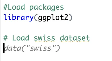
# Load packages
library(ggplot2)

# Load swiss dataset
data("swiss")
Copilot will already start to give suggestions (as shown in the picture below); to follow those, you need to press the tab key.
Now, let's proceed with exploring the dataset with some summary statistics. Again, notice that just by typing "Exploratory data analysis" in the R script, ghost suggestions will appear for the following steps. Such examples are the commands “summary" and "head".
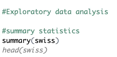
# Exploratory data analysis

# summary statistics
summary(swiss) #providing a summary of each variable in the dataset
head(swiss) #view the first rows of the dataset

# summary statistics on one variable (e.g., fertitlity)
mean(swiss$Fertility)
sd(swiss$Fertility)
 Tip
TipTo get the best output from Copilot, it's important to keep your instructions simple. Remember, Copilot is still a new feature in RStudio and it is continuously learning. Additionally, if you want to maintain Copilot's momentum, just press the tab key on its previous suggestions to bring up more commands.
Another useful way to use Copilot is simply writing what you want to do, and suggestions will appear accordingly.
For example, if we are researching demographic patterns in Switzerland, it could be interesting to understand how education influences family planning decisions. Accordingly, we want to know the summary statistics for two variables (e.g. fertility and education) and their correlation. Simply write it in a comment format (using #) and Copilot will provide the code as shown below.
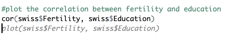
# summary statistics on two variables (e.g., fertility and education)
mean(swiss$Education)
sd(swiss$Education)
mean(swiss$Fertility)
sd(swiss$Fertility)

#plot the correlation between fertility and education
cor(swiss$Fertility, swiss$Education)
plot(swiss$Fertility, swiss$Education)
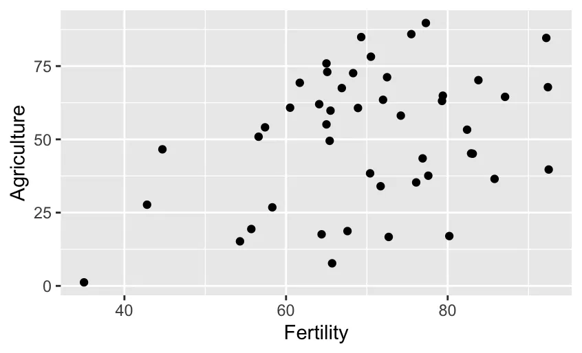
The resulting plot should look like this:
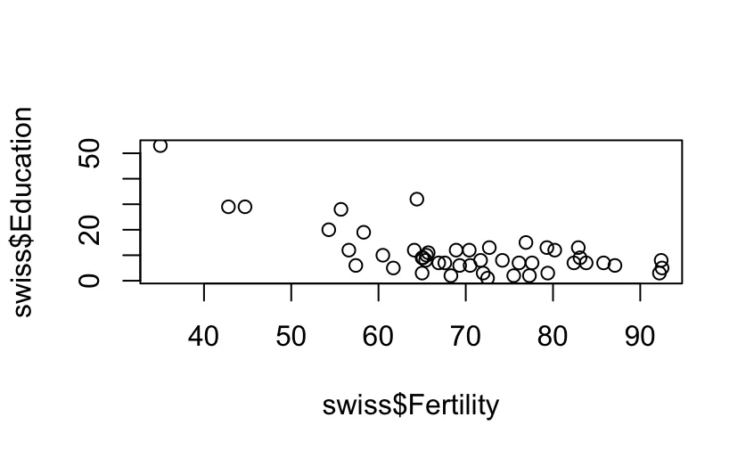
The scatterplot looks unrefined, but no worries, the following section will show you how to improve this with the help of Copilot.
Data visualization
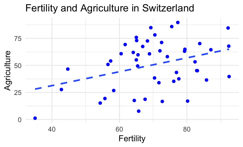
A great advantage of using Copilot in RStudio is data visualization. With a simple request to Copilot, you can change the appearance of your visualization and implement small changes to elevate your graphs quickly. The first step is writing out in a comment form which variables you want to use and which figure you aim for. Copilot will suggest the simplest form of a graph, you can then proceed to refine the visualization to your best liking.
An example is the following suggested code:
- The first scatterplot is pretty basic and lacks some essential elements.
- We proceed to inquire Copilot for improvemets such as a minimal setting, different colours and regression lines.
# create a scatterplot between Fertility and Agriculture using ggplot2
ggplot(data = swiss, aes(x = Fertility, y = Agriculture)) + geom_point()

# improve the visualization, add a title, impose minimal setting and change the color of the points to a more neutral one
ggplot(data = swiss, aes(x = Fertility, y = Agriculture)) + geom_point(color = "grey") + theme_minimal() + labs(title = "Fertility and Agriculture in Switzerland")

# I want the dots to be blue for better visibility
ggplot(data = swiss, aes(x = Fertility, y = Agriculture)) + geom_point(color = "blue") + theme_minimal() + labs(title = "Fertility and Agriculture in Switzerland")

# add the regression line to the plot to visualize a trend in the data
ggplot(data = swiss, aes(x = Fertility, y = Agriculture)) + geom_point(color = "blue") + theme_minimal() + labs(title = "Fertility and Agriculture in Switzerland") + geom_smooth(method = "lm", se = FALSE)

# make the line dashed
ggplot(data = swiss, aes(x = Fertility, y = Agriculture)) + geom_point(color = "blue") + theme_minimal() + labs(title = "Fertility and Agriculture in Switzerland") + geom_smooth(method = "lm", se = FALSE, linetype = "dashed")
For your reference, a comparison between the starting and the final scatterplot:
As a second example, we want to visualize the density of the fertility rate. This is interesting in order to identify a tendency in the data, peaks in the distribution and potential outliers. Again, ask Copilot to do this for you, it's suggestions are as follows:
#create a density plot of the variable fertility
ggplot(swiss, aes(x = Fertility)) +
  geom_bar(stat = "density", fill = "skyblue") +
  labs(title = "Fertility Rates in Swiss Provinces", y = "Density", x = "Fertility Rate") +
  theme_minimal() +
  theme(axis.text.x = element_text(angle = 45, hjust = 1))  # Rotate x-axis labels for better readability
Notice that the quality of this graph is already pretty good, Copilot has implemented some of the previous requests regarding visualization features. A possible addition to the graph could be adding a line signaling the mean of the distribution to compare it with the peaks as follows:
ggplot(swiss, aes(x = Fertility)) +
  geom_bar(stat = "density", fill = "skyblue") +
  labs(title = "Fertility Rates in Swiss Provinces", y = "Density", x = "Fertility Rate") +
  theme_minimal() +
  theme(axis.text.x = element_text(angle = 45, hjust = 1)) +  # Rotate x-axis labels for better readability
  geom_vline(aes(xintercept = mean(Fertility)), color = "red", linetype = "dashed", size = 1) +
  geom_text(aes(x = 80, y = 0.02, label = "Mean Fertility"), color = "red", size = 4)
Data manipulation
In this case, the data manipulation consists of adding the cantons’ names as the first column instead of having them as indexes. This can be useful for performing a cluster analysis grouping cantons with similar socio-economic features.
In case you don't know how to proceed, you can ask Copilot how to do it, and it will give you input, as you can see in the code block below.
The following code block represents Copilot's input. It could be possible that your suggestion will be different.
# I want to remove the index and add it as a column in the dataset. Suggest me a way to do it
swiss$Cantones <- rownames(swiss)
head(swiss)
After running this command, visualize the dataset. Notice that the cantons’ names were not removed as row names but added as the last column.
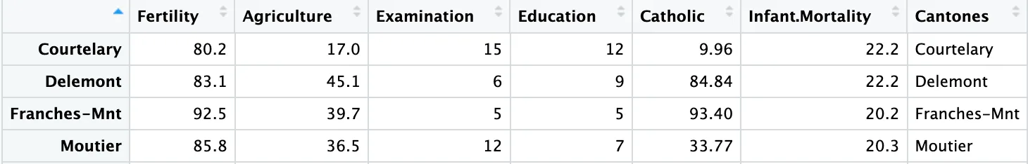
Although, in principle, this is not wrong, it doesn’t look very clean, and it would be better to have them in the first column for a clearer and more structured dataset.
After some research, one of the possible ways to do this is the following:
data("swiss")
library(tibble)
swiss <- as_tibble(swiss, rownames = "Cantons")
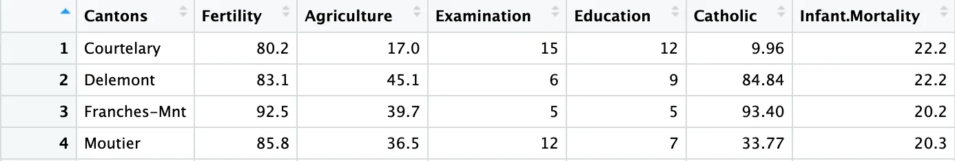
TipBefore running the above code chunk, re-load the “swiss” dataset to work on the original version, otherwise you will be running the code on the modified data.
Manipulation with "dplyr" package
In this segment, we'll explore the coupling of GitHub Copilot's code suggestions and the powerful data manipulation capabilities of the dplyr package. Together, they redefine how you approach and execute tasks, offering a seamless and productive experience. Let's dive in and amplify your dplyr workflows in RStudio!
Let's first do the preliminaries such as cleaning the environment and load the necessary packages:
#i want to remove all objects from my environment
rm(list = ls())

#load dplyr package
library(dplyr)
library(ggplot2)

#load swiss data
data(swiss)
A first interesting feature of the package is the possibility to manipulate a variable and change it's values. In the following example, we want to manipulate the variable Catholic and transform it to a binary variable according to the prevailing percentage of religion. Copilot, once faced with the request, suggested the following code:
#I want to change the column Catholic to a factor of 1 if the value is above 50 and 0 if the value is below 50
swiss$Catholic <- ifelse(swiss$Catholic > 50, 1, 0)
swiss
If you open the swiss dataset now, you can see that the column Catholic has been modified accordingly. An interesting additon could be exploring the education level of Catholic and non-Catholic cantons as follows:
#Explore the mean education level of the Catholic and non-Catholic cantons
swiss %>%
  group_by(Catholic) %>%
  summarise(mean(Education))
As you can infer from the results, we have higher mean education for non-Catholic cantons.
A second use case of the dplyr package is filtering and subsetting data, these functions provide an efficient way to manipulate and extract relevant information from your dataset. Let's stick to Education as our variable of interest and only look at highly educated cantons (arbitrarly defined as above 10%) and correlate the result with fertility. When asking Copilot to do the above, this is the suggestion provided:
#Filter the cantons with education level above 10
high_education <- swiss %>%
  filter(Education > 10)

#Explore the correlation between high education cantons and fertility
cor_test_result <- cor.test(high_education$Fertility, high_education$Education)
cor_test_result
The result indicated negative correlation, however, it would be preferrable to visualize it also for external readers of your code. Let's ask for the help of Copilot as we have seen in the previous section!
#Visualize the correlation between high education cantons and fertility
ggplot(high_education, aes(x = Fertility, y = Education)) +
  geom_point() +
  geom_smooth(method = "lm", se = FALSE) +
  labs(title = "Correlation between high education cantons and fertility",
       x = "Fertility",
       y = "Education")
To conclude, recall that, as every AI powered tool, GitHub Copilot is not to be followed blindly as it is constantly learning and can cause mistakes or not execute what you have in mind due to the phrasing of the request.
Questions & Answers
A nice feature of Copilot is the possibility to ask questions and receive a response on the RStudio script. A simple example is the following:
# You can also ask questions to Copilot.

# q: What is the definition of mean of a variable?
# a: The mean is the average of the numbers. It is easy to calculate: add up all the numbers, then divide by how many numbers there are. In other words, it is the sum divided by the count.
To ensure accuracy, ask relatively clear and simple questions.
Applications in VS Code
Webscrapers
The above mentioned examples can also be easily implemented with Copilot in VS Code. Therefore this section will explore on how to use Copilot for the somewhat more advanced topic of webscraping. The advantage of using Copilot for this task is that you only need to specify which website you want to scrape and what information you are interested in.
The first step is to ask Copilot to retrieve the raw HTML code from a certain website ((e.g., Music to Scrape). Following this, you can elaborate on your request by specifying the information you are interested in and how you want to process it.
An example is the following suggested code:
# can you retrieve the raw HTML code for this website: https://music-to-scrape.org/ ? And then return to me the names of the top-15 weekly hits (class = center-vertical center-text)?

import requests
from bs4 import BeautifulSoup

url = "https://music-to-scrape.org/"
response = requests.get(url)
html_content = response.text

soup = BeautifulSoup(html_content, "html.parser")
weekly_hits = soup.find_all(class_="center-vertical center-text")

top_15_hits = []
for hit in weekly_hits[:15]:
    top_15_hits.append(hit.text.strip())

print(top_15_hits)
From which the output is indeed the top-15 songs from the website! Additionally, you can ask Copilot to store the information for you in a specified file:
#Can you adjust this code so that it stores the names of the songs in a new line seprated JSON file called "15-hits"

import requests
import json
from bs4 import BeautifulSoup

url = "https://music-to-scrape.org/"
response = requests.get(url)
html_content = response.text

soup = BeautifulSoup(html_content, "html.parser")
weekly_hits = soup.find_all(class_="center-vertical center-text")

top_15_hits = []
for hit in weekly_hits[:15]:
    top_15_hits.append(hit.text.strip())

with open("15-hits.json", "w") as file:
    json.dump(top_15_hits, file, indent=4)
To which Copilot adjusts the code in order to save the information in the specified structure!
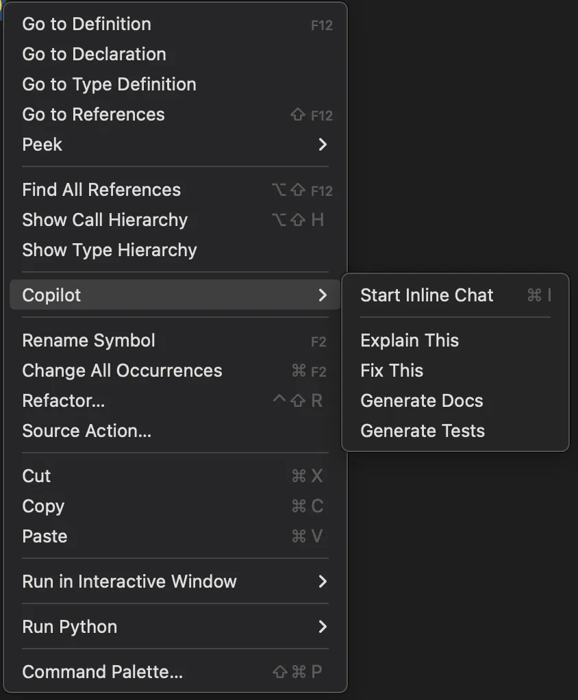
TipYou can also right click on parts of the code you have written and have Copilot explain it, fix it, generate docs or generate a test. Additionally, you can start an incline chat (ctrl + i on Windows, and command + i on Mac) in order to ask more specific questions about parts of the code. This allows you to quickly understand, fix en improve yours and others code!
You can for example tell Copilot that you are only interested in the songs from place 10 up to 20 to which Copilot changes the part of the code that is responsible for the selection to:
for hit in weekly_hits[9:19]:
    top_15_hits.append(hit.text.strip())
 Summary
This tutorial provides an overview of GitHub Copilot and its application in RStudio and VS Code for research purposes. It comprises four blocks:
- Explaining what GitHub Copilot is, its main features, and its applications.
- The setup process to ensure a smooth start with this new tool in RStudio and VS Code.
- Demonstrations on how to use Copilot in RStudio.
- Demonstration on how to use Copilot in VS Code for webscraping.
Sources: RStudio GitHub Copilot; GitHub Copilot